Work 🠖

CALLIOPE MAGAZINE
editorial, advertising
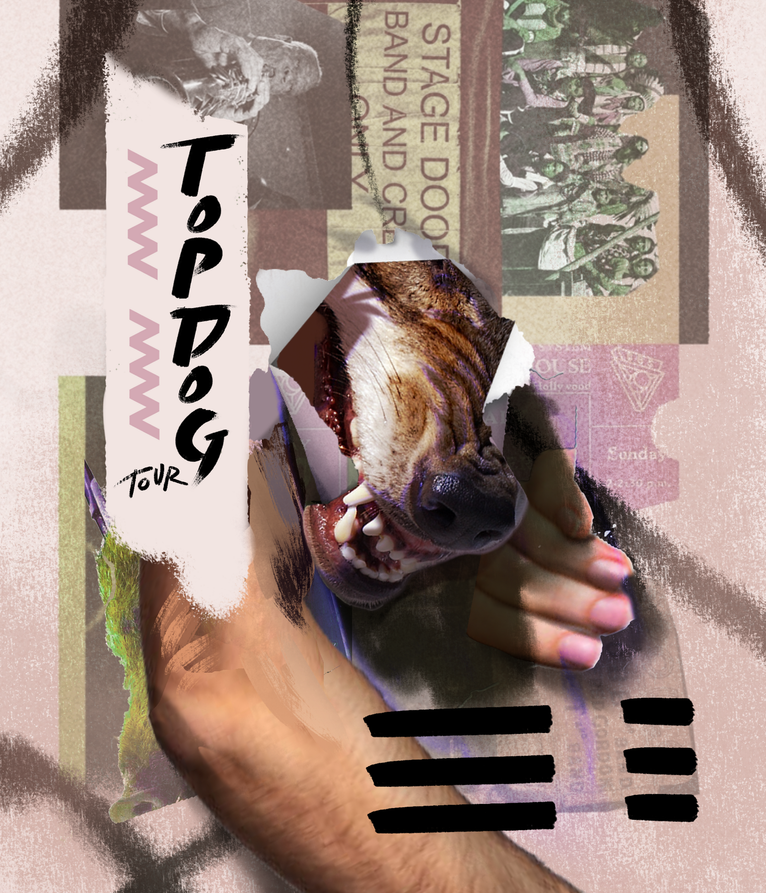
TOP DOG TOUR
illustration, branding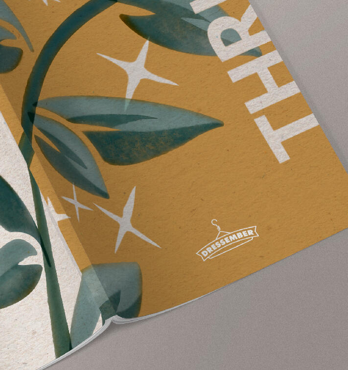
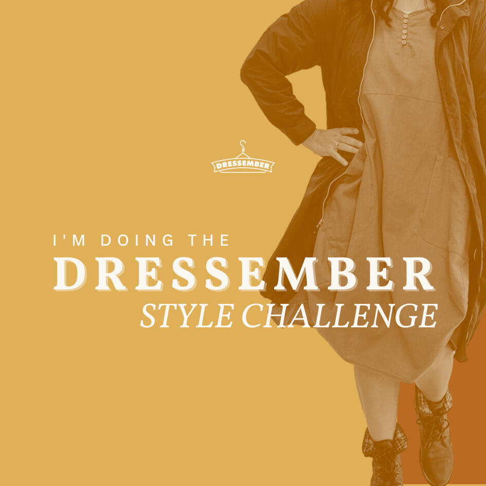
DRESSEMBER FOUNDATION INTERNSHIP
advertising, merch design
TAROT BUSINESS CARD SERIES
illustration, branding
SOAP BOX
packaging
HOMELESSNESS ADVOCACY
advertising
DON QUIXOTE
editorial, illustration
DESIGN ZINE
editorial
WAYFINDING CAMPAIGN
information design
BILINGUAL CULTURAL GUIDE
editorial, illustration
BILINGUAL EMERGENCY KIT
information design
PERSONAL ILLUSTRATION
+ Calliope Magazine
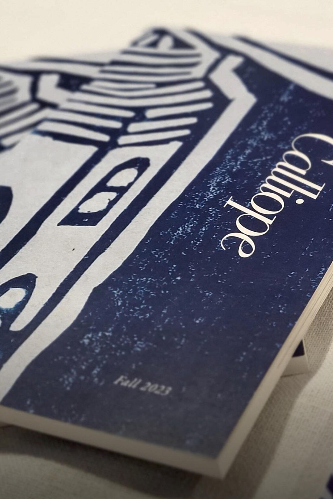
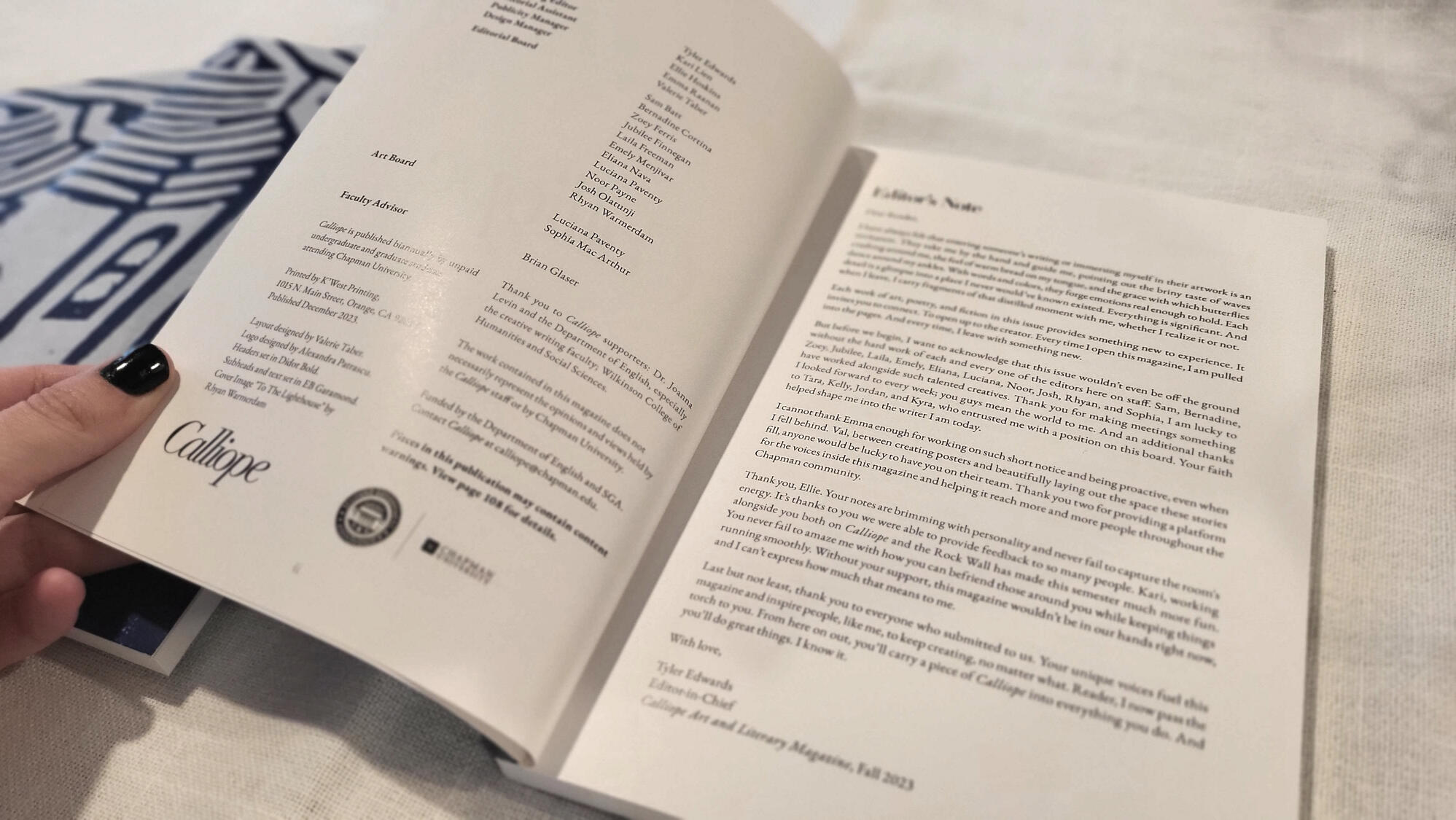
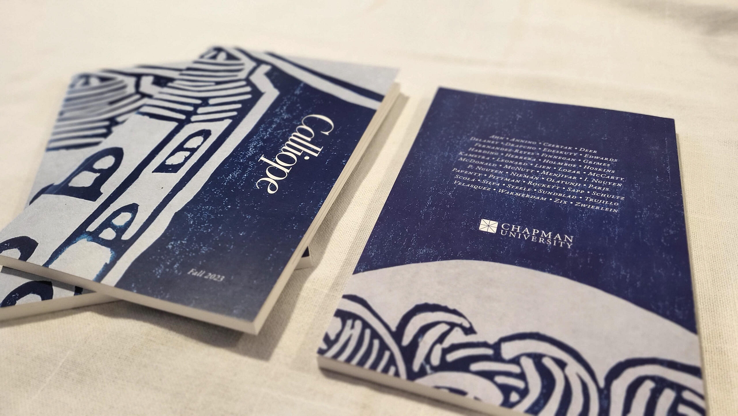
Calliope Art & Literary Magazine is Chapman University’s own student-run literary magazine, publishing a range of visual and written creative works created by members of Chapman's community.As Head Designer for the Fall 2023 publication, I designed the entire layout of the magazine, as well as a targeted digital and print advertising campaign that aided in nearly doubling the number of visual art submissions received for this edition over the previous one.Program: Adobe InDesign, Adobe Photoshop
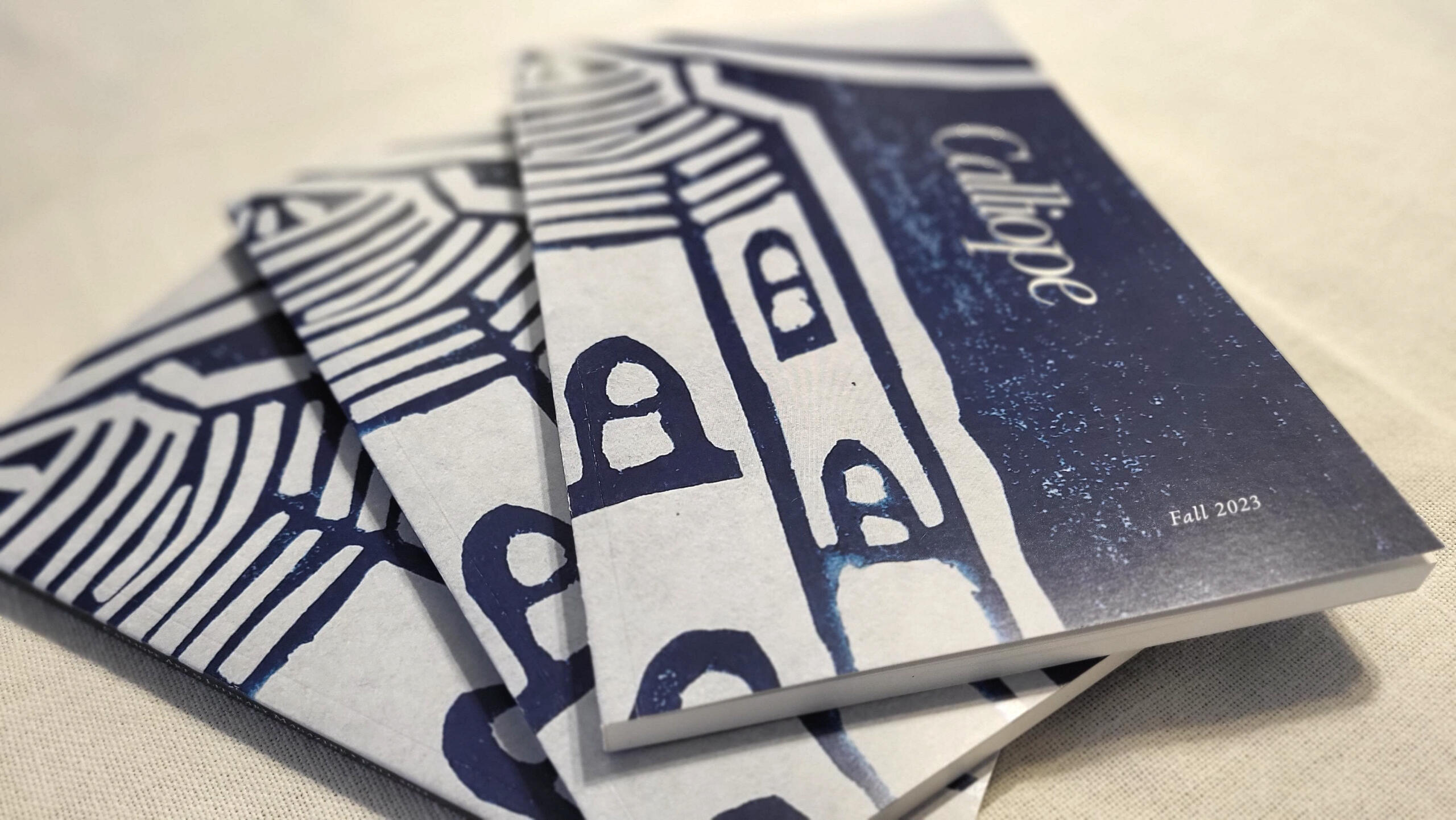
Cover Image: “The Lighthouse” by Rhyan Warmerdam, edited with permission of the author.
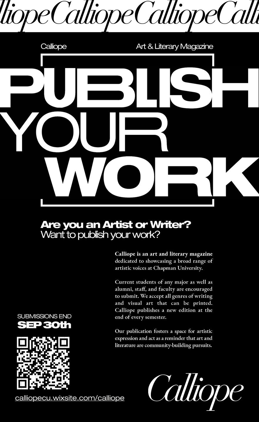
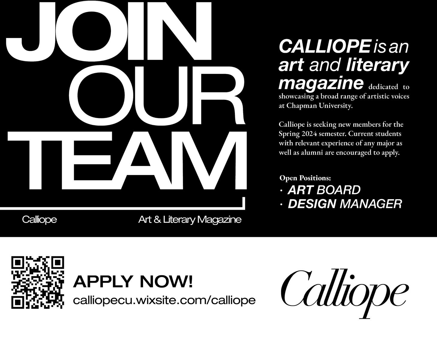
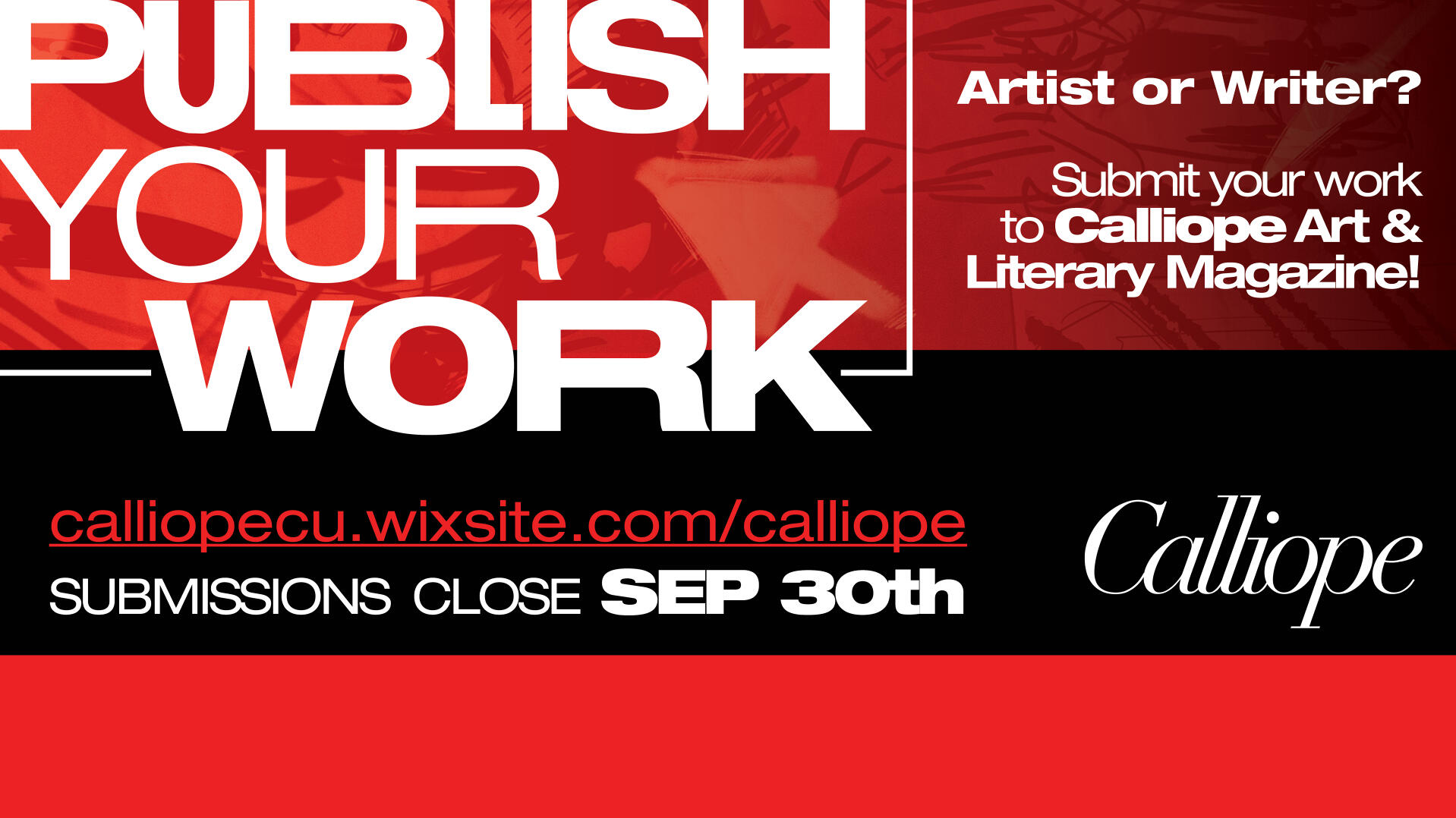
Advertising Materials
I created a digital and print ad campaign to solicit submissions to the magazine. The campaign utilizes high contrast, text based designs more consistent with the magazine website's current branding, in unorthodox dimensions where possible to distinguish itself from the host of other competing flyers on the Chapman campus.
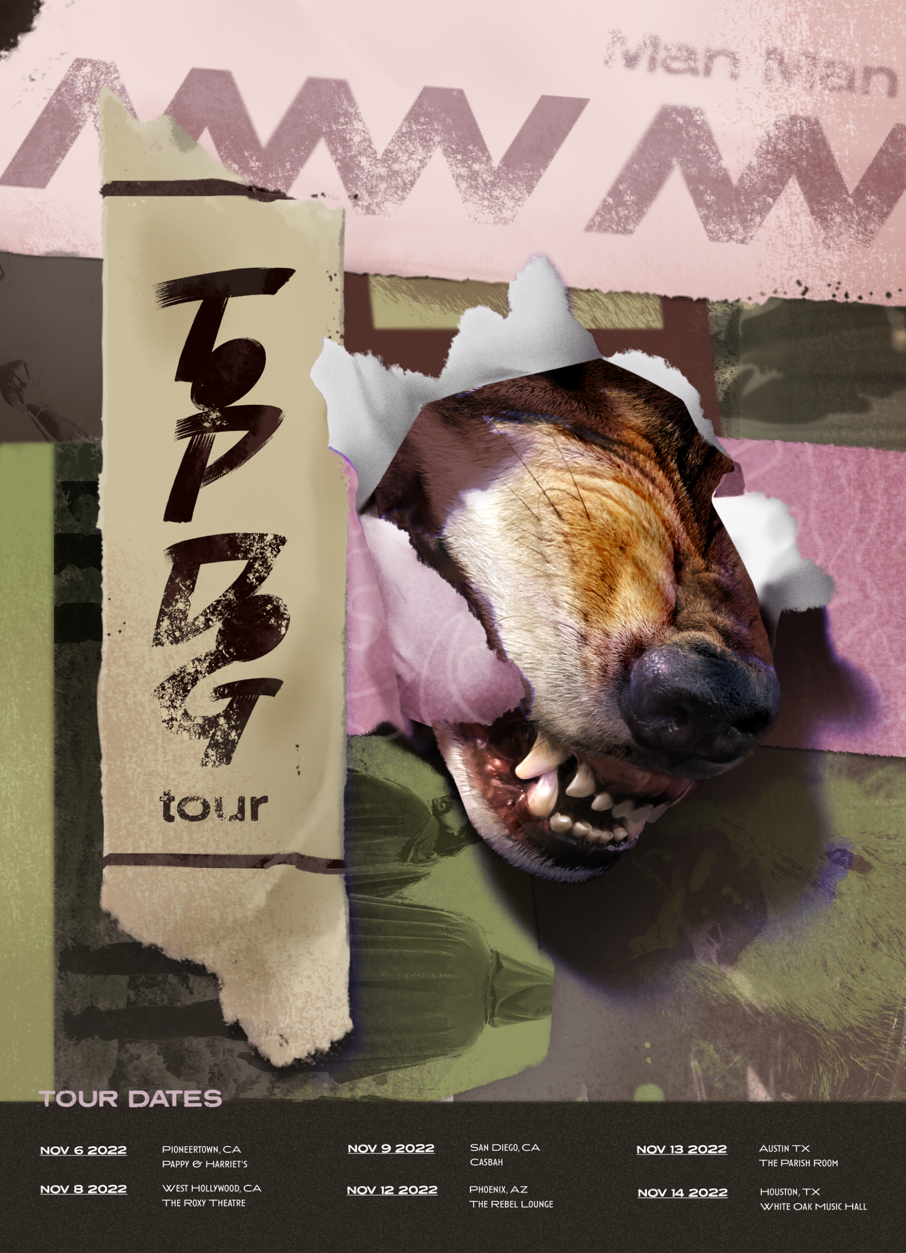
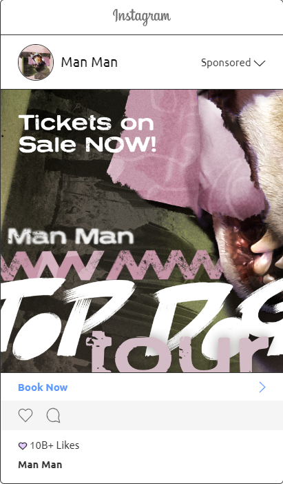
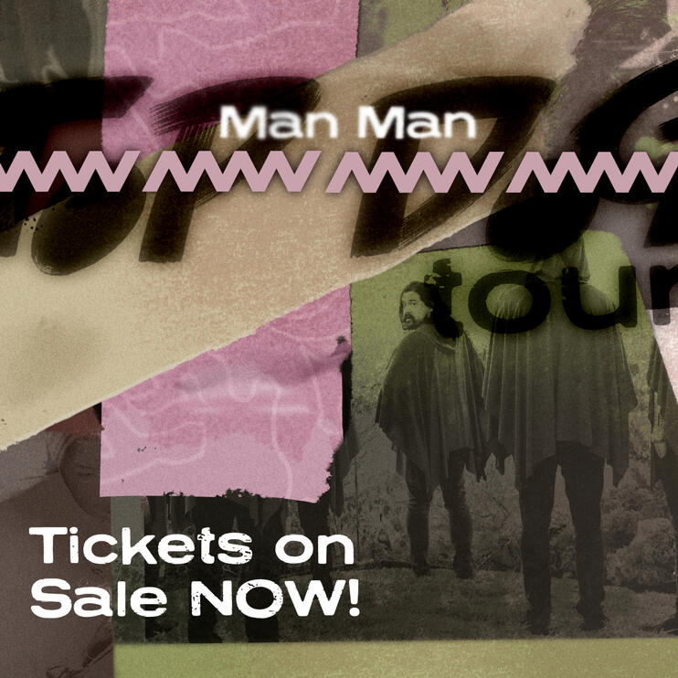
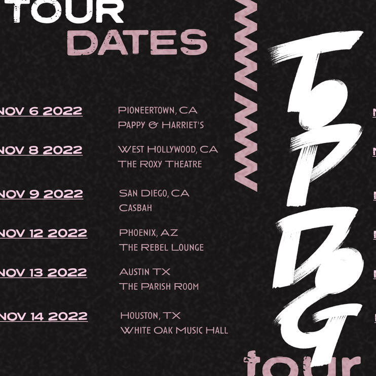
+ TOP DOG TOUR
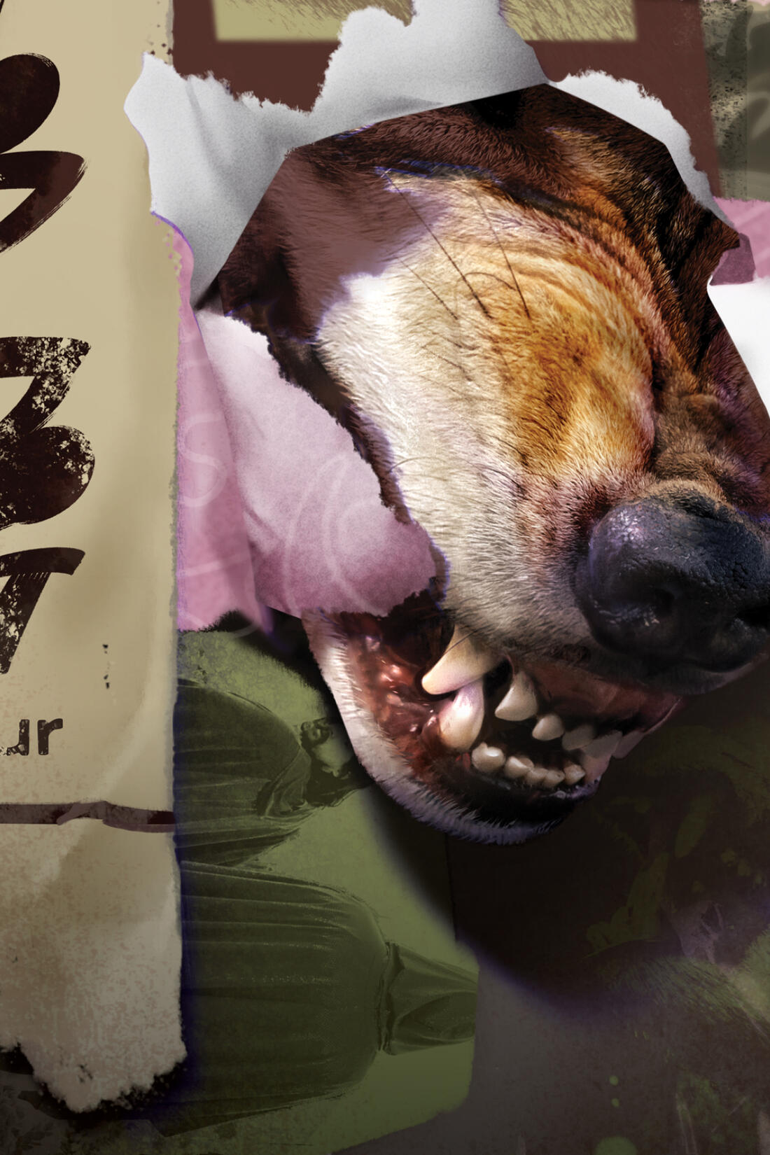
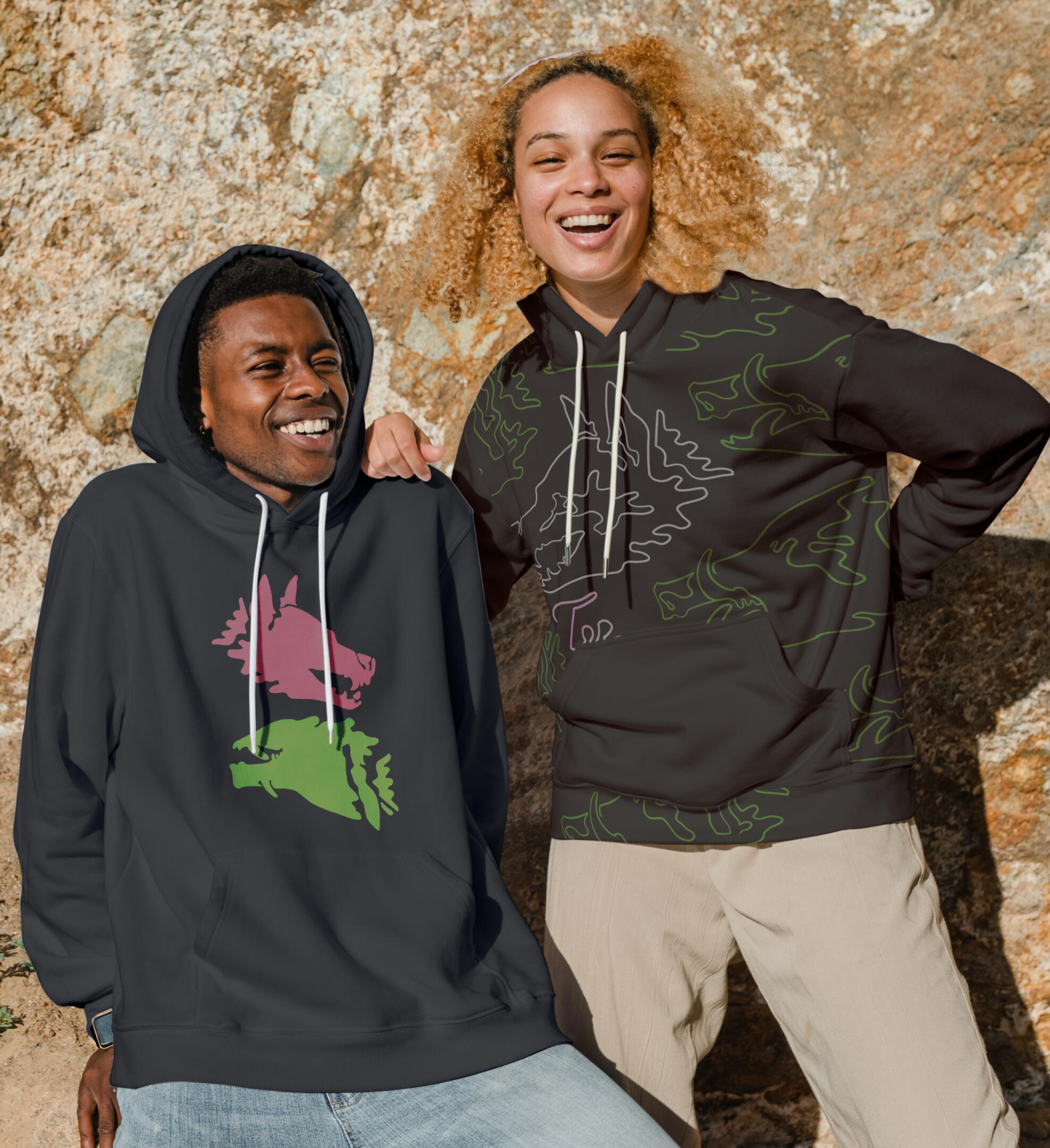
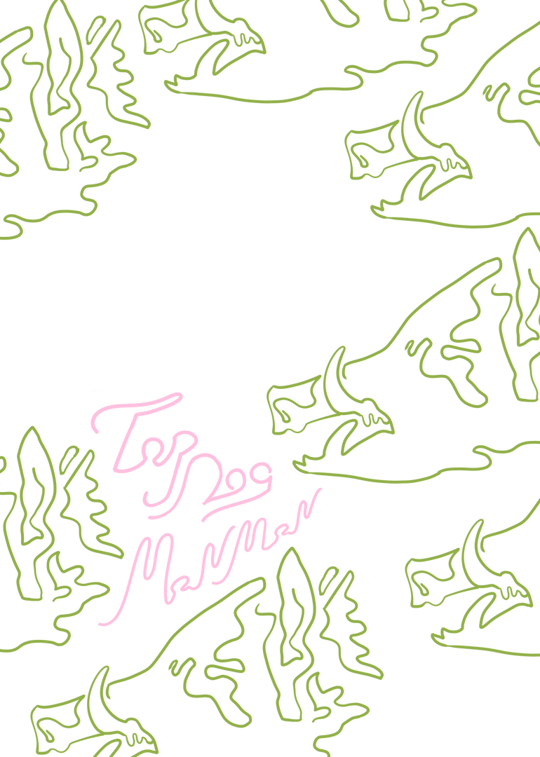
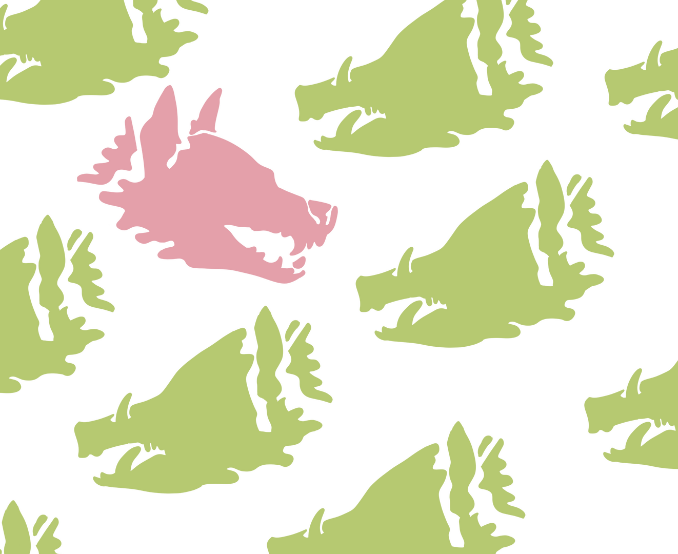
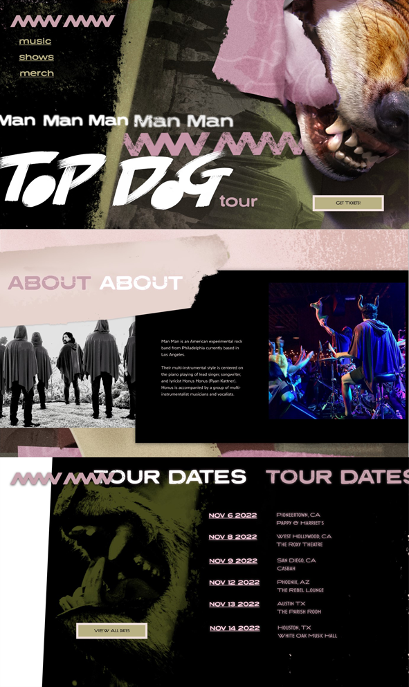
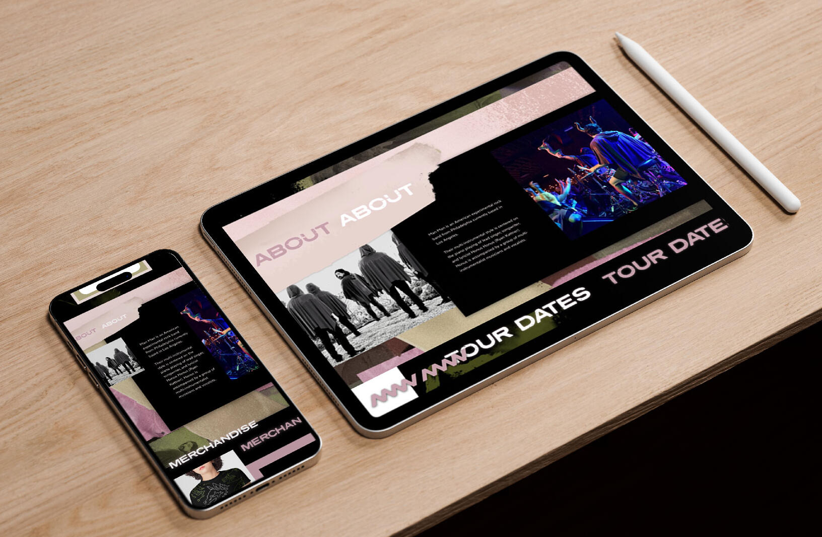
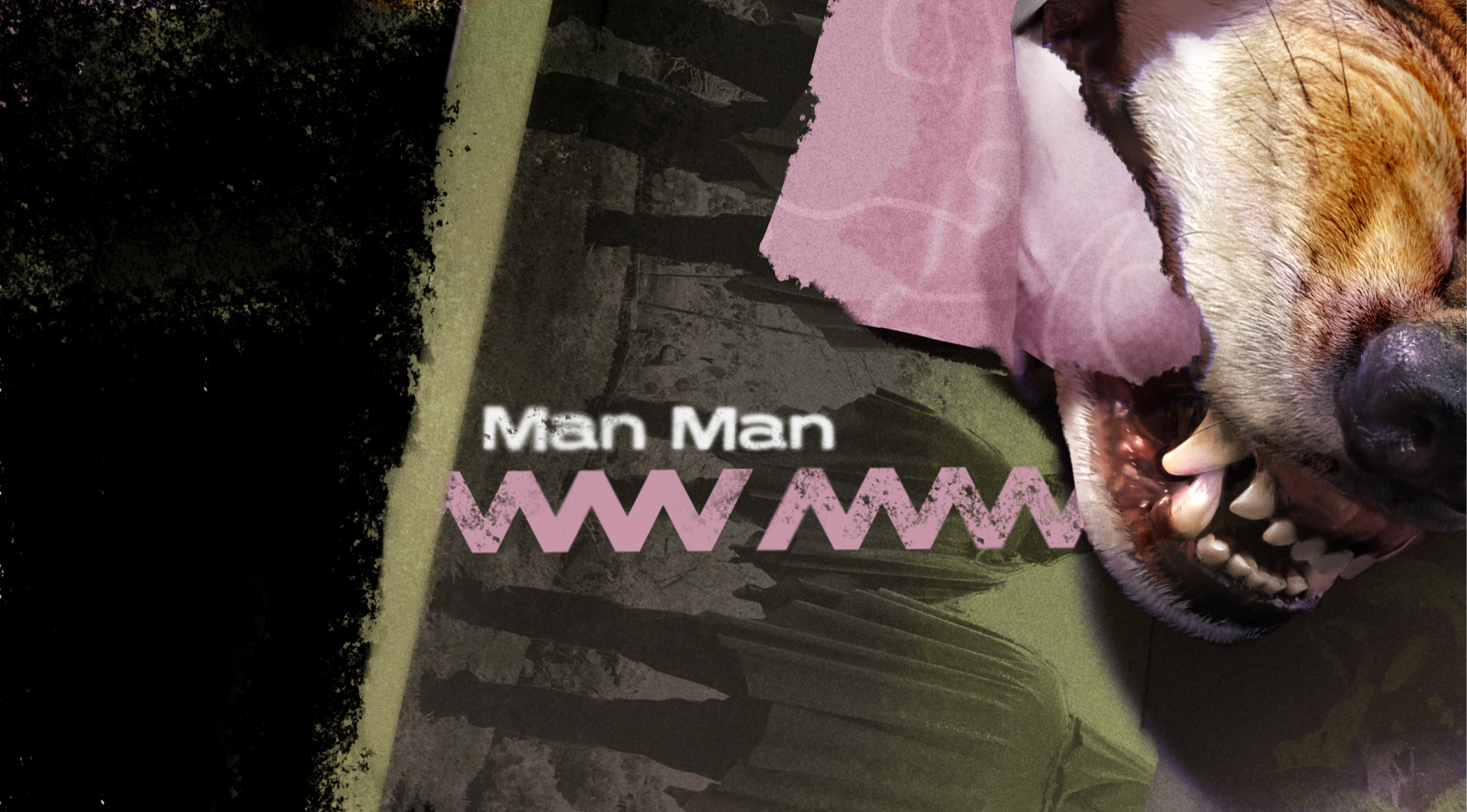
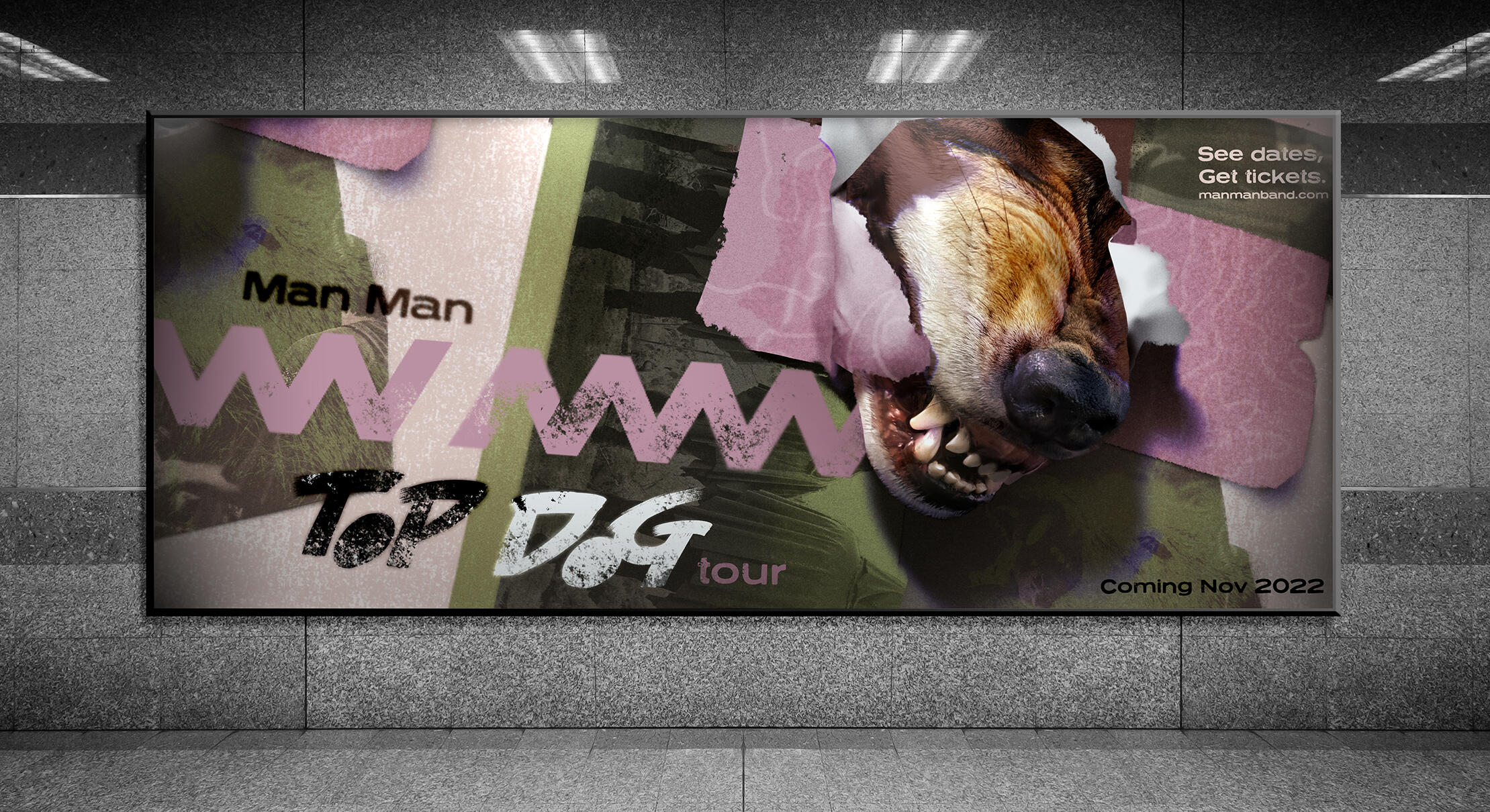
Man Man* is an LA-based alternative rock band best characterized by their stylistic affinity for unusual instruments and the grotesque. Often incorporating imagery of boars and dogs into their lyrics, the Top Dog Tour concept recreates the chaotic, patchwork tone of their music coupled with their common choices of lyrical imagery for this tour design.Programs: Adobe InDesign, Adobe Photoshop
*This is a student project not endorsed by or affiliated with the people or brands mentioned.
MERCH Patterns
WEBSITE
+ GRAPHIC PROCESS
AESTHETIC INSPIRATION
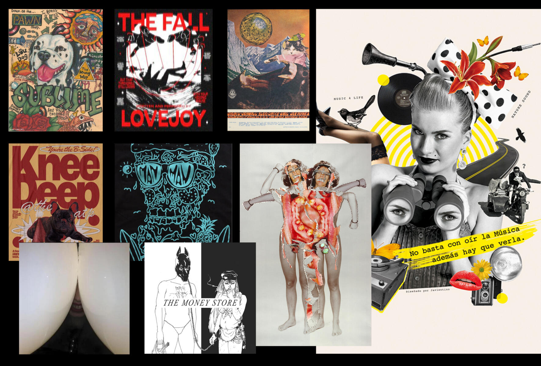
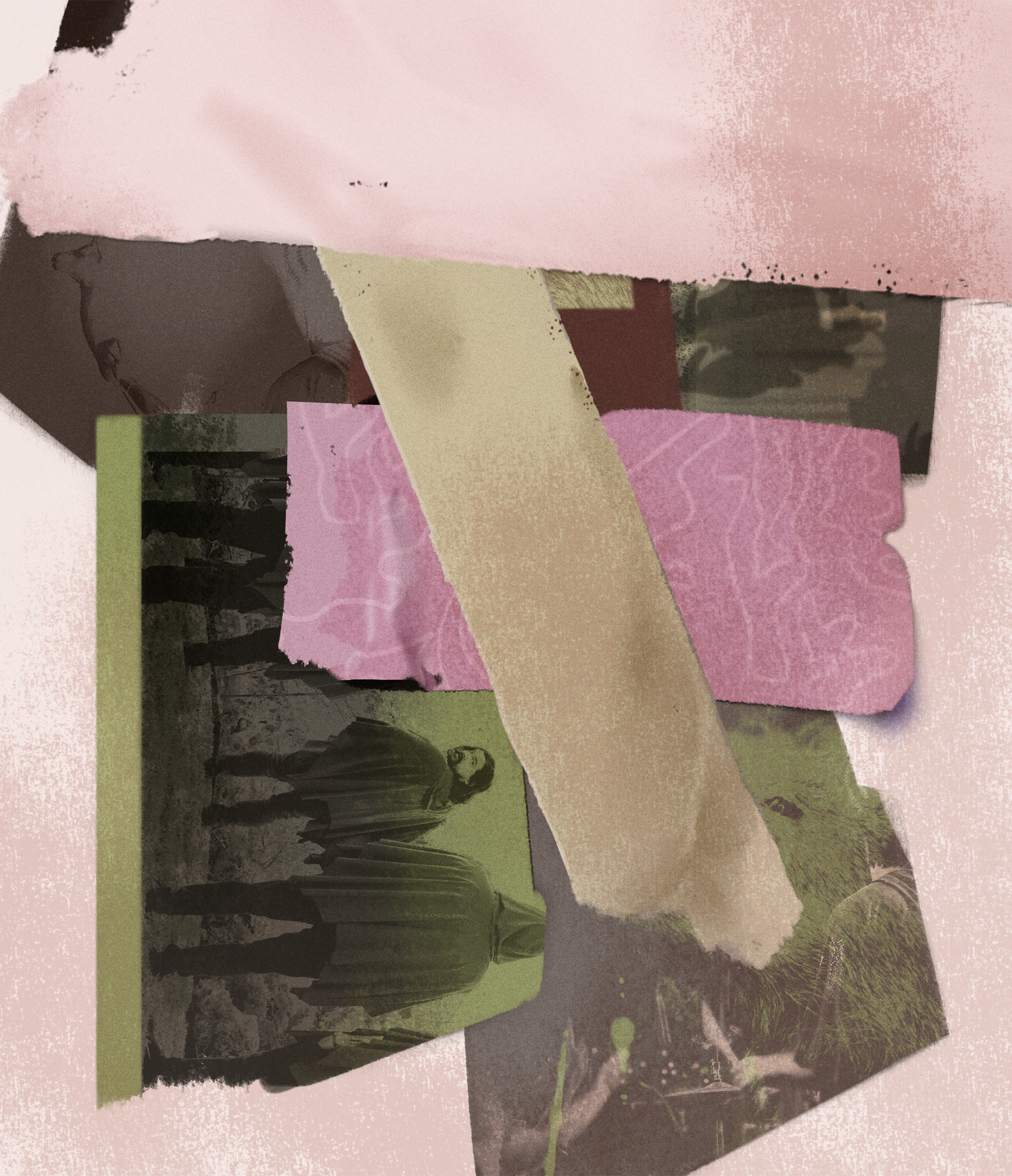
The main descriptors I aimed for with the primary image for the tour's graphics was 'messy' and 'grotesque.' I wanted to create a graphical node I could use to expand out into other aspects of the tour design, such as merch. I didn't want the coherency that true collage usually has, so instead I opted for textured, wheat pasted music posters for this background of visual noise and snarling dogs as the primary motif.
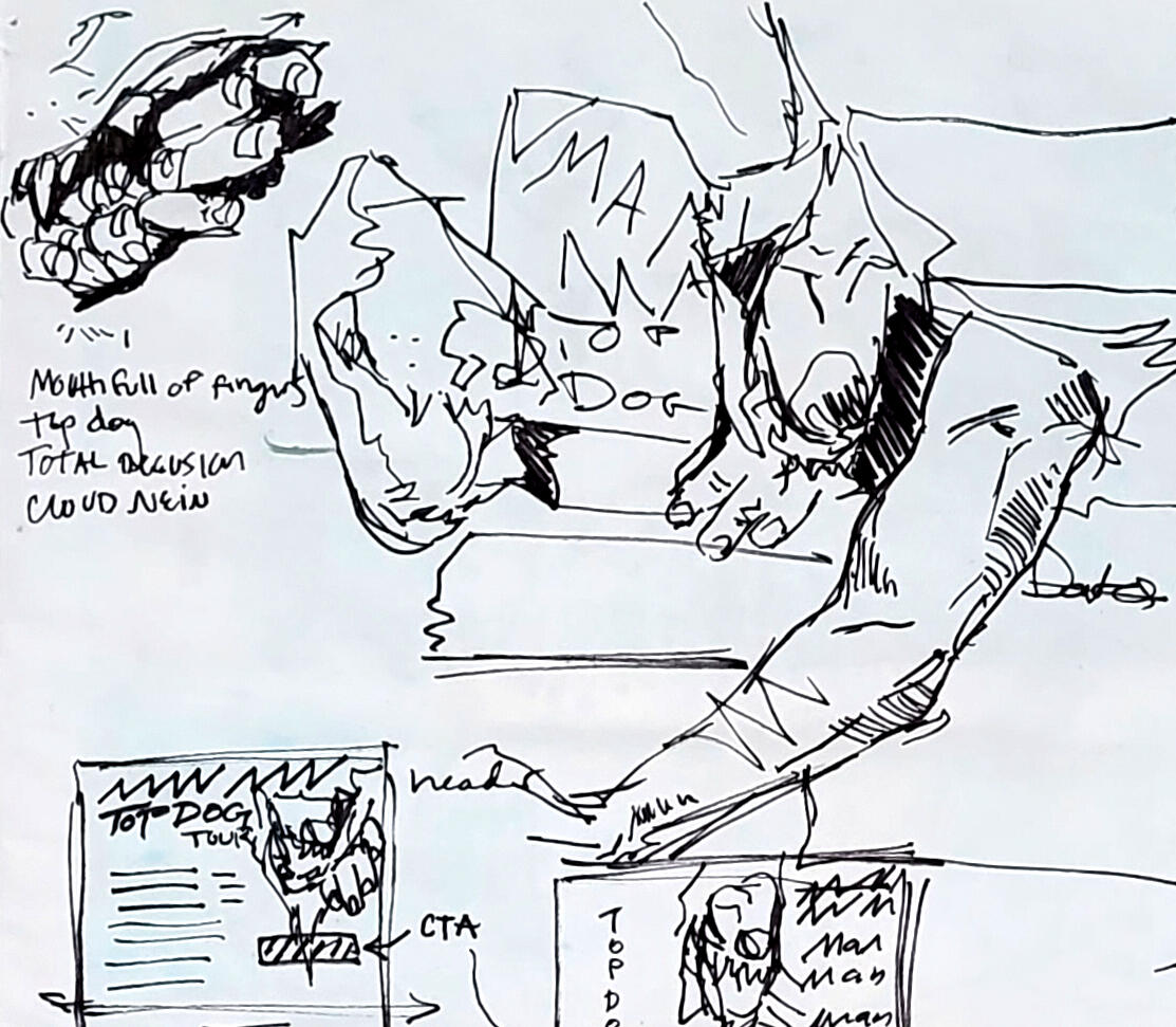
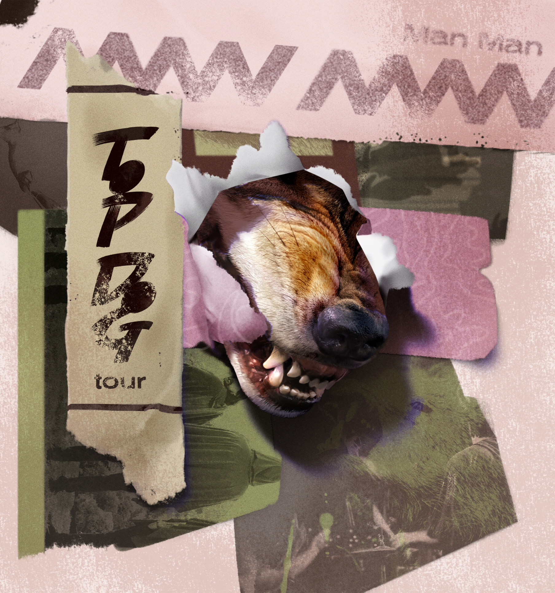
FIRST DRAFTThe part that takes the longest! I create a very rough composite with stock images that are close to the look and feel texturally that I want. This helps resolve compositional and legibility issues early. For instance, peer review helped me discern that the arms tearing through the page on this version were not working, and were subsequently removed.
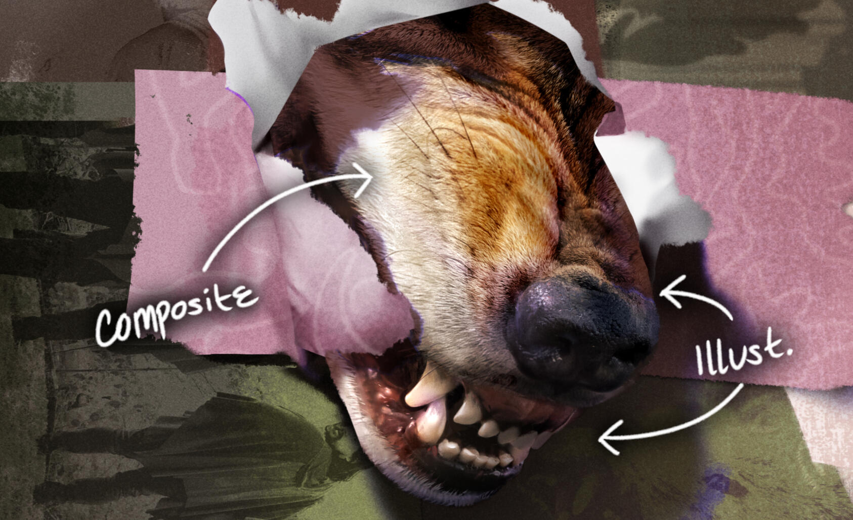
ON COMPOSITING:Sometimes it's not possible to find a straightforward, high-fidelity stock image image that best represents your vision. From here I composite different stock images into one as a base or as reference. The resulting composited image may also be refined with digitally painted over details.In this design for example, all the dog's mouth and parts of its nose, as well as all of the torn-through hole in the paper is added-on digital illustration, namely to control tangents, contrast, and composition.
+ Homelessness advocacy Bus Poster
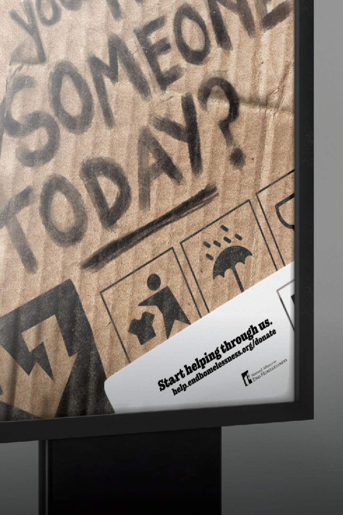
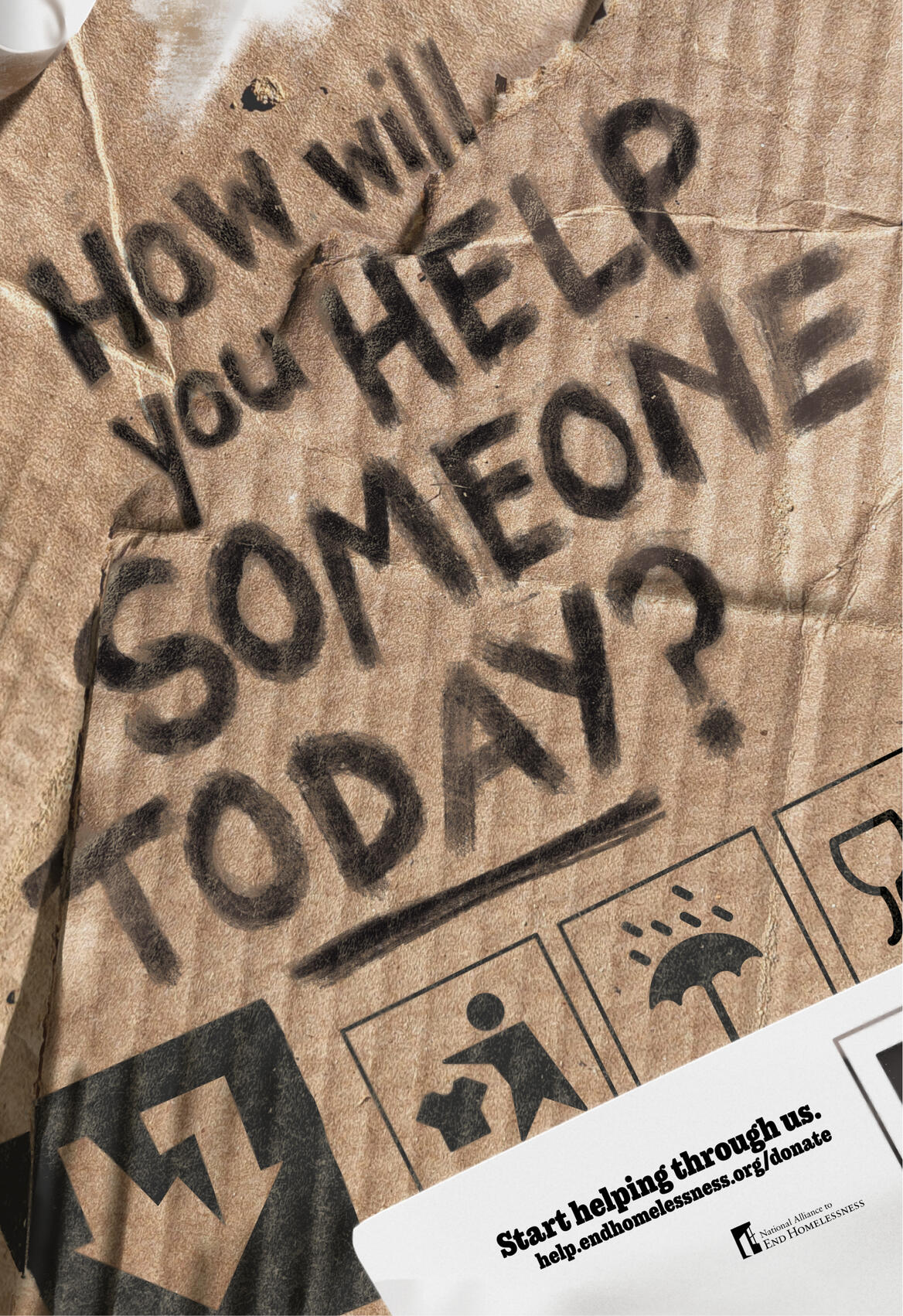
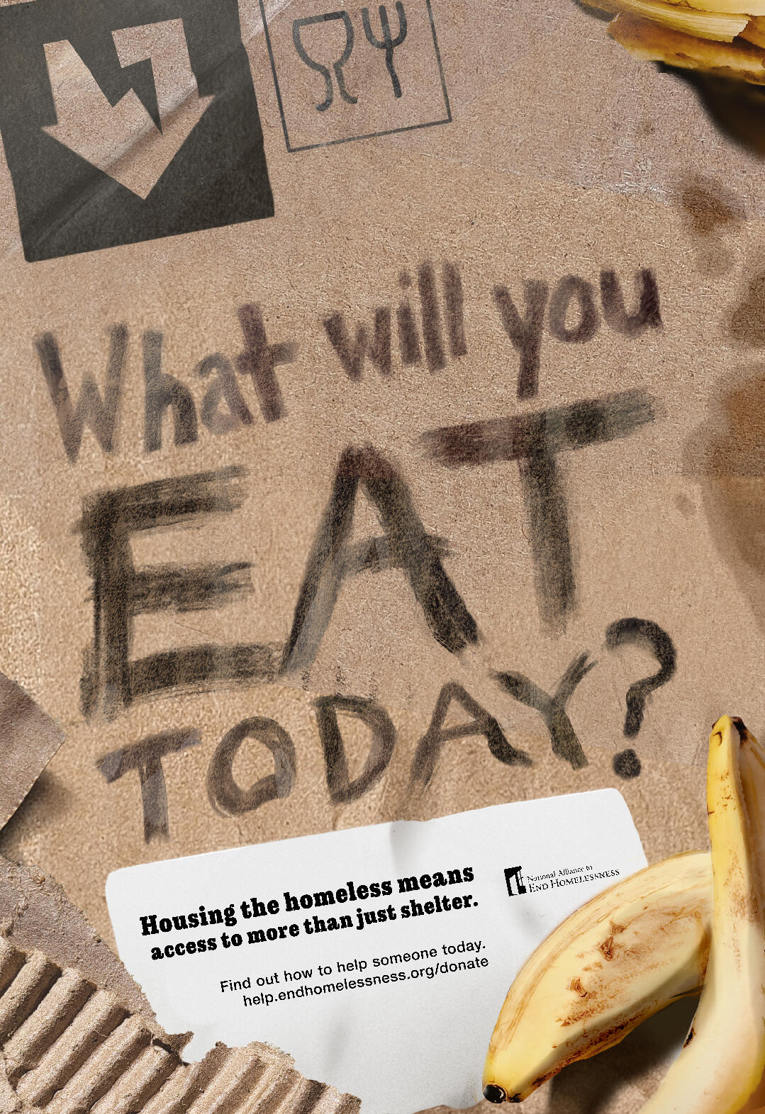
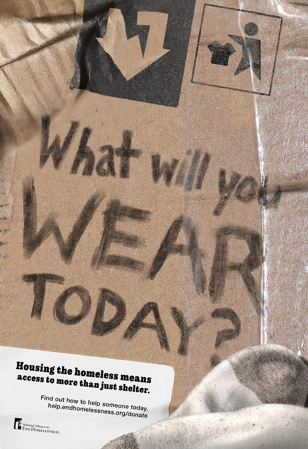
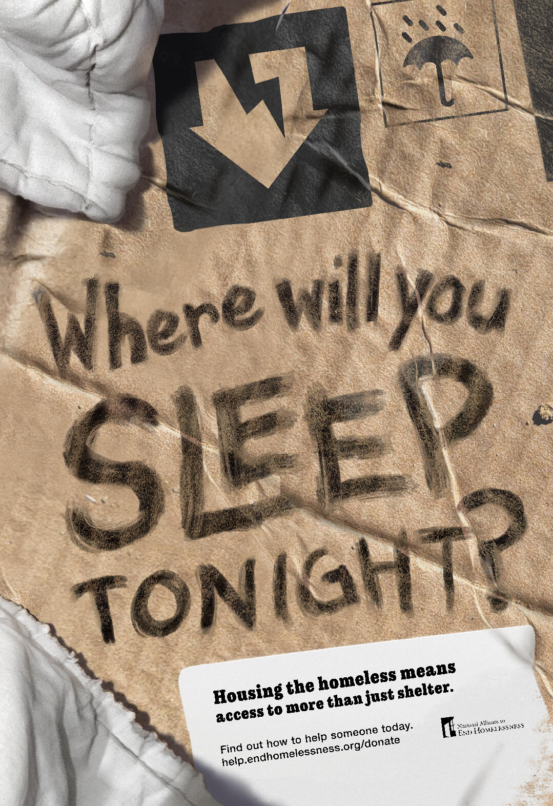
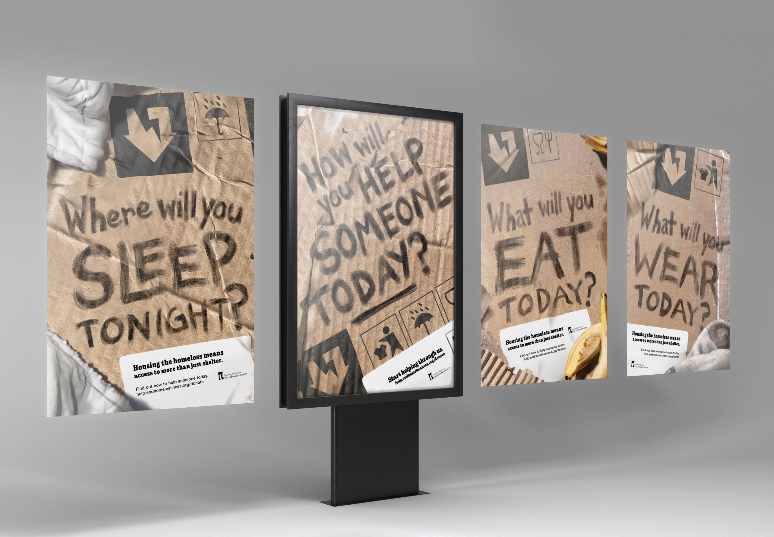
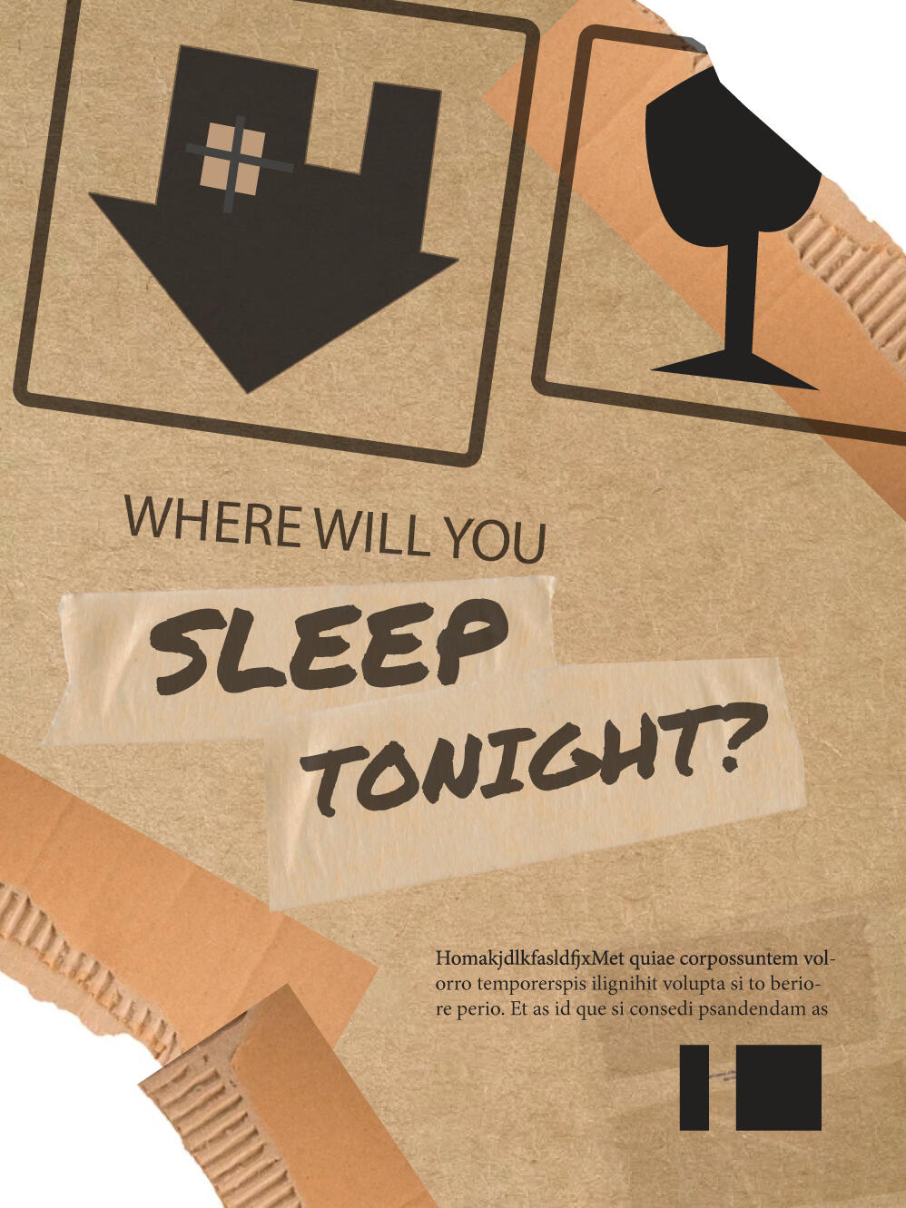
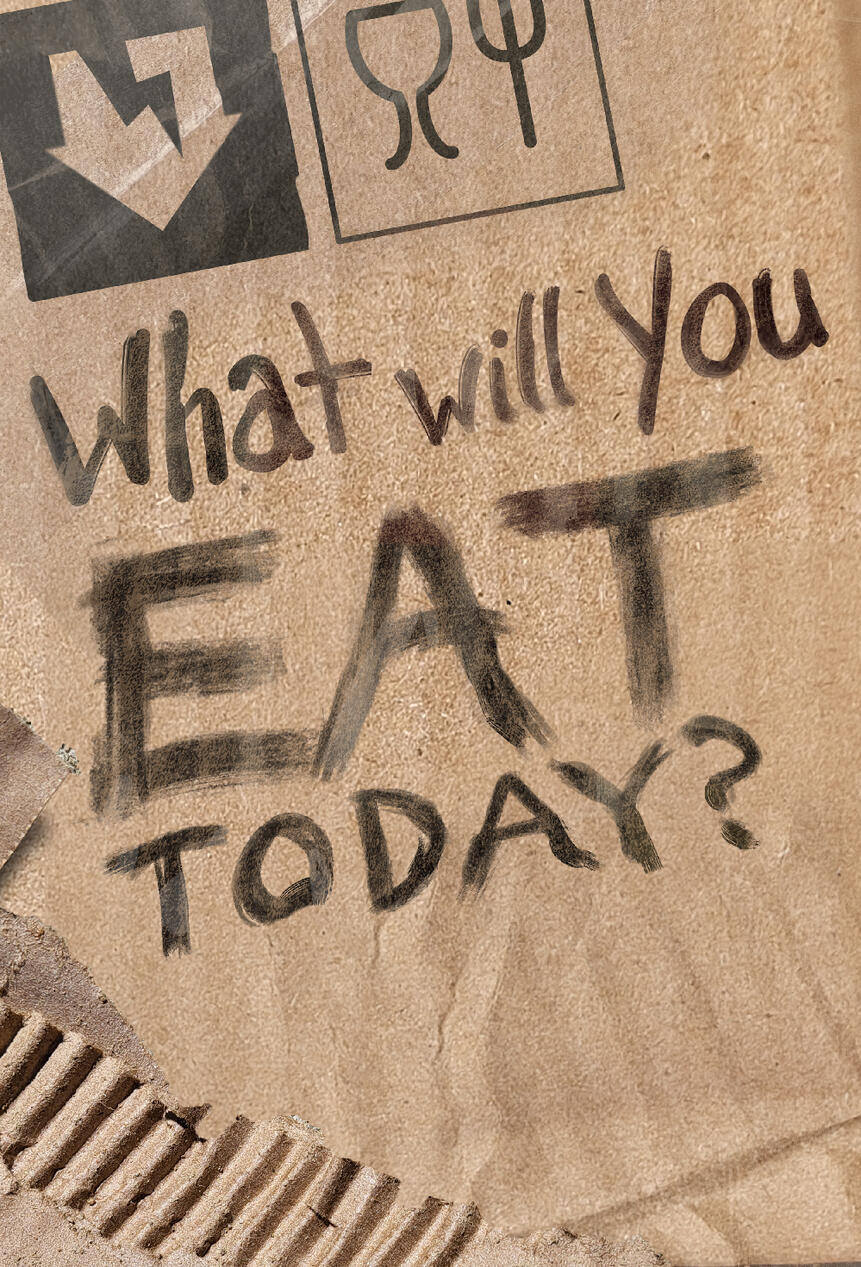
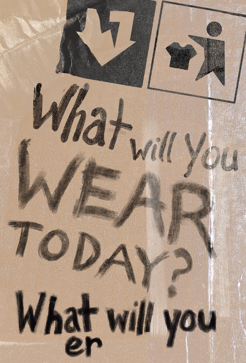
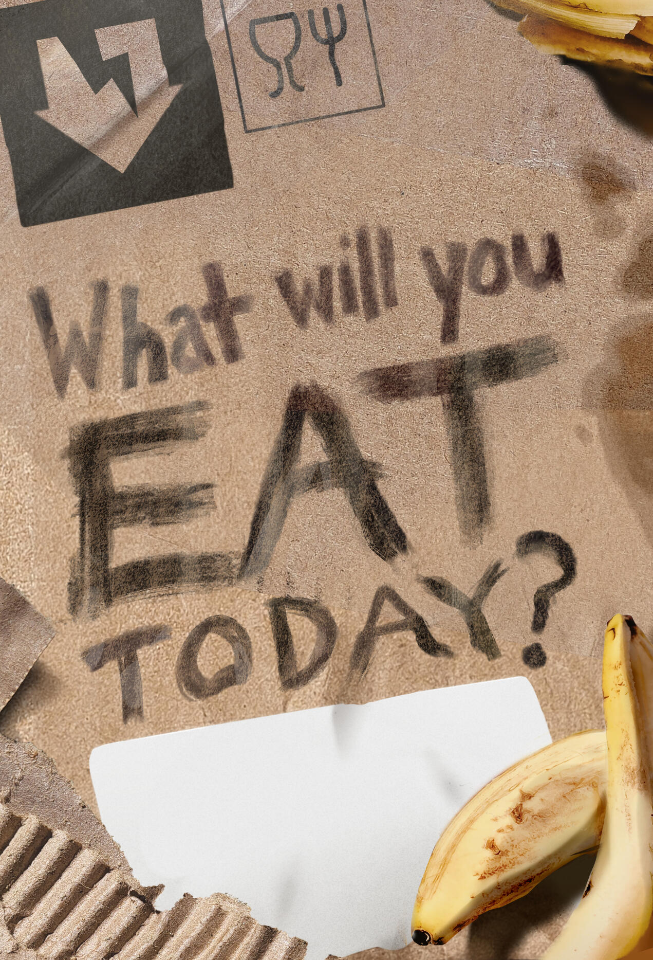
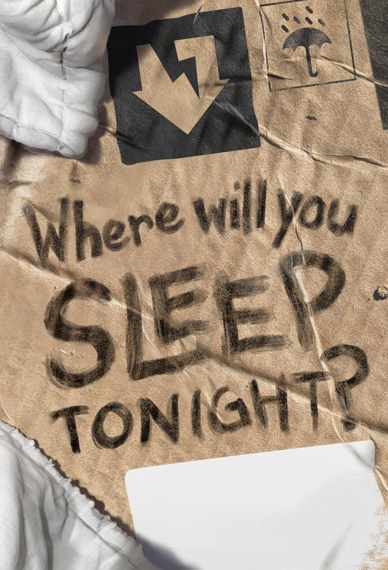
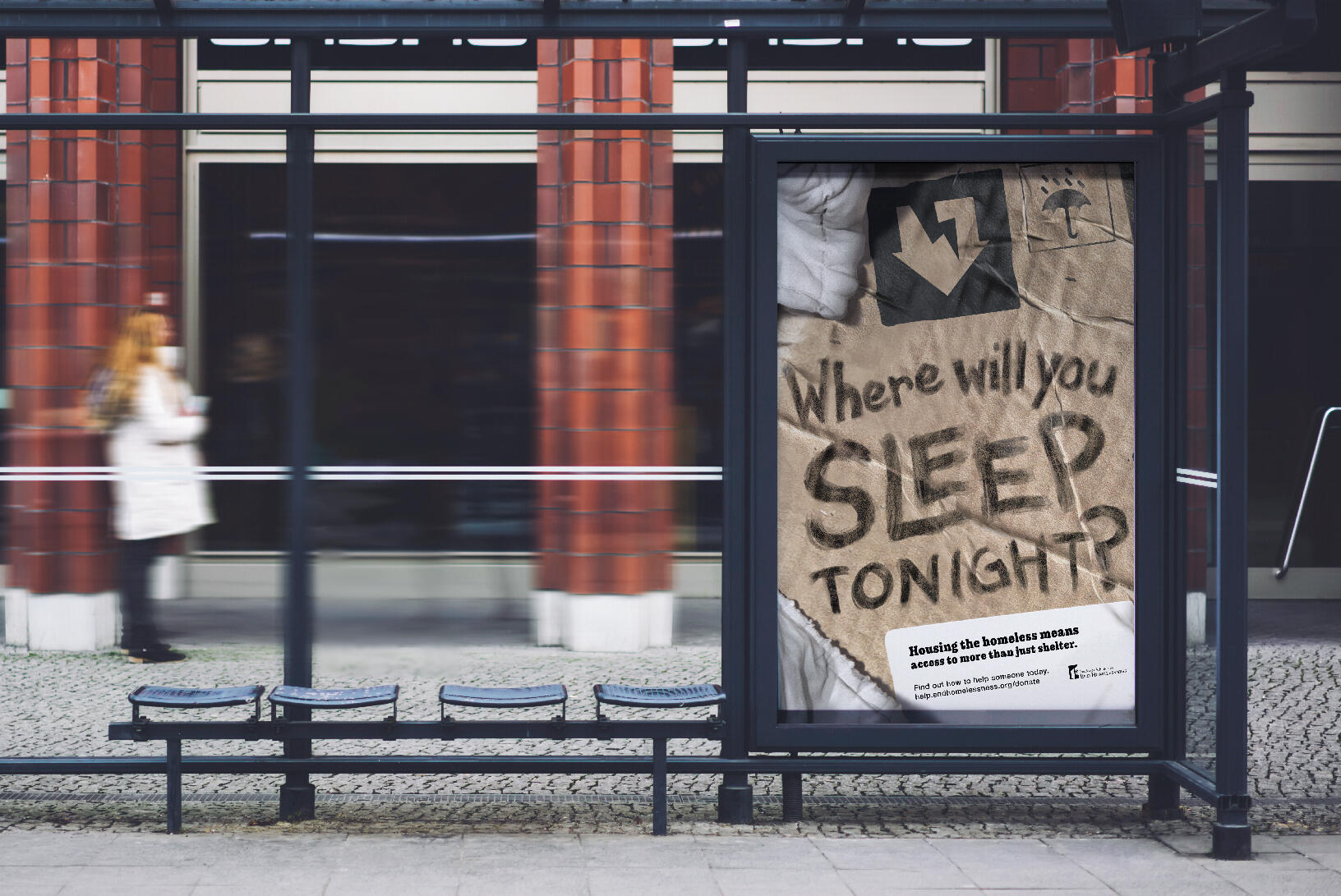
By evoking materials most commonly associated with homelessness, this bus stop ad campaign calls on empathy to solicit donations from the target audience. Research showed that people respond better to images related to homelessness and the conditions they endure that did not include human imagery, and had a better long term impact on fundraising campaigns when they did not use “poverty porn” imagery tactics.Programs: Adobe Indesign, Adobe Illustrator, Adobe Photoshop
*This is a student project not endorsed by or affiliated with the people or brands mentioned.
+ PROCESS
AESTHETIC INSPIRATION
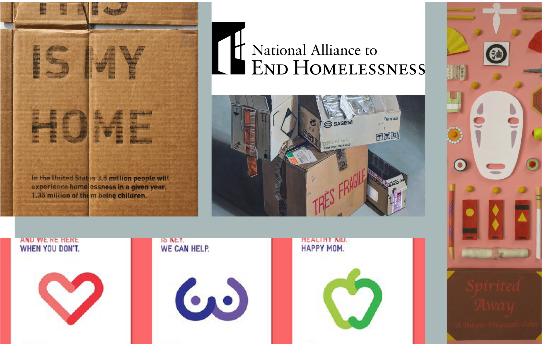
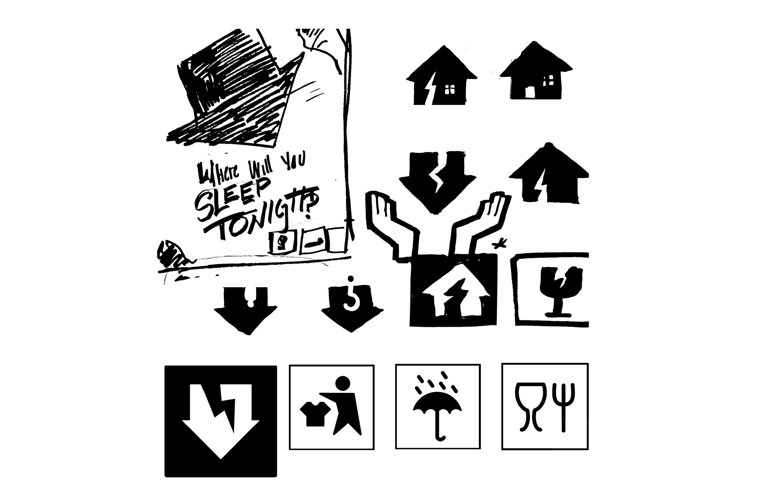
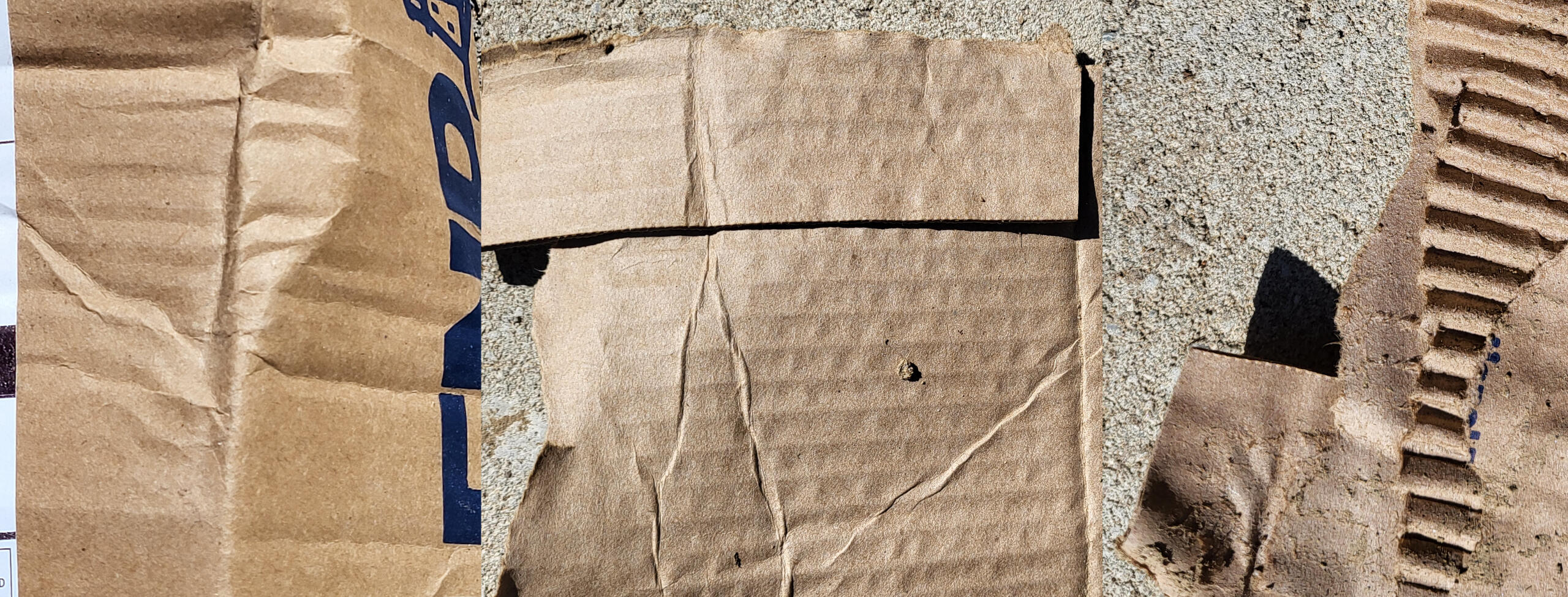
While doing tactical research, the majority of my findings cautioned me towards avoiding the "poverty porn" approach because of its insensitivity and ineffectiveness. I decided to circumvent the issues with showing human faces representing this human issue by evoking empathy. I used materials commonly associated with homelessness to try to encourage viewers to empathize with the harsh conditions it imposes.
First DraftHere, I hash out composition. Because this will be viewed from a distance, my primary focus in this was to parse font size. I tested legibility by having other people walk by and try to read the large type from a distance to simulate their takeaways both textually and from the meaning of the graphical elements while driving.
Final RefinementsHere, custom type is polished and incorporated better with the lighting and material effects.Space is blocked out for the final typesetting components and unneeded open space are accented with imagery related to the messaging of the poster. Some roughening to the type and materials overall is added to emphasize the themes.
+ Bilingual Guidebook
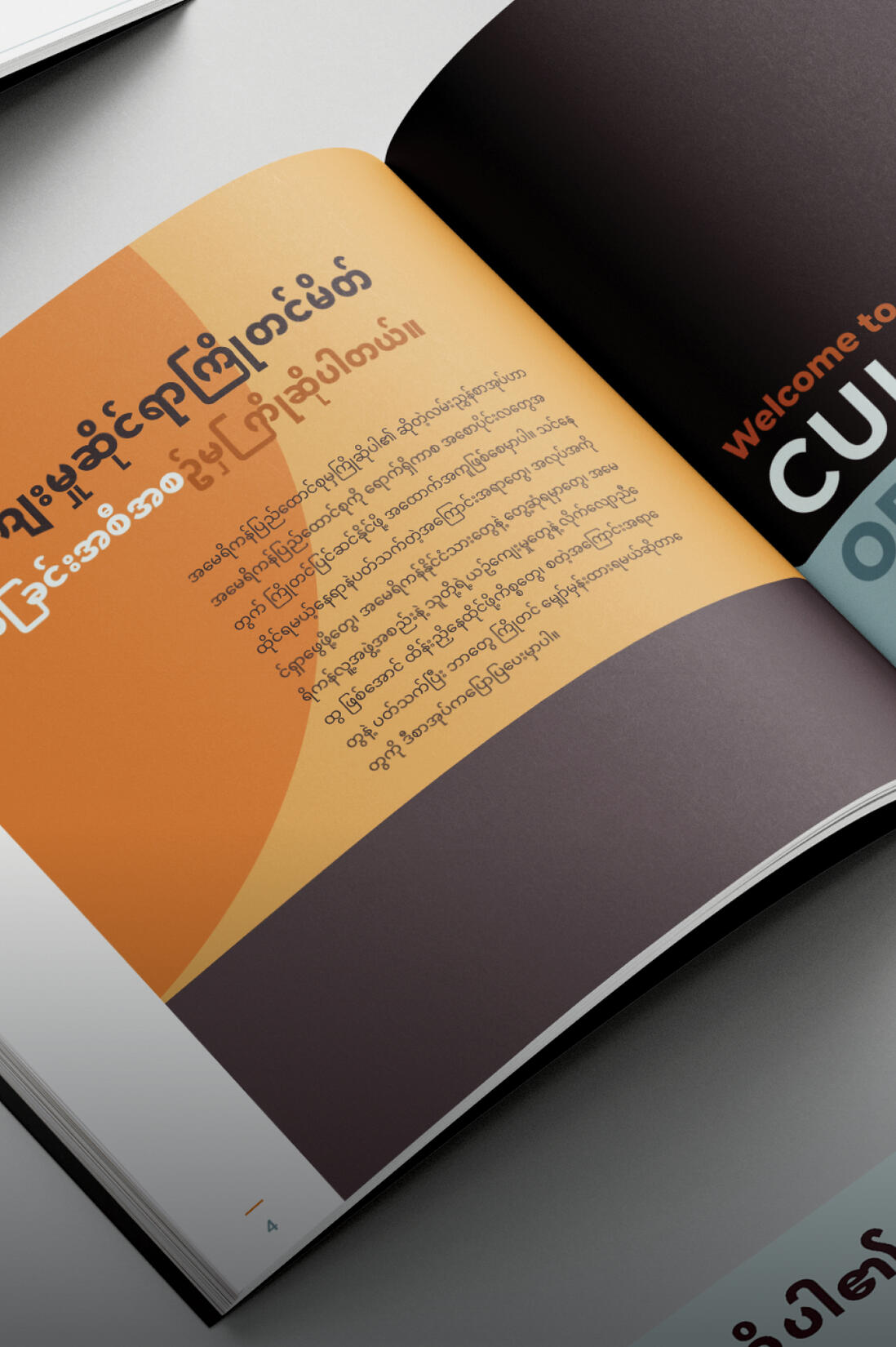
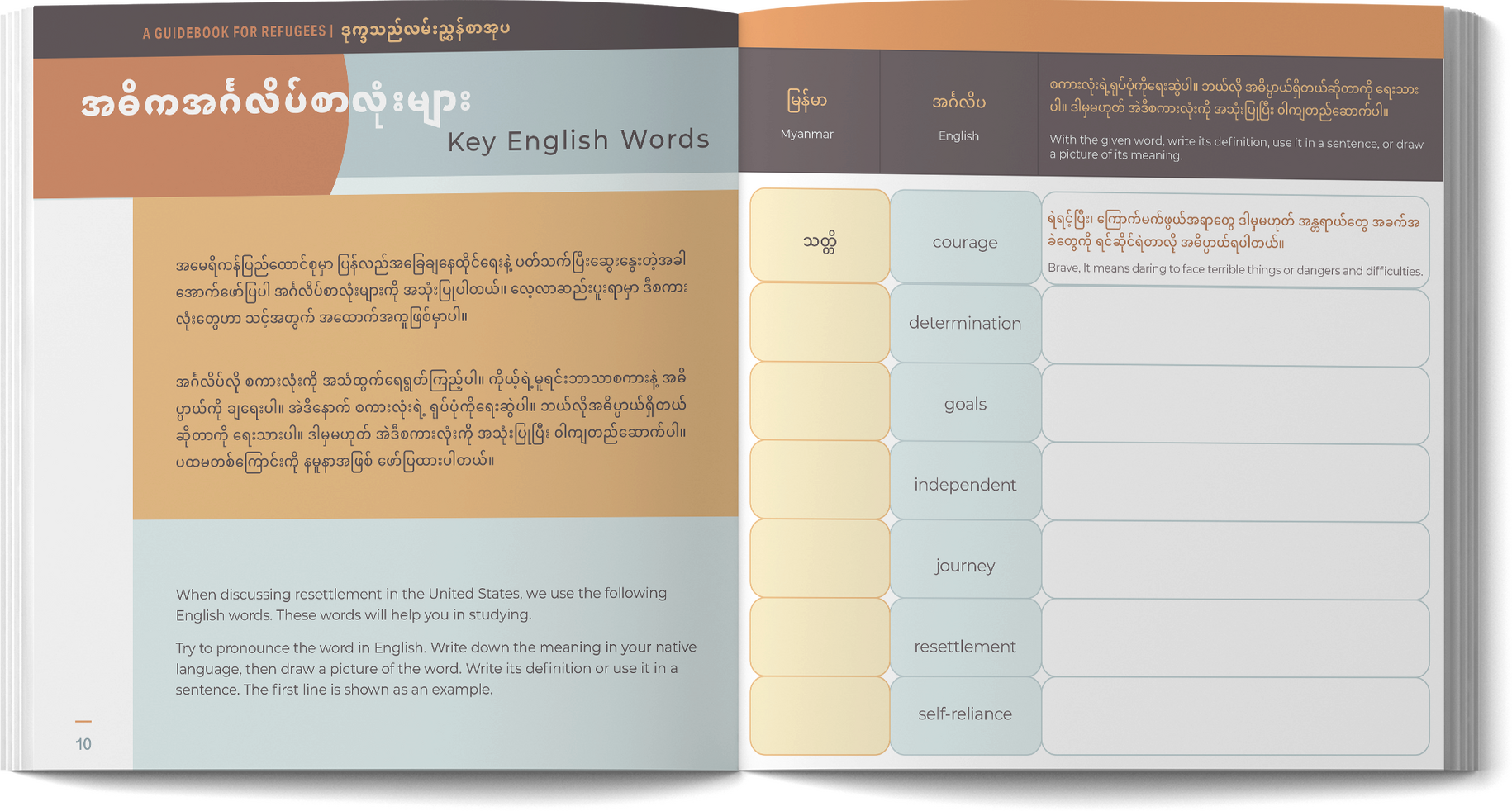
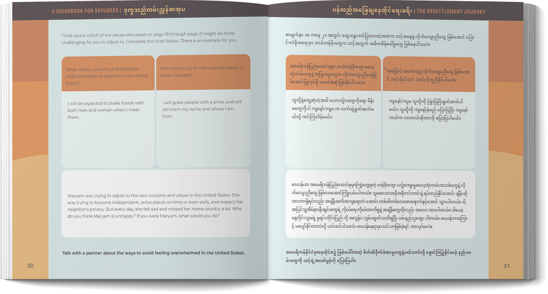
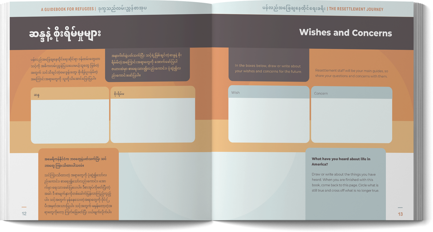
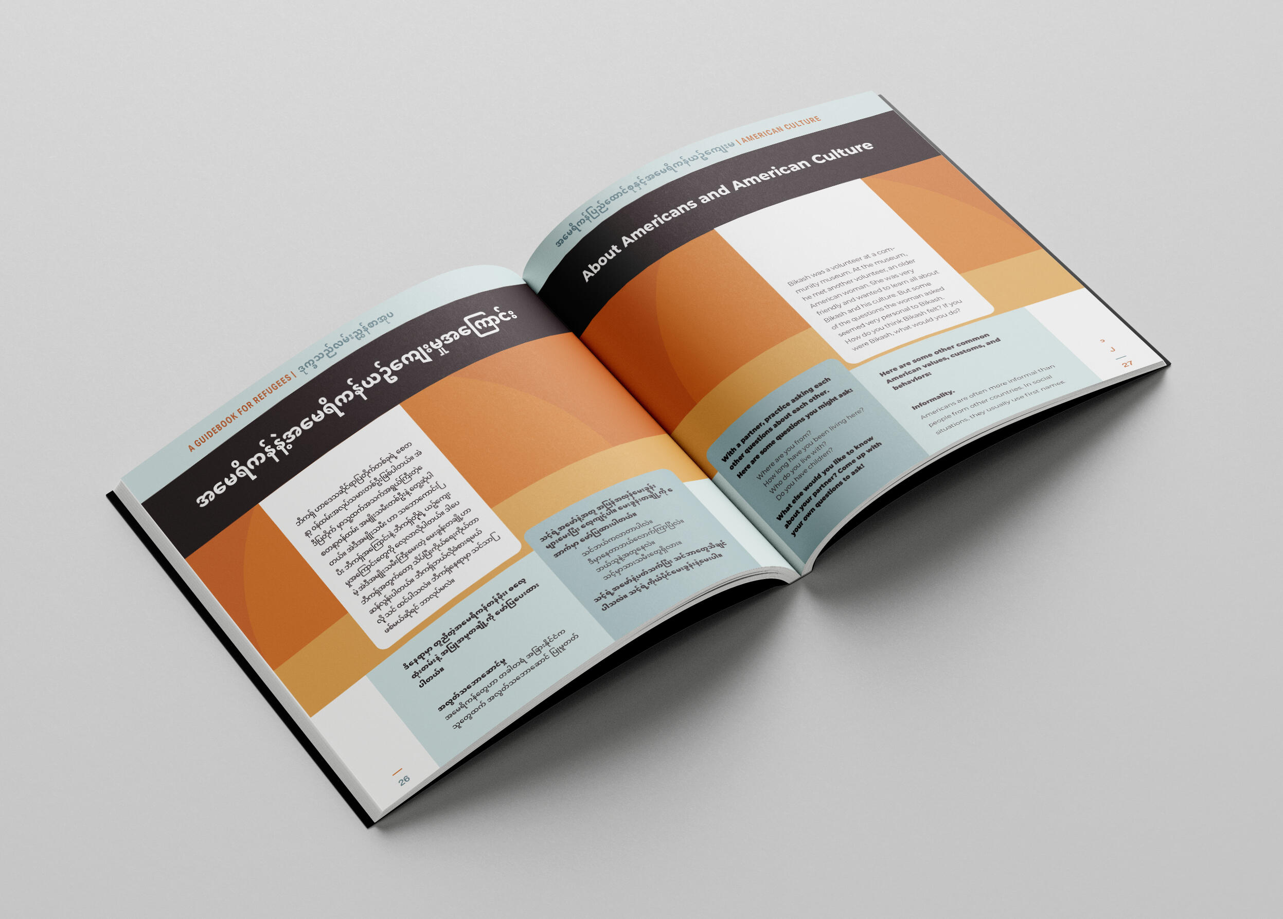
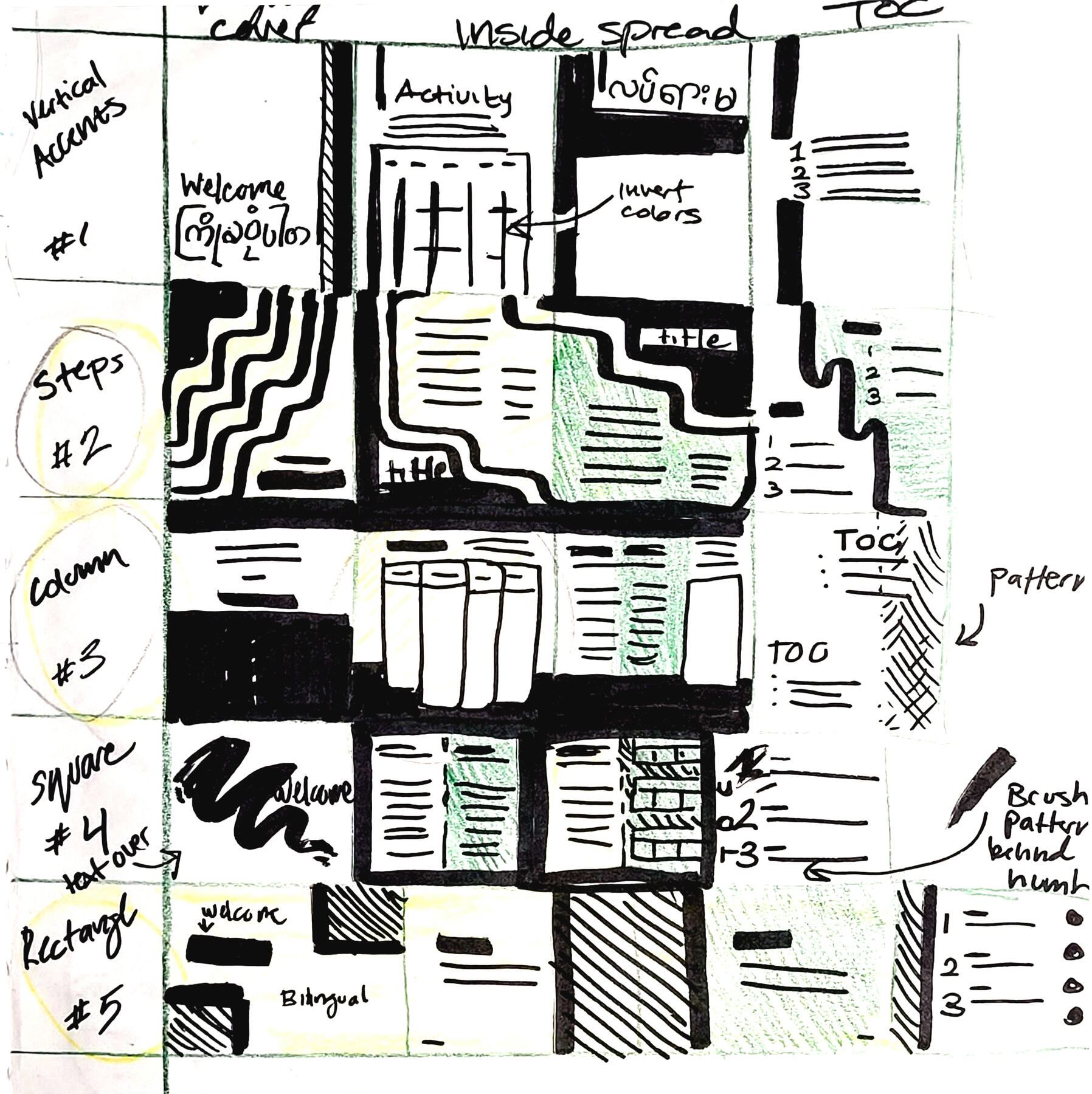
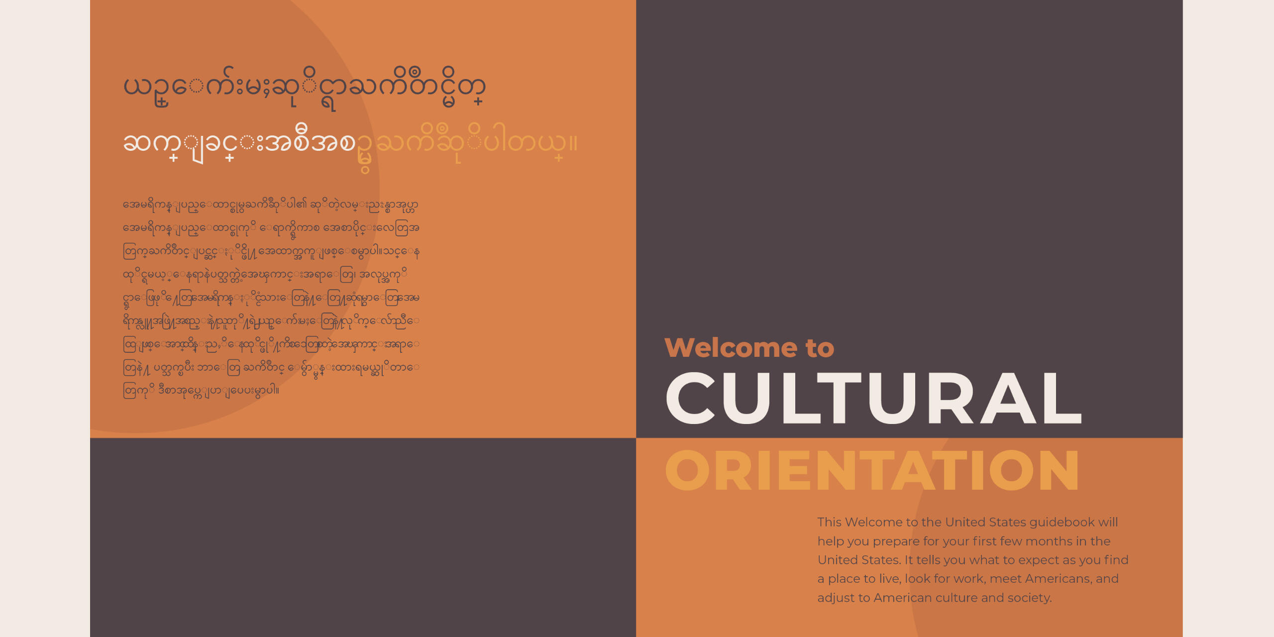
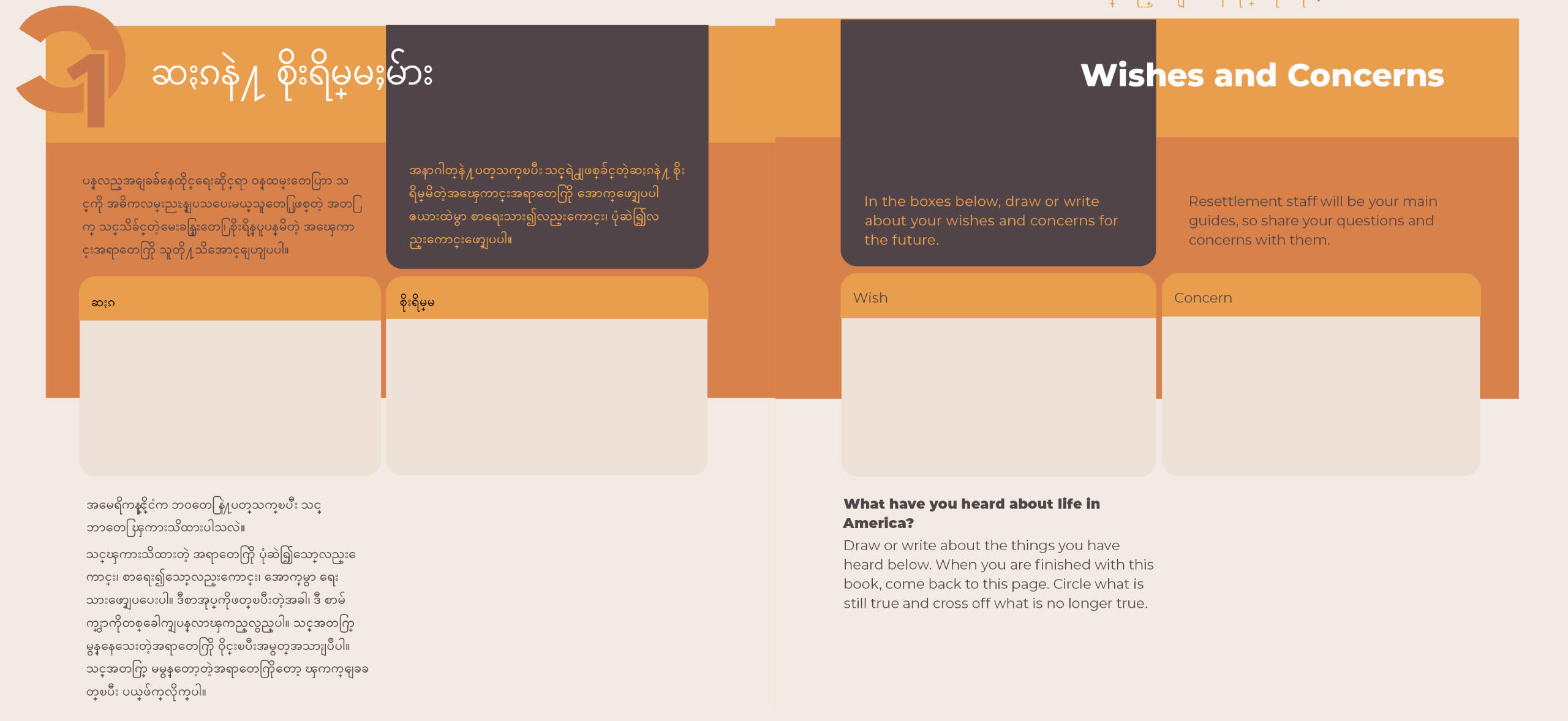
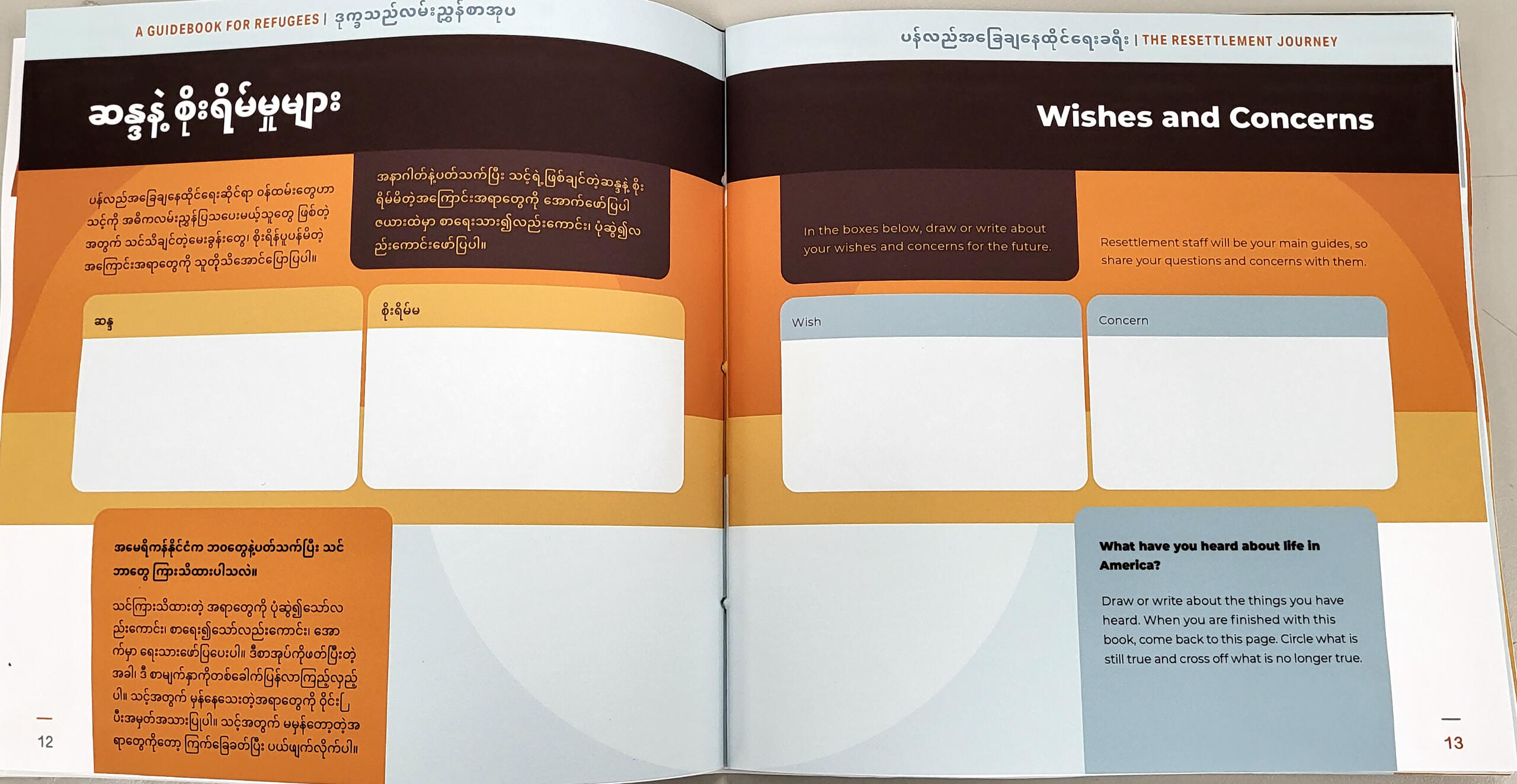
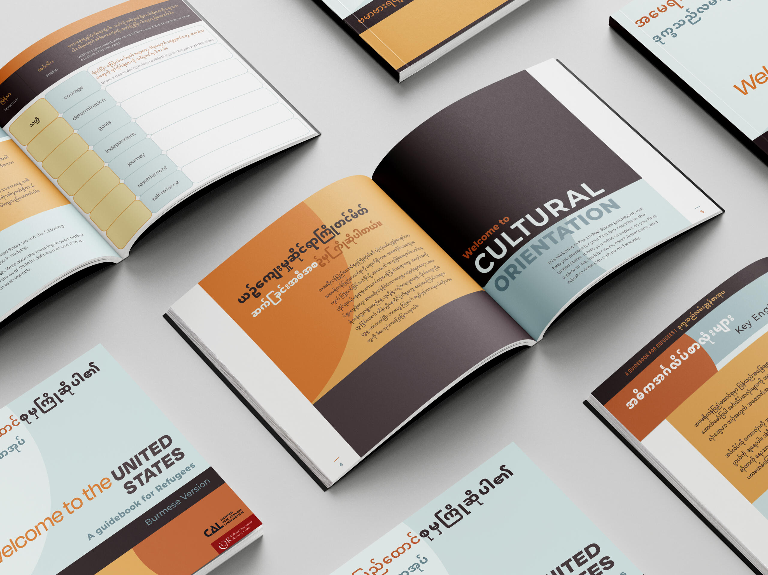
Aimed at helping refugees from Myanmar adjust to culture and life in the United States, this guidebook uses color with deliberate and consistent layout choices to instill its users with a sense of comfort and confidence in their ability to learn from it.Programs: Adobe Indesign
*This is a student project not endorsed by or affiliated with the people or brands mentioned.
+ PROCESS
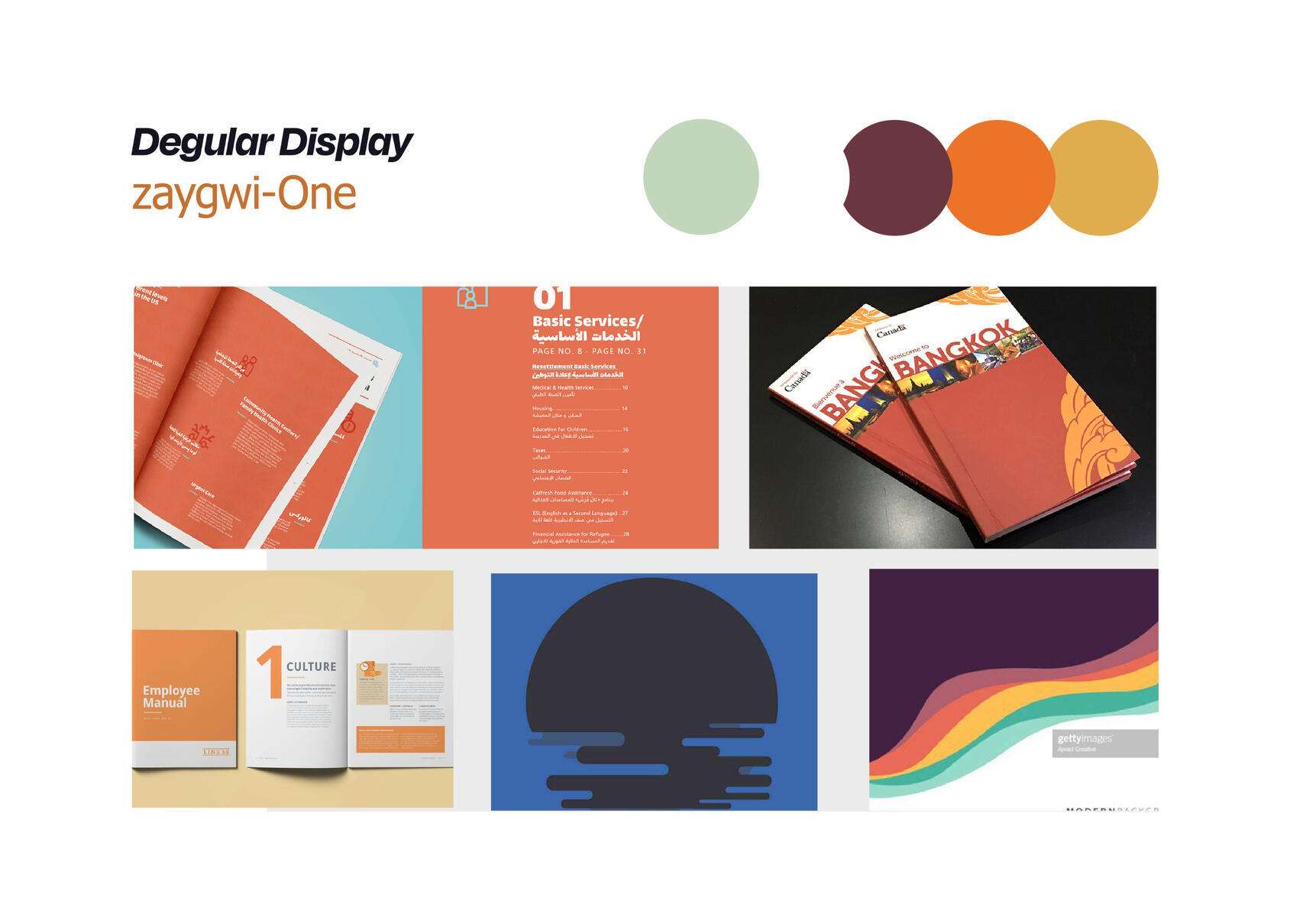
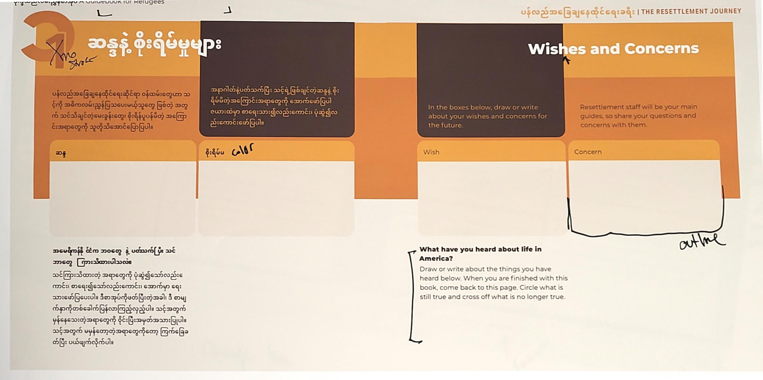
FINAL ADJUSTMENTS, TEST PRINTSAs this would be a print format, color print tests were done to see if any contrast or legibility issues arose in physical form with consideration for issues related to users with low vision capability.Palette, spacing, and layout adjustments are made as these changes move the guidebook into its final stages of completion.
+ SOAP BOX
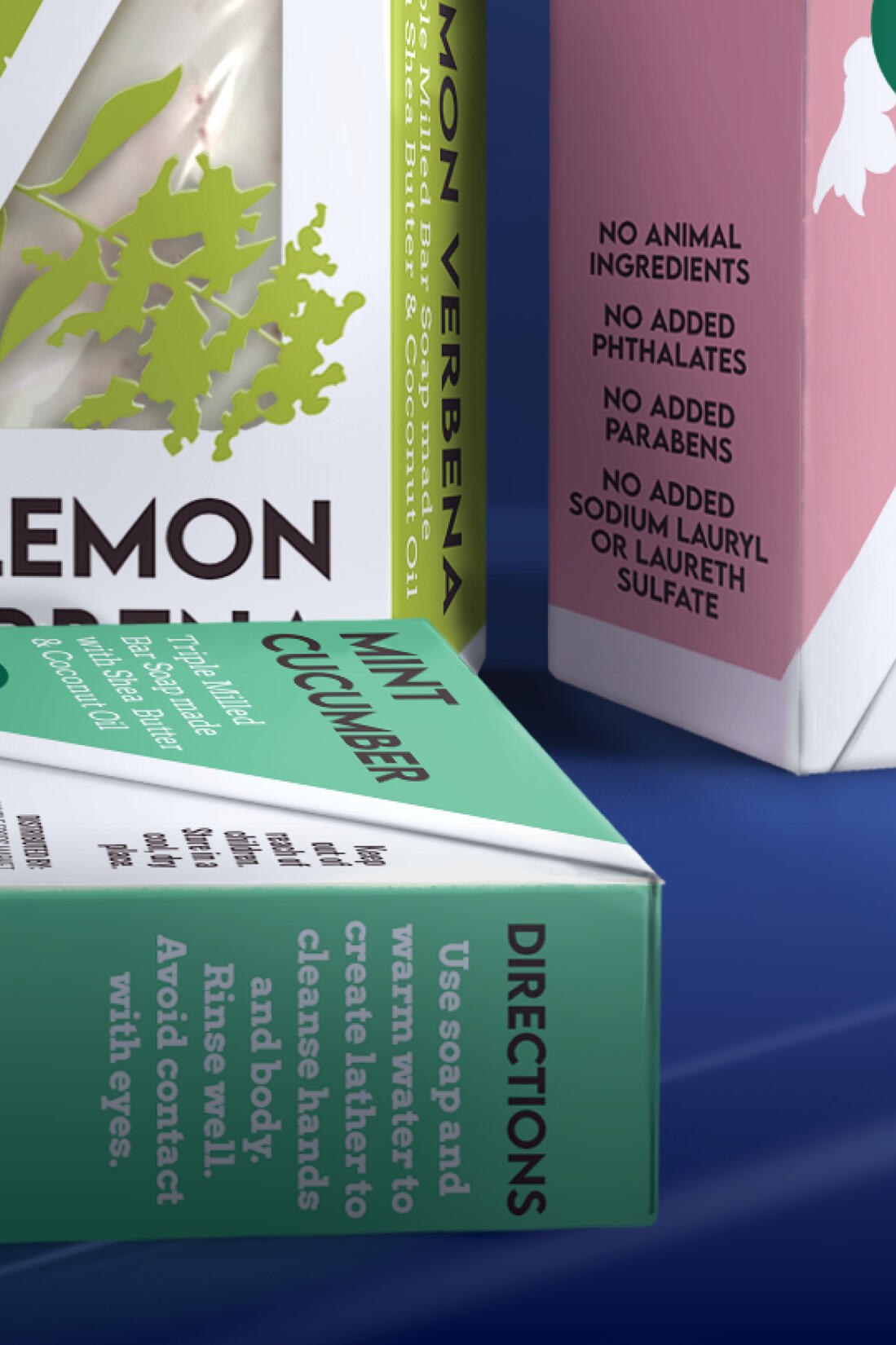
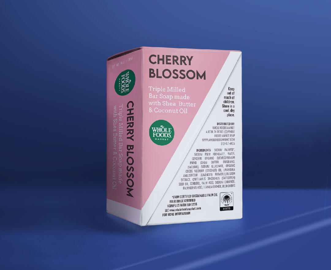
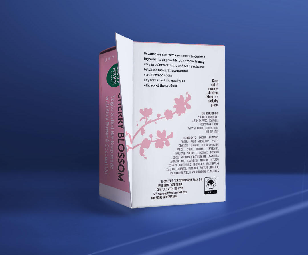
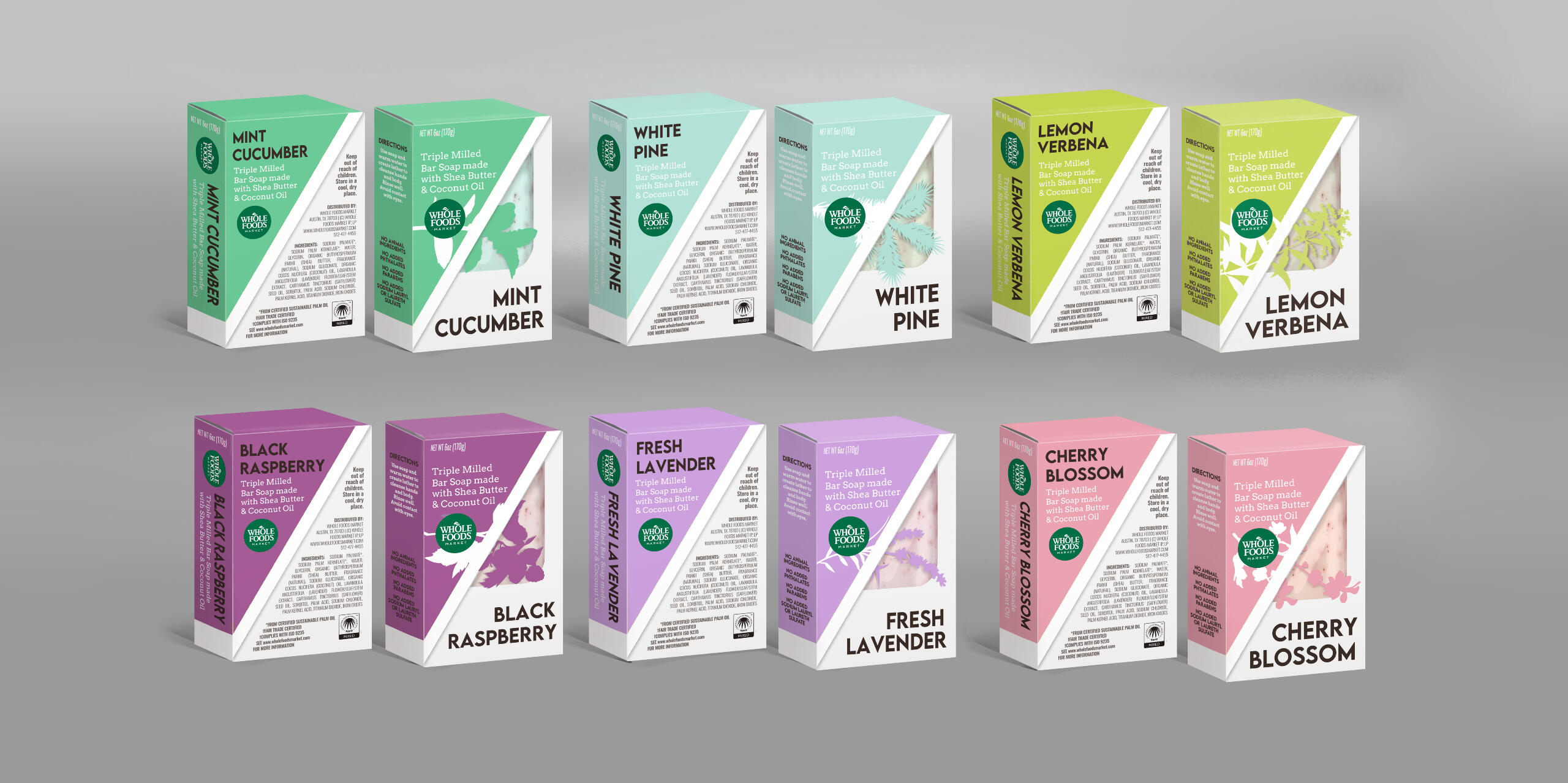
This packaging redesign incorporates color to distinguish product type, as well as iconography related to the soap’s scent to better distinguish each type. This package also allows users to interact with the package more confidently via a die-cut window and a fold-out flap that allows users to engage more directly to learn more about the product.Programs: Adobe Illustrator
*This is a student project not endorsed by or affiliated with the people or brands mentioned.
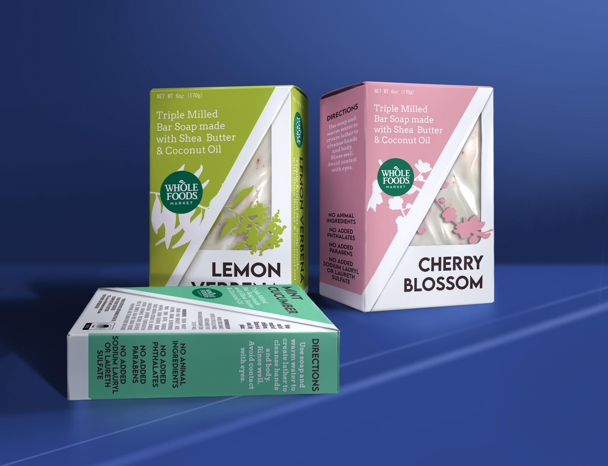
This mockup is one I custom-made! Ask about it if you want to use it too :)
+ Tarot-Themed
Business Cards
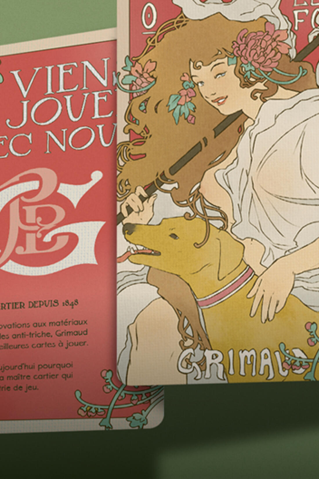
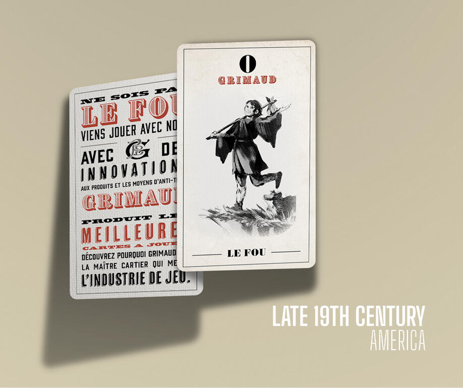
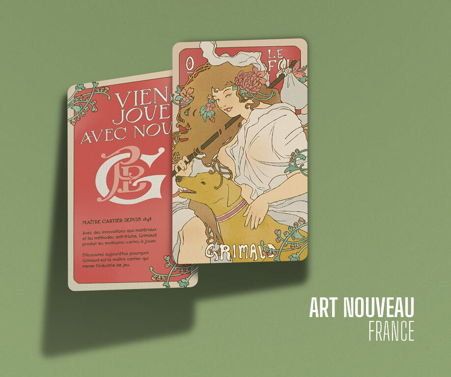
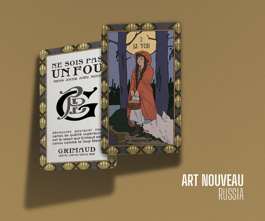
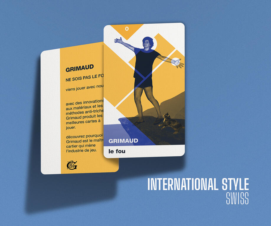
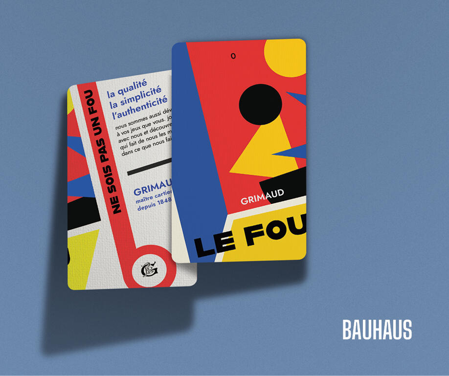
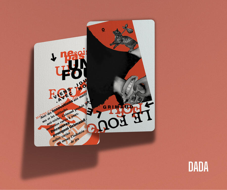
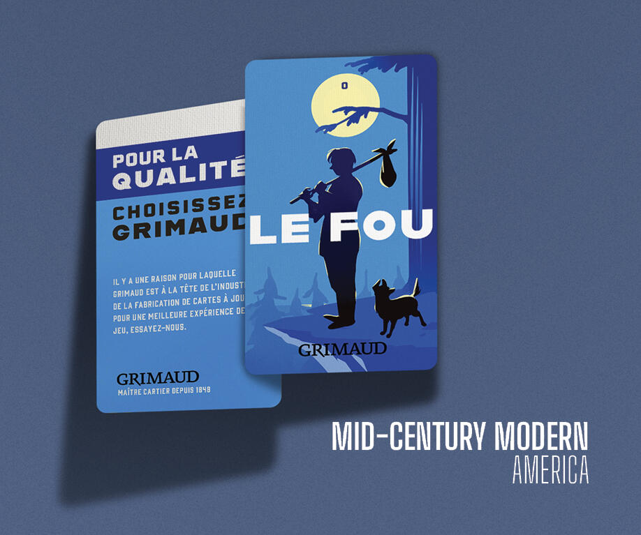
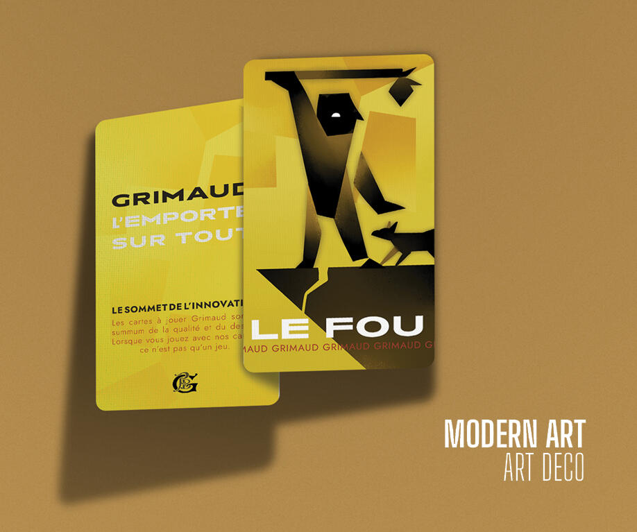
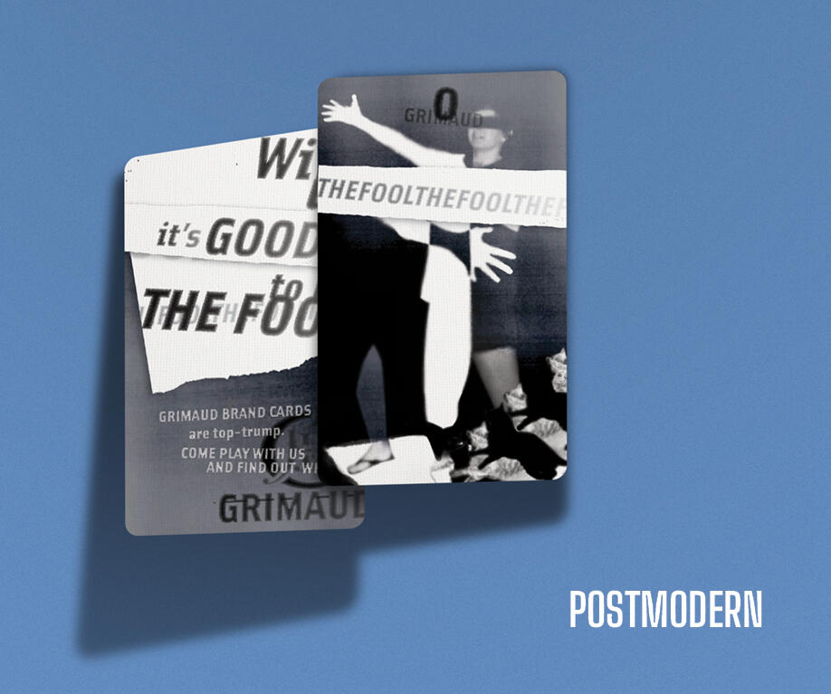
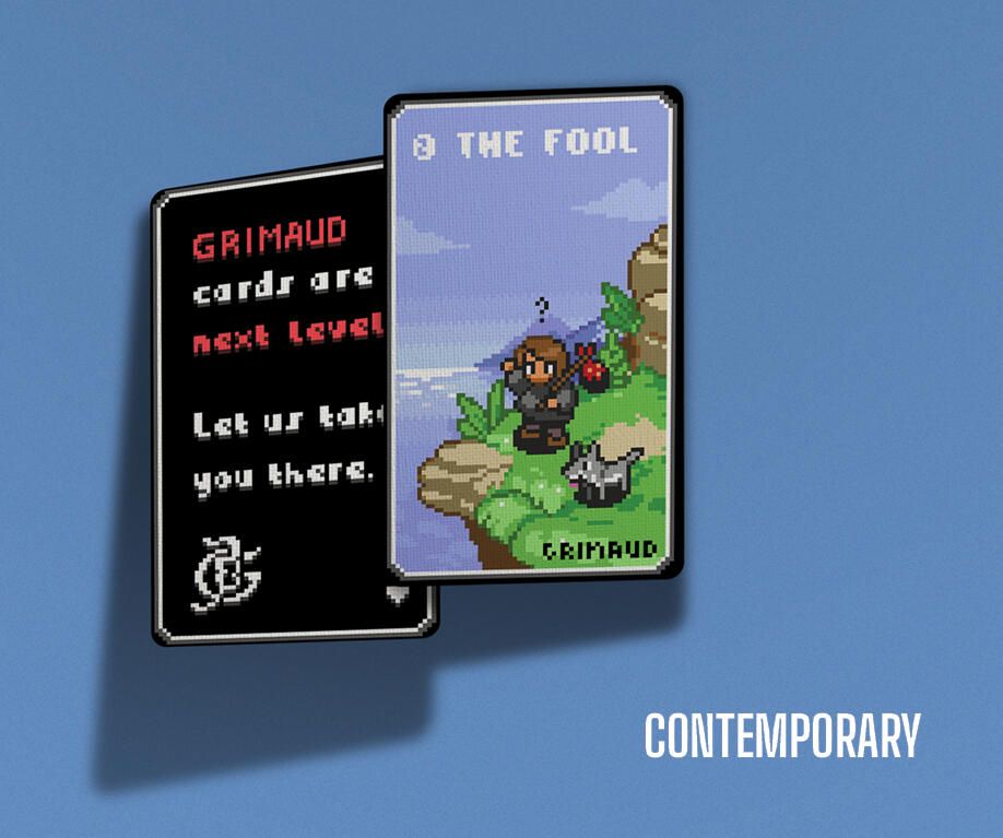
A set of promotional business cards showcasing card manufacturer* Grimaud’s material capabilities and print quality. The cards are themed after different historical design eras, and use French cultural references and puns to appeal to the French target audience. Tarot was the game chosen because it is a popular card game in France, and has a more striking graphical component than its more conventional playing card counterparts.Program: Adobe InDesign, Adobe Photoshop
*This is a student project not endorsed by or affiliated with the people or brands mentioned.
+ DON QUIXOTE
Book Design
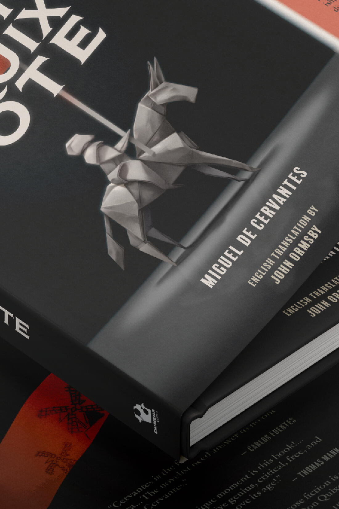
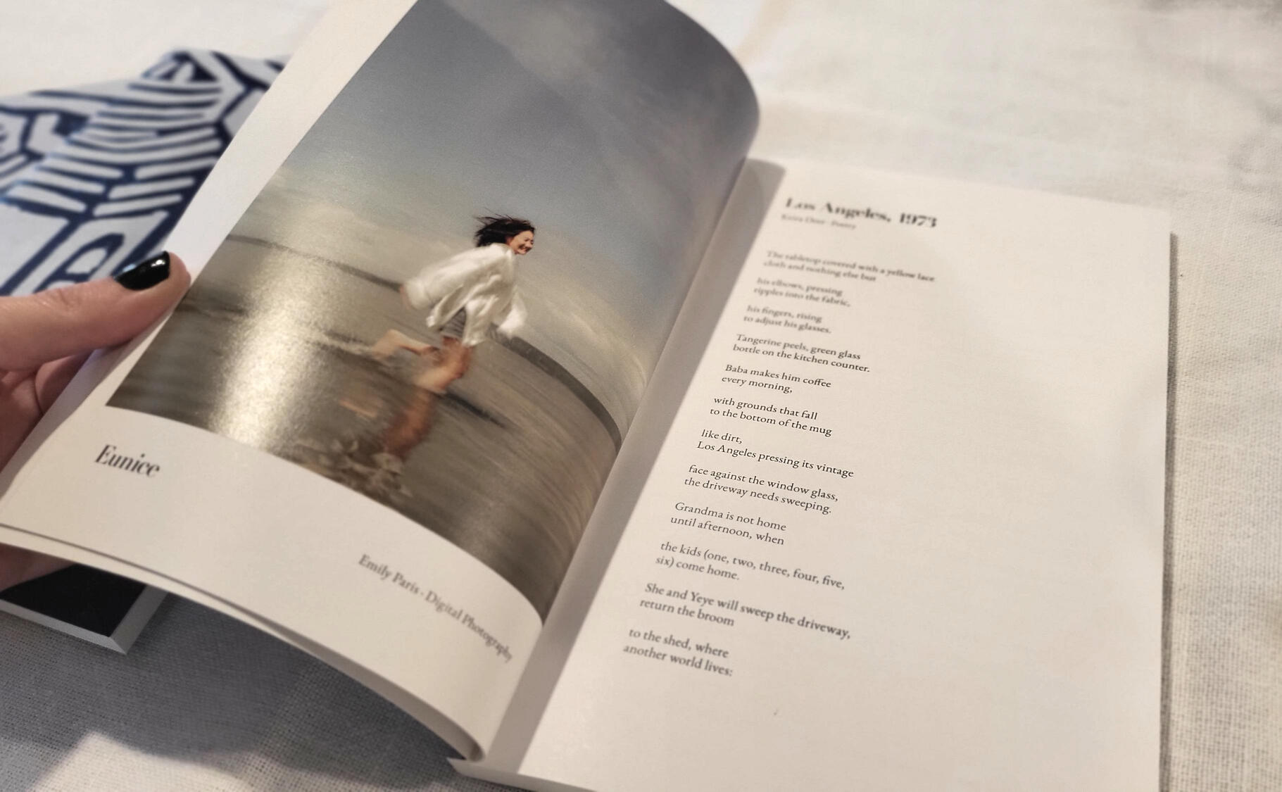
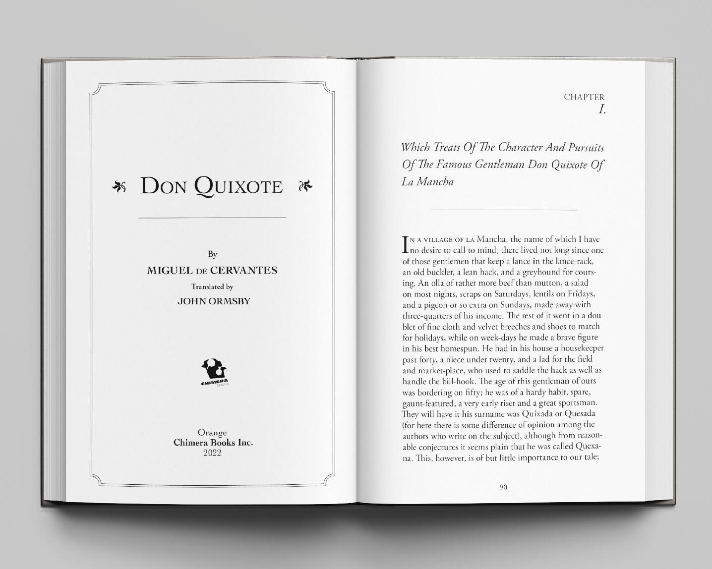
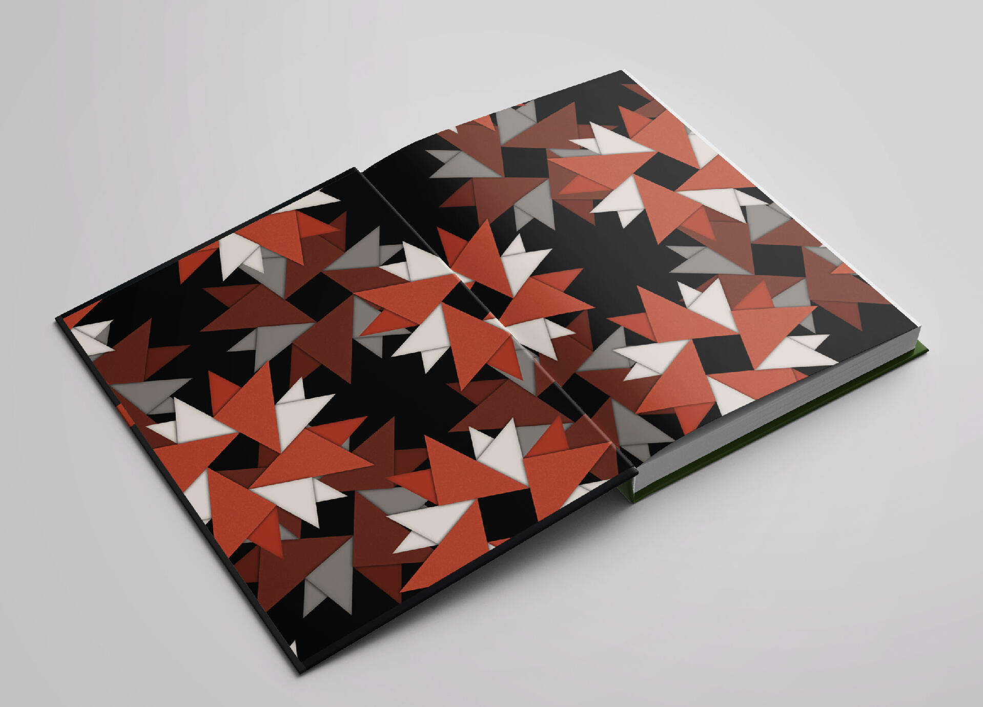
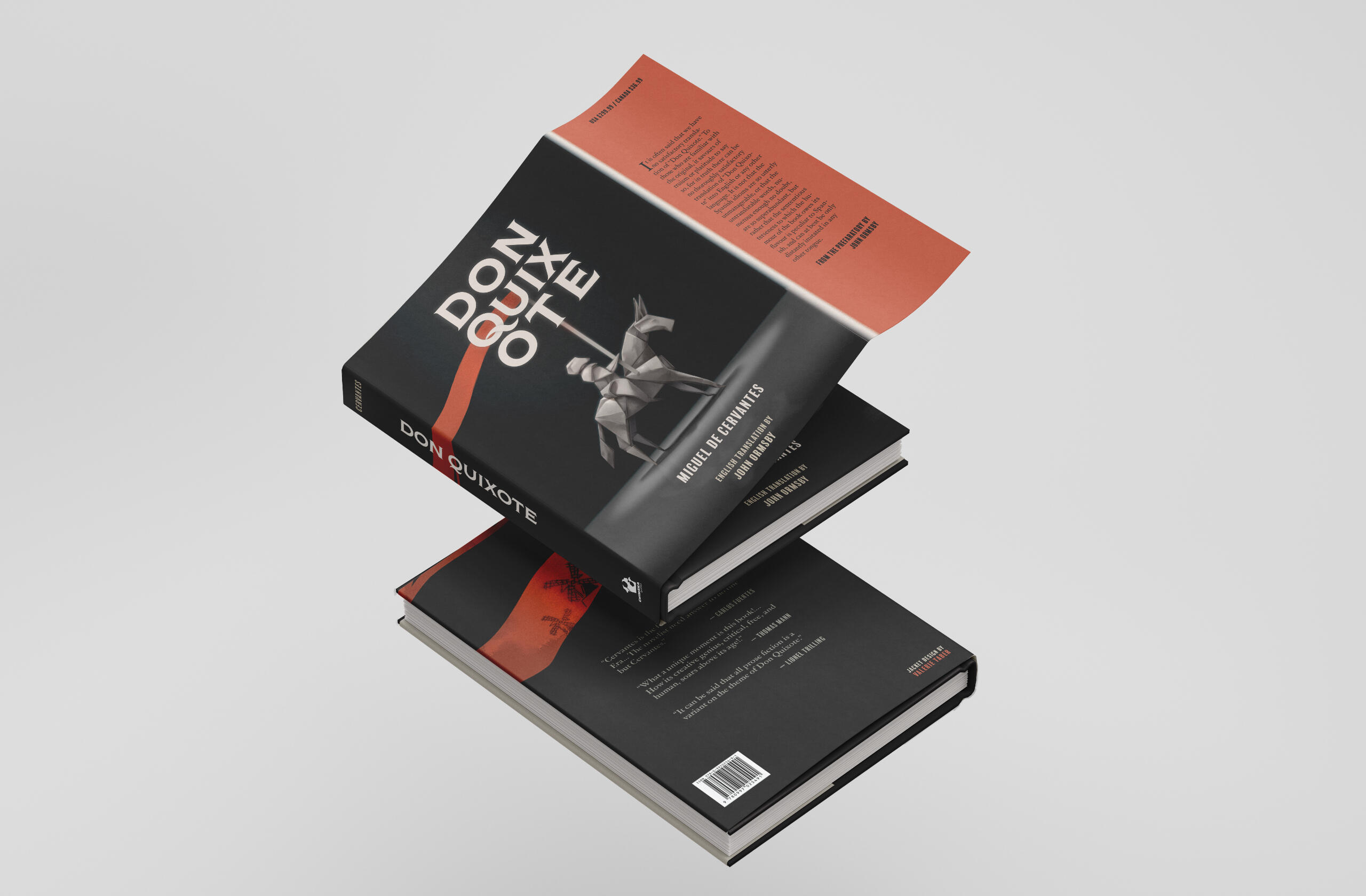
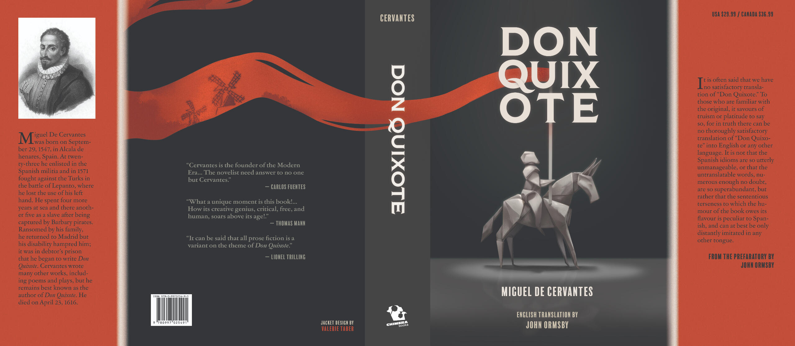
A full internal and external design with custom cover art for the novel ‘Don Quixote’ that makes use of references to the story’s themes of duplicity and falsehood to capture the spirit of the work. The book’s contents were typeset with classic yet professional feeling serifs, alluding to its position as a cultural icon.Programs: Adobe Indesign, Adobe Illustrator, Adobe Photoshop
+ Wayfinding Campaign
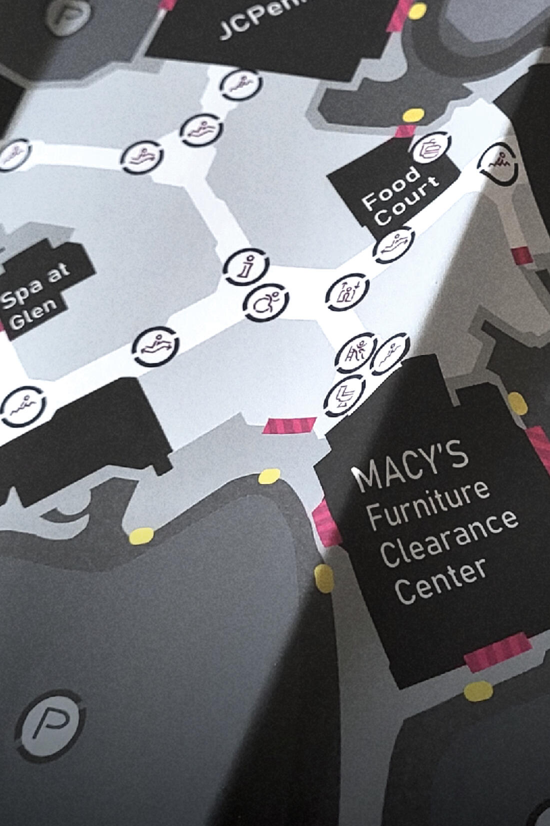
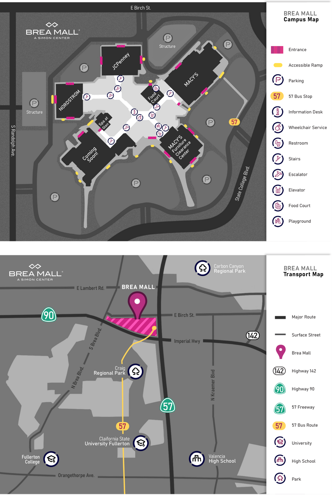
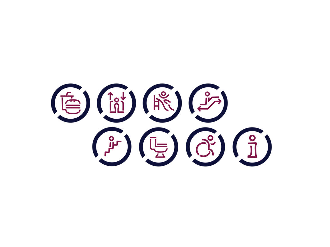
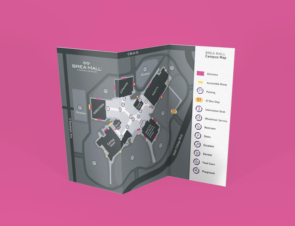
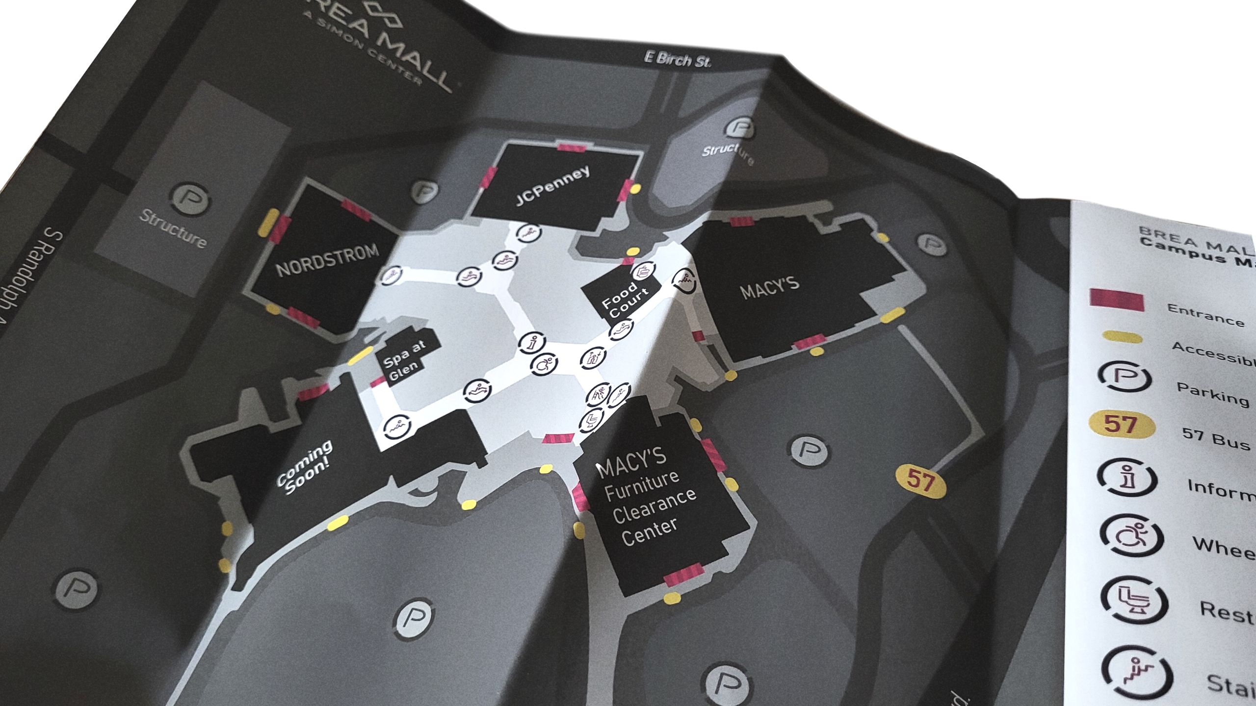
A wayfinding campaign project to develop a map for Simon Mall’s Brea location. This map design is used in lieu of their digital maps, which lack in terms of their usability for discerning information related to accessibility. This project makes an update to the clarity of iconography with an emphasis on low vision standards and accessibility markers for individuals with limited mobility to use both to arrive to and use on site.Programs: Adobe Indesign, Adobe Illustrator
*This is a student project not endorsed by or affiliated with the people or brands mentioned.
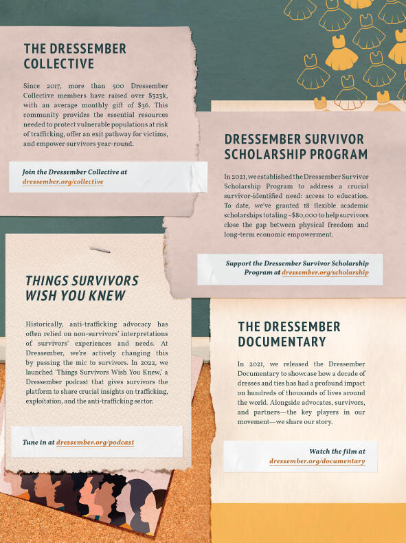
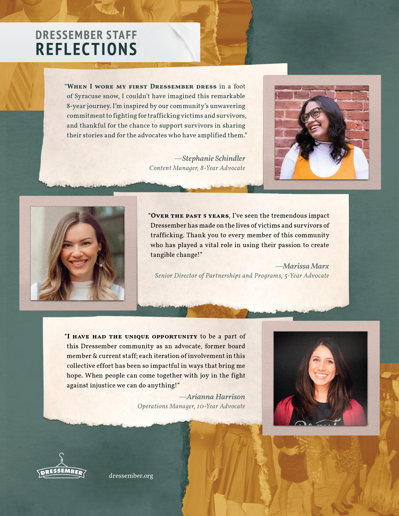
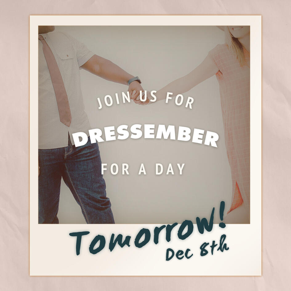
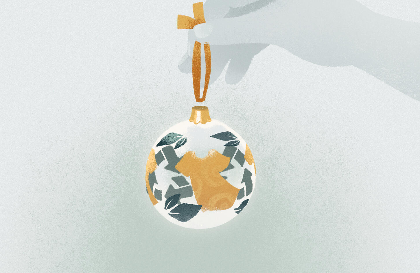
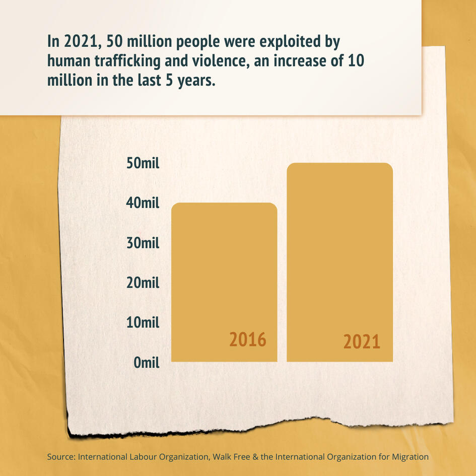
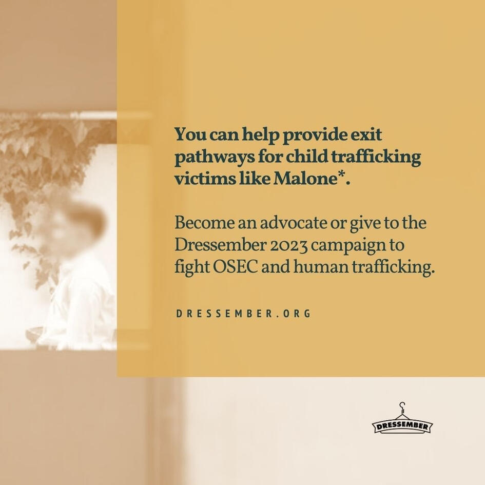
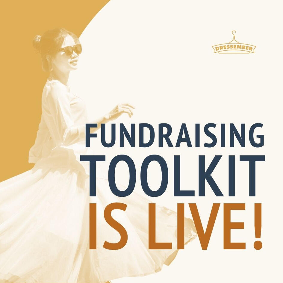
+ DRESSEMBER INTERNSHIP
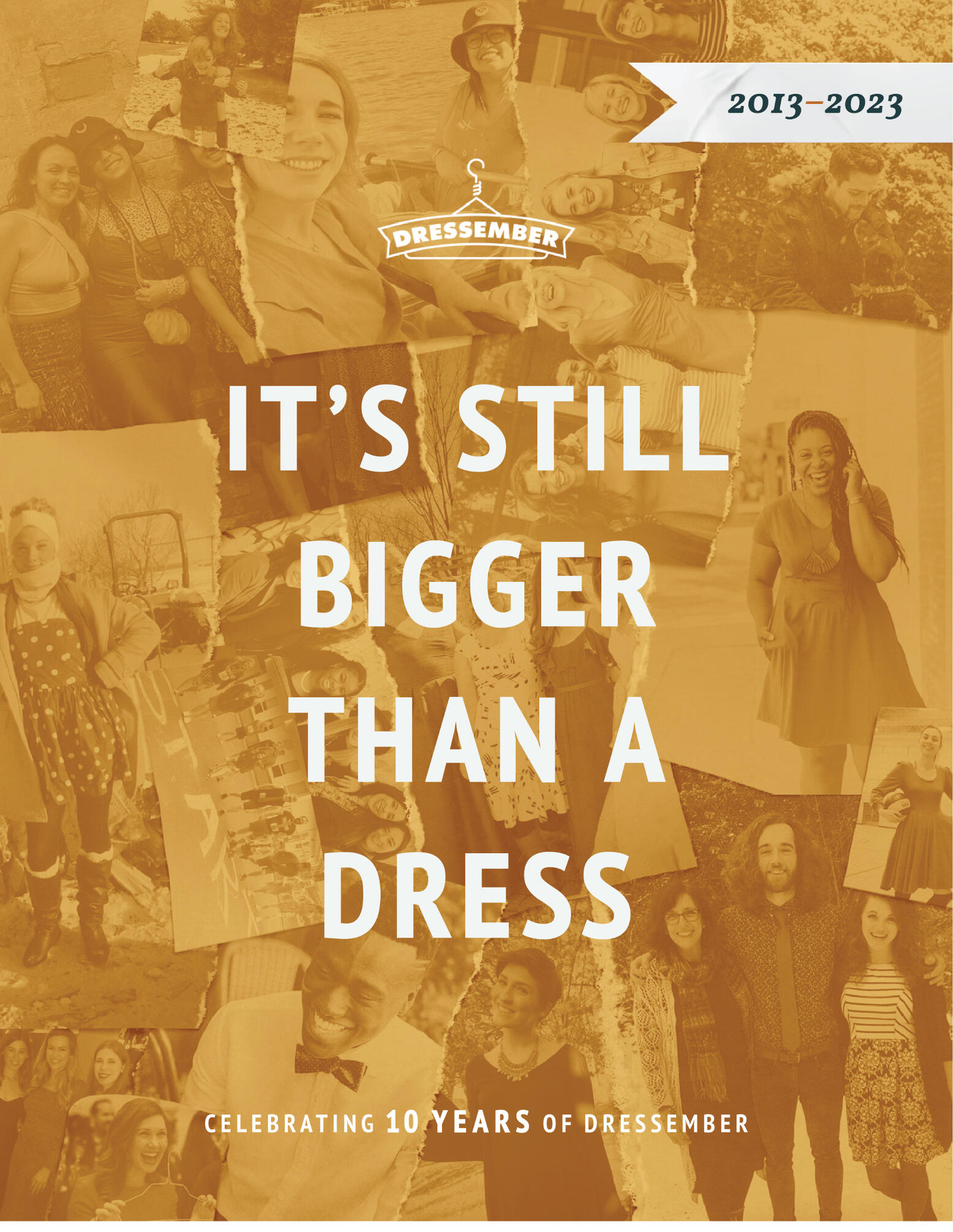
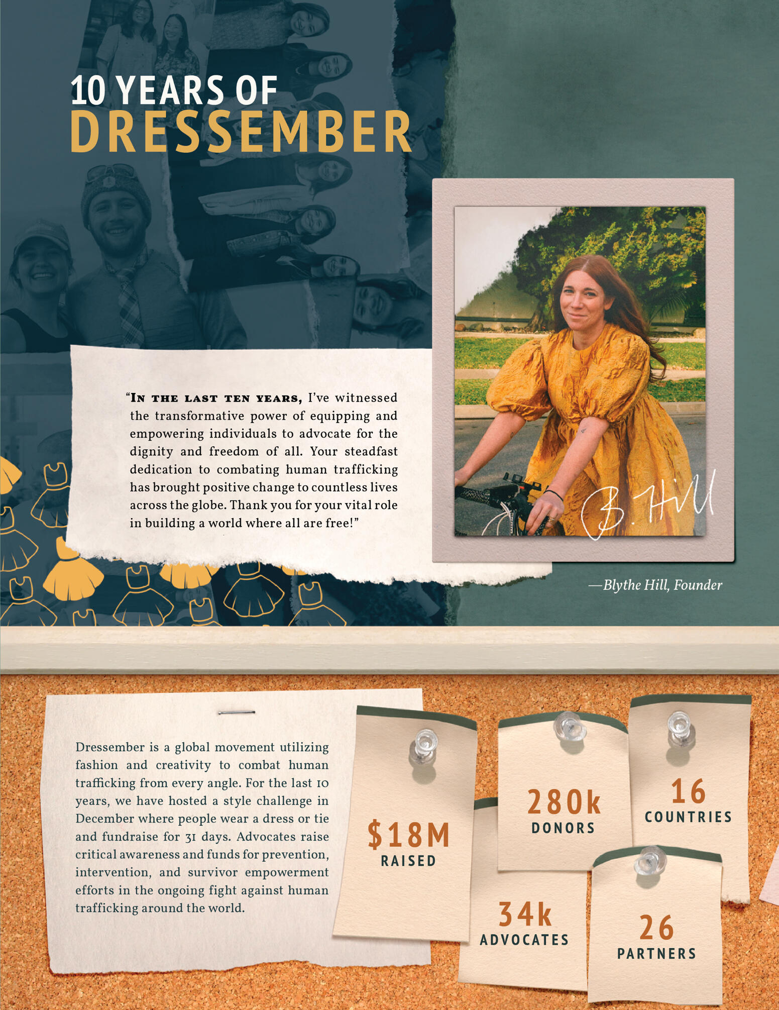
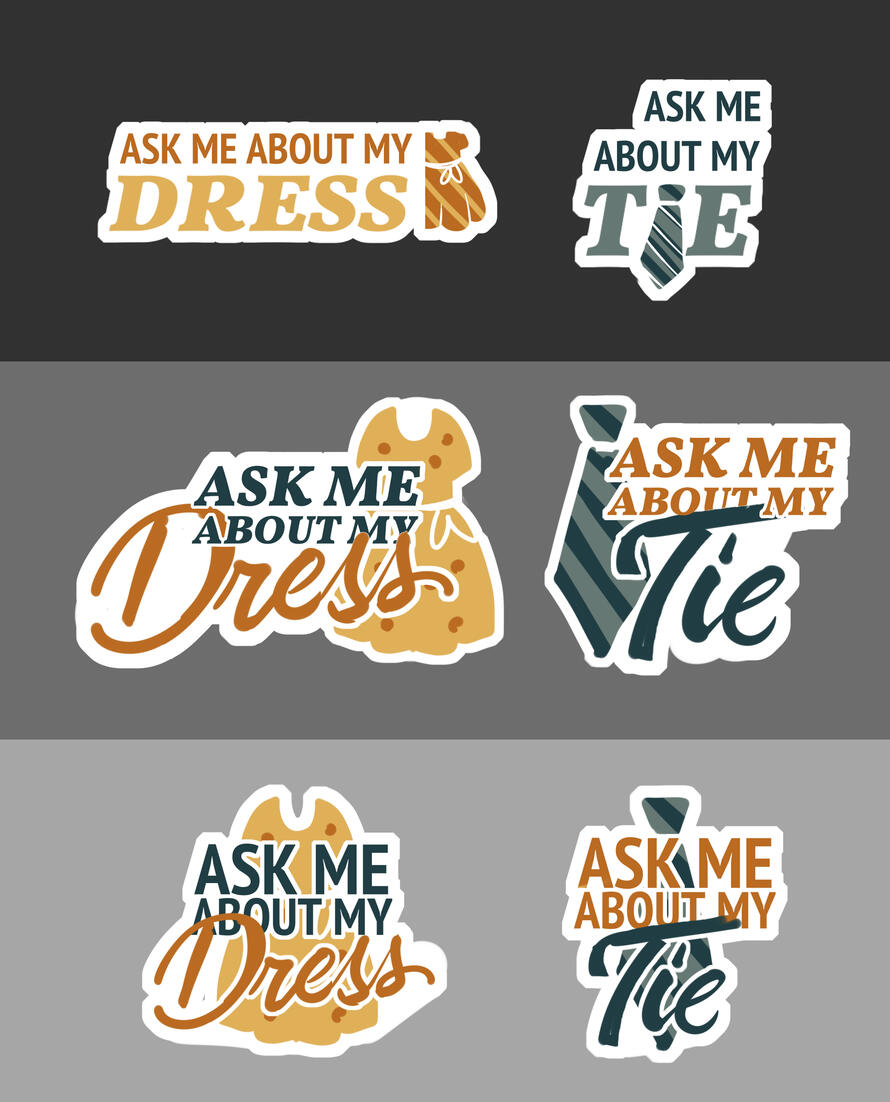
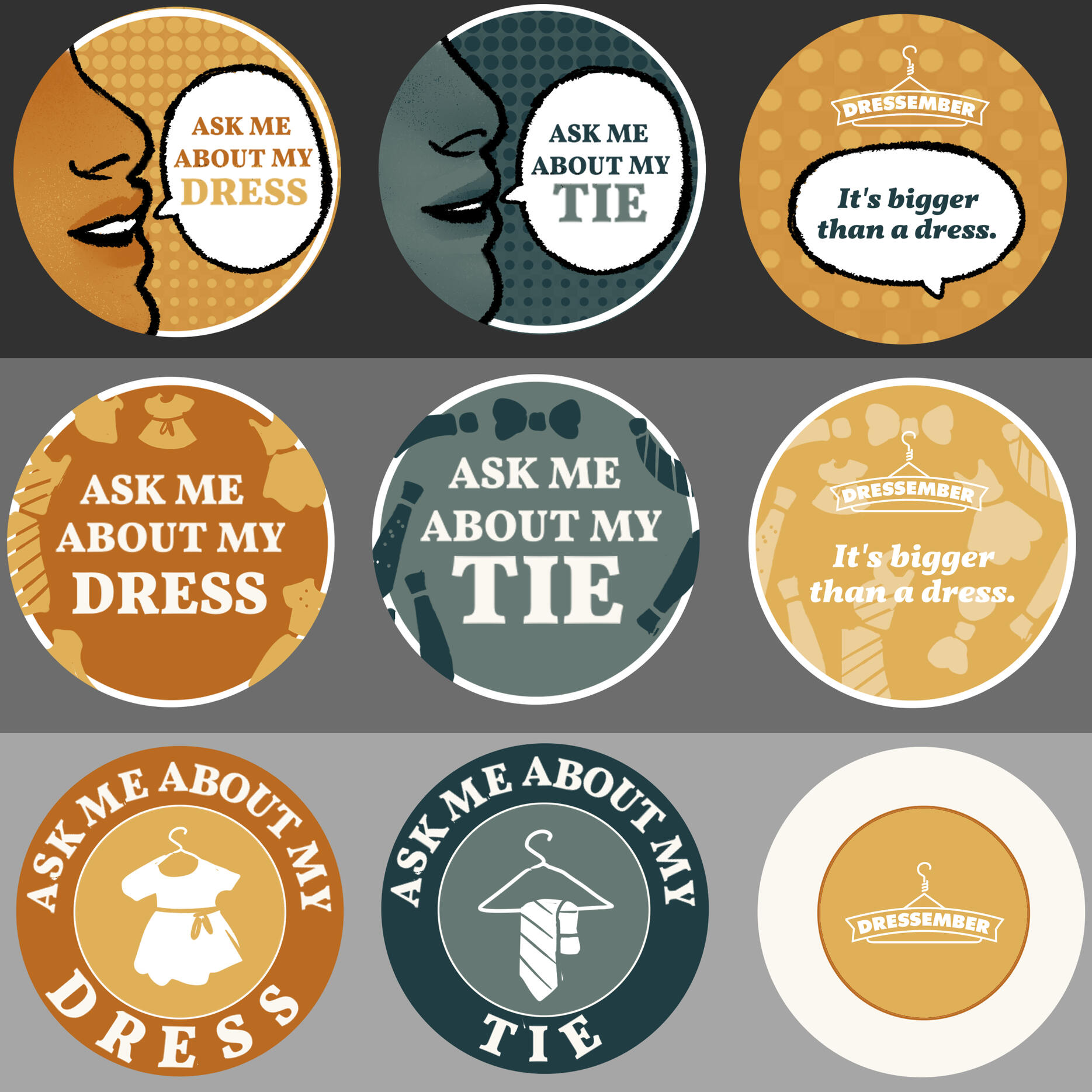
During my time as Dressember's Graphic Design Intern in the second half of 2023, I worked to create a variety of recruitment, informative, and merch-related graphics both static and motion-based, as well as evolutions of existing brand assets. This also involved a great deal of photo editing and custom illustrations!Programs: Adobe Indesign, Adobe Illustrator, Adobe Photoshop
Fundraising reward | Journal cover design
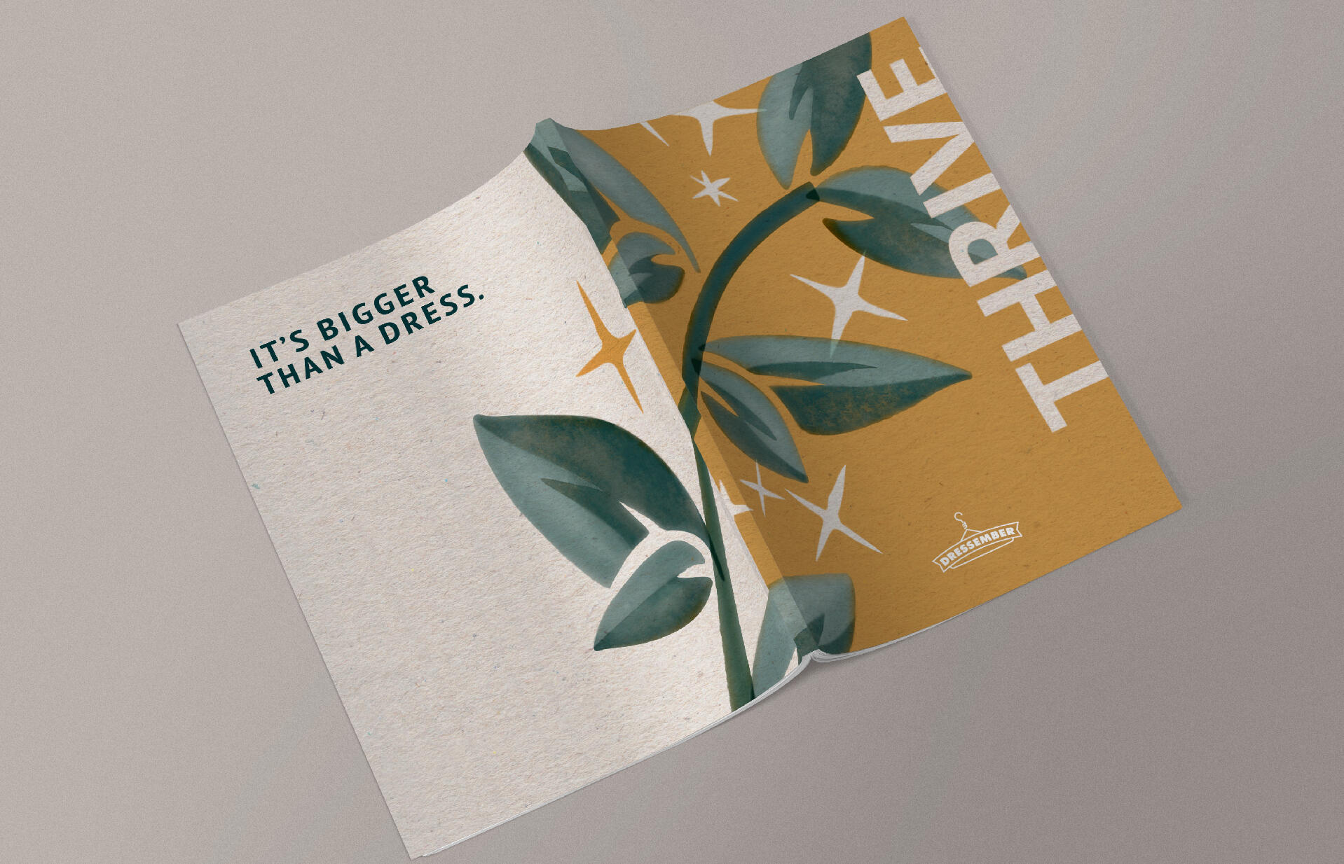
10-Year Annual REport
Sticker Designs + Concepts
Various Instagram Graphics | Advertisements, Editorial Illustrations
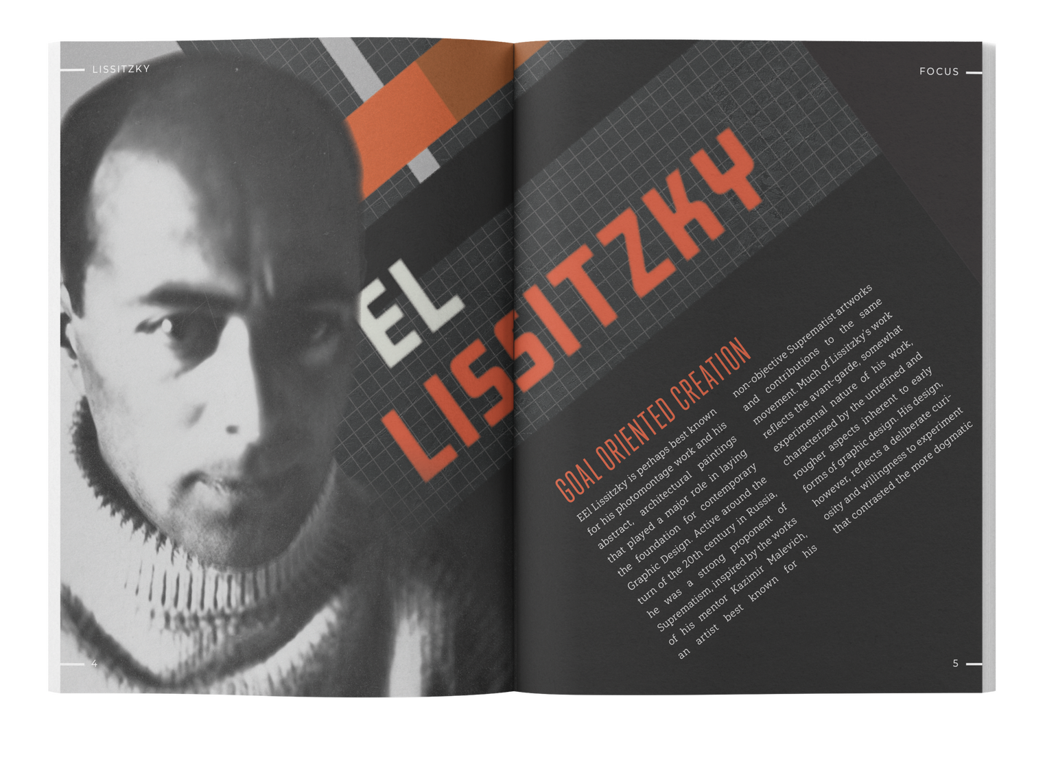
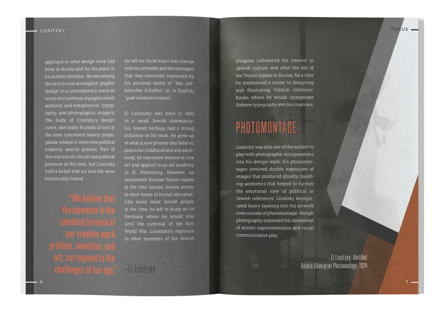
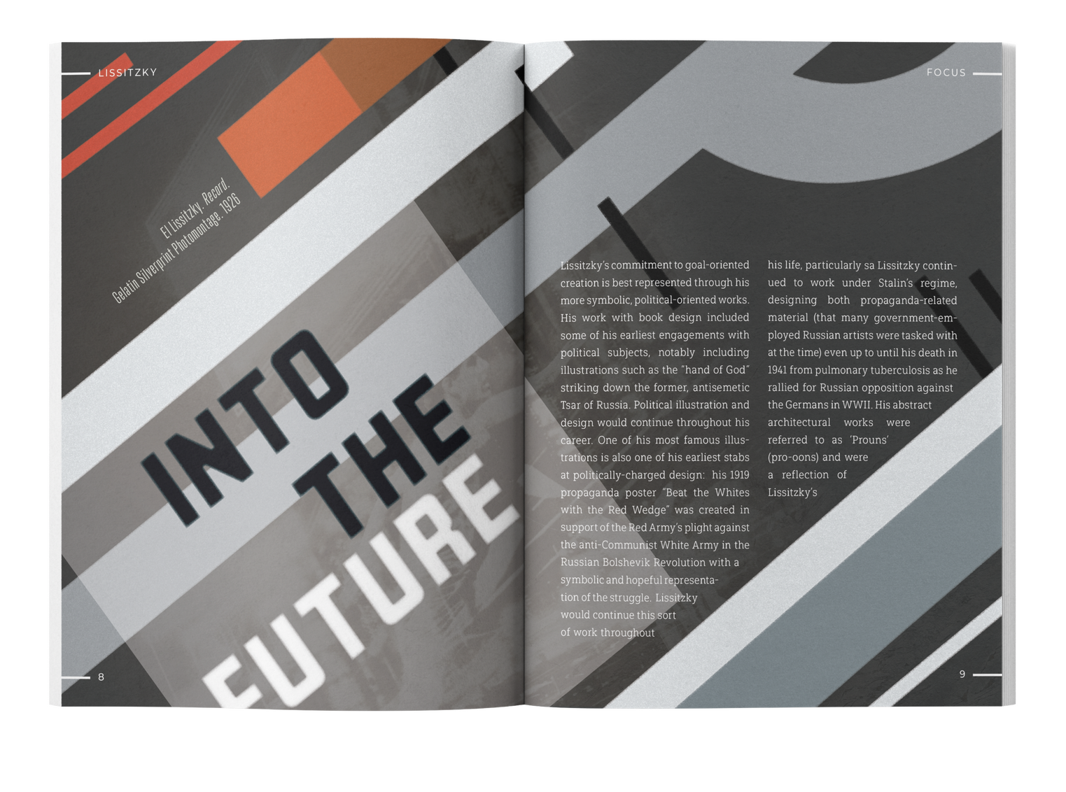
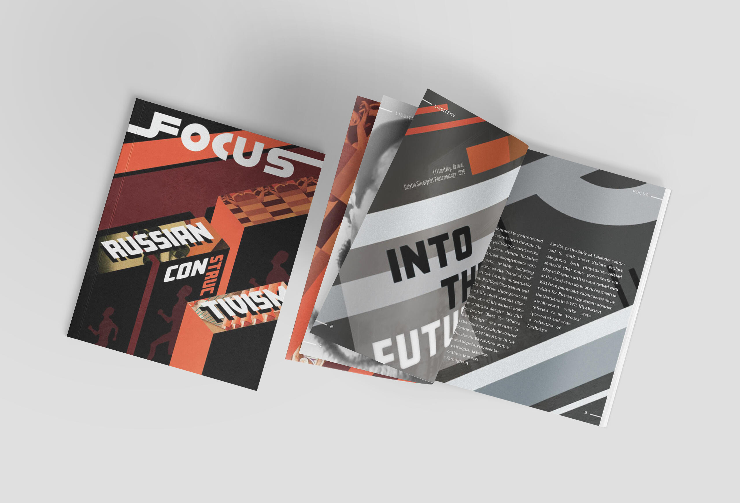
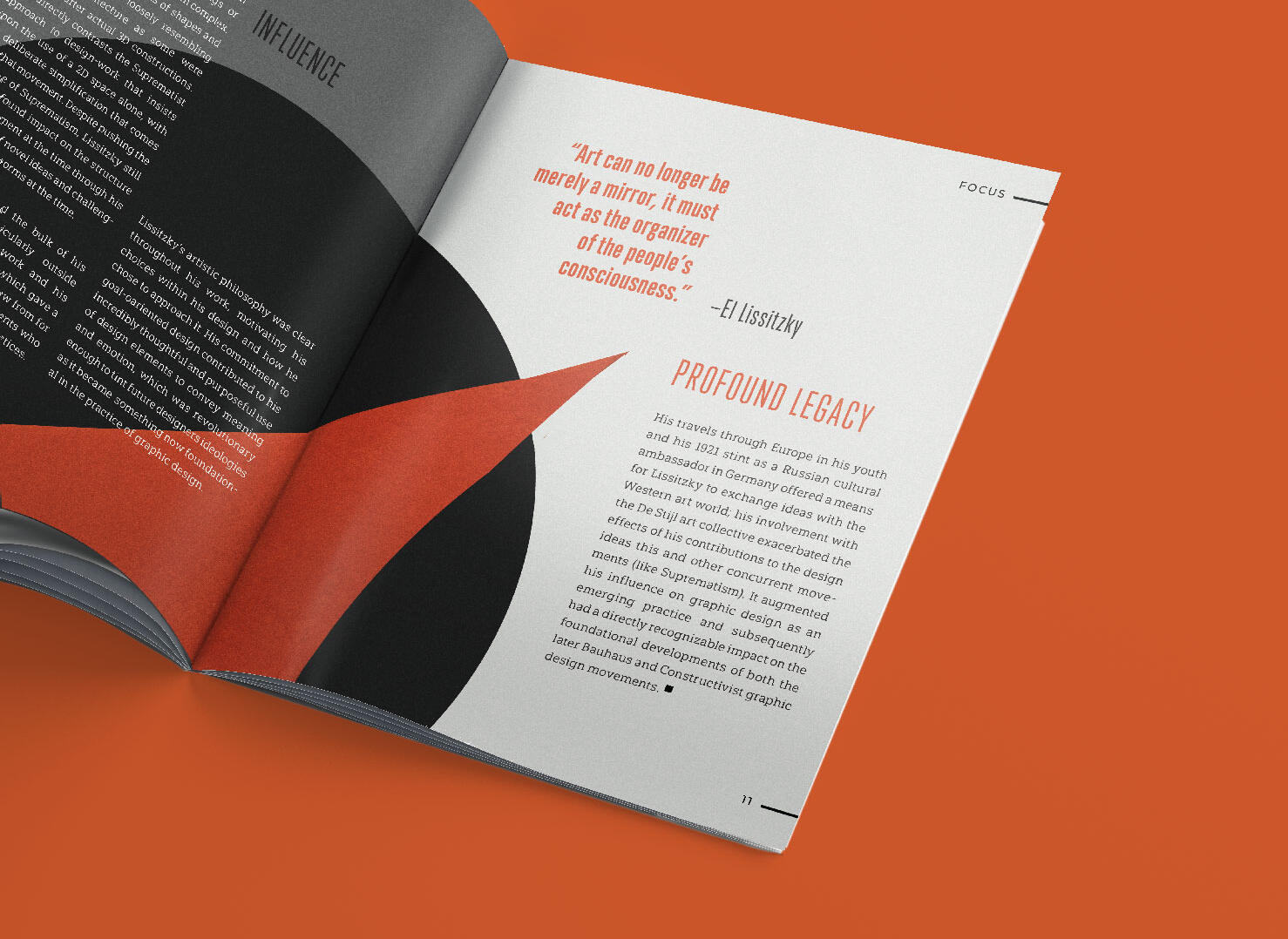
+ Constructivism Zine
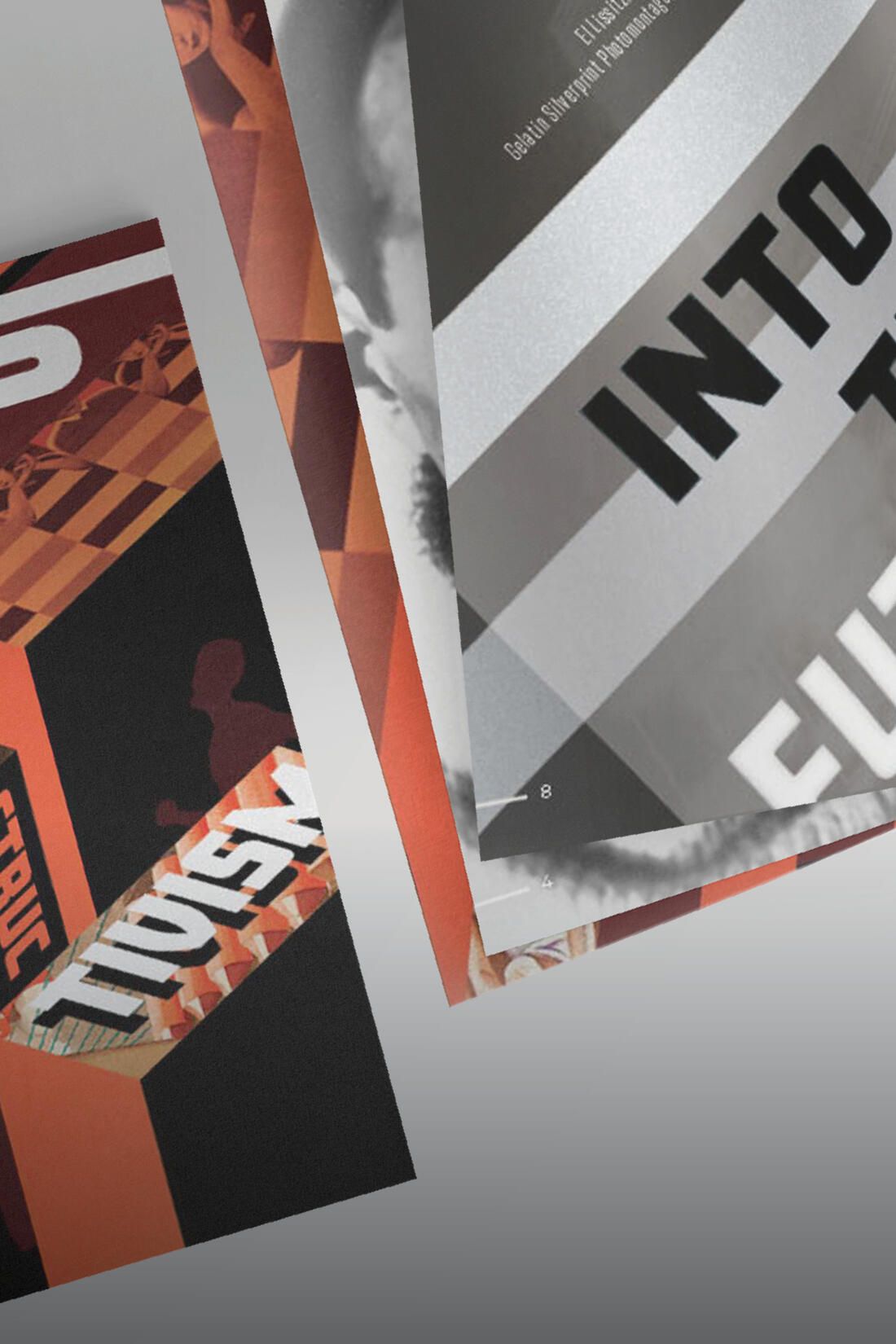
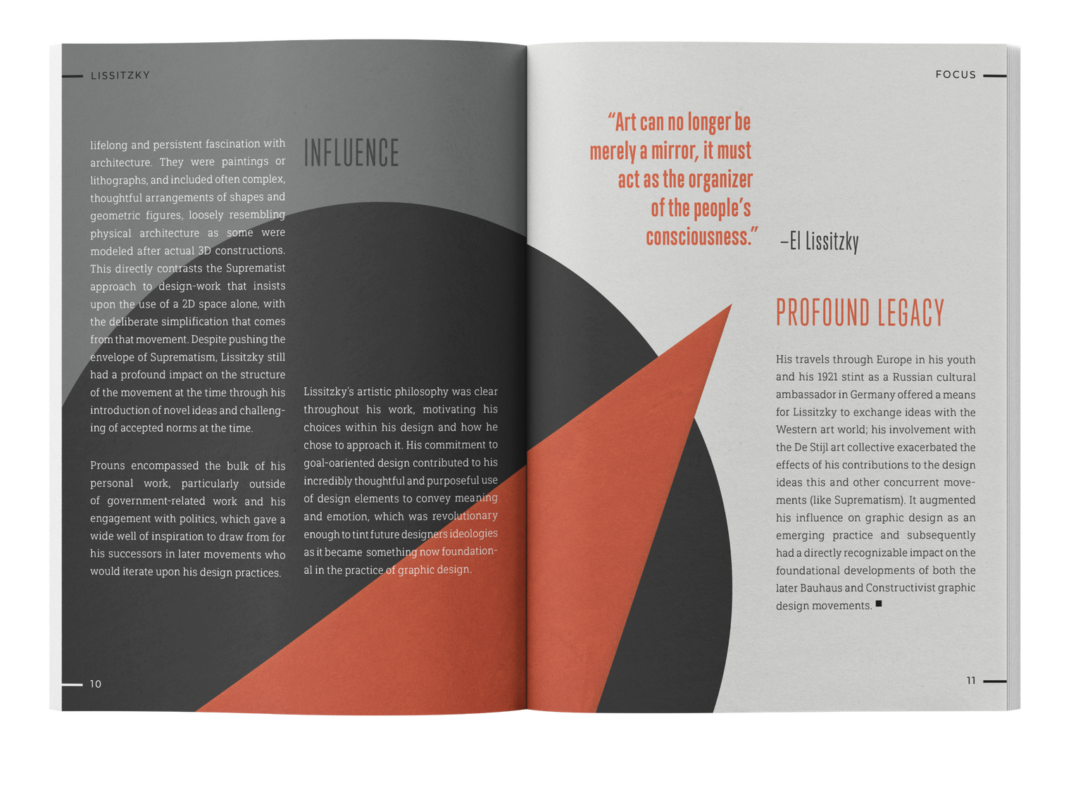
A set of zine spreads examining the life and work of Russian Constructivist designer El Lissitzsky. The design pays homage to his work through layout, and to the style holistically through the cover design.Programs: Adobe Indesign, Adobe Illustrator, Adobe Photoshop
+ Emergency Kit
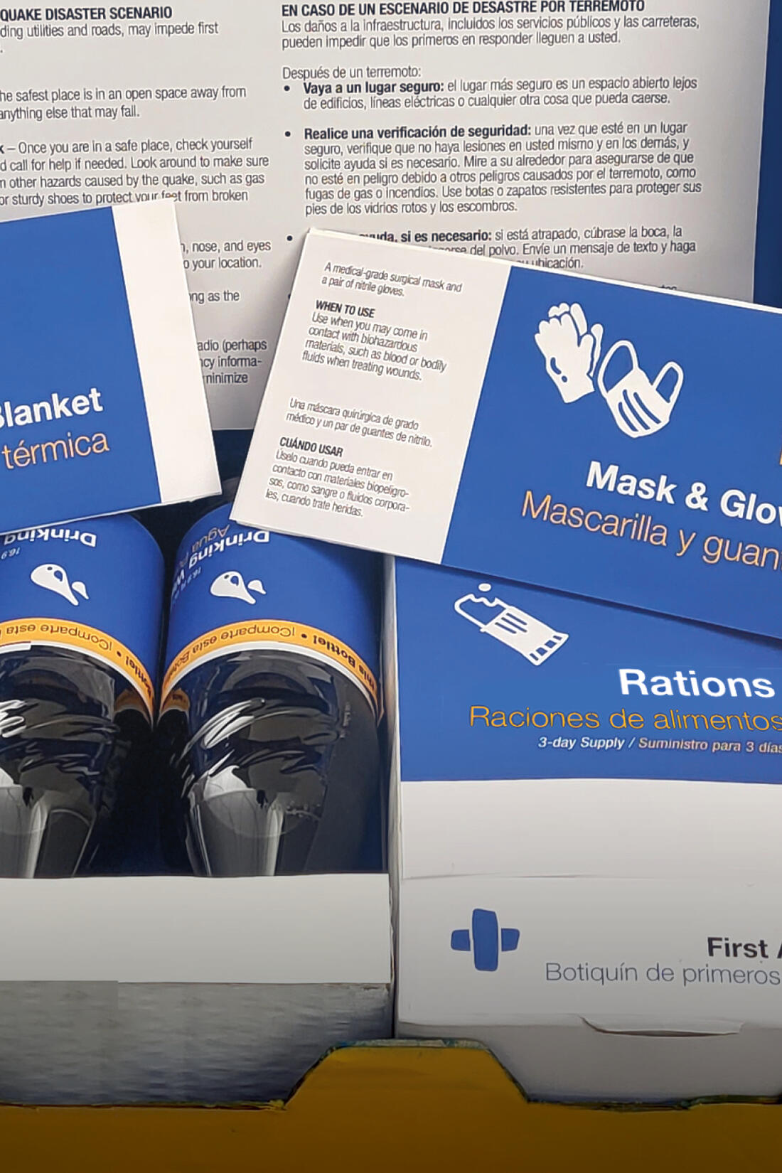
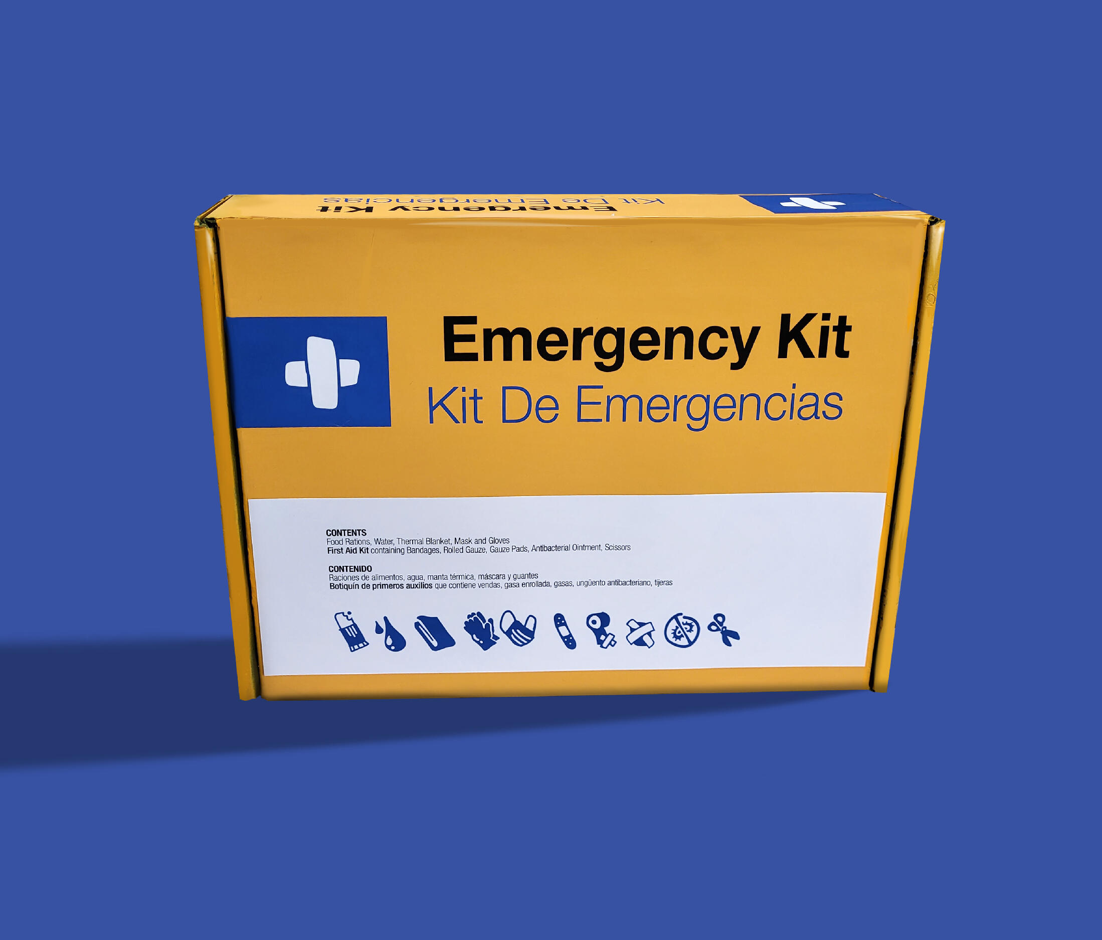
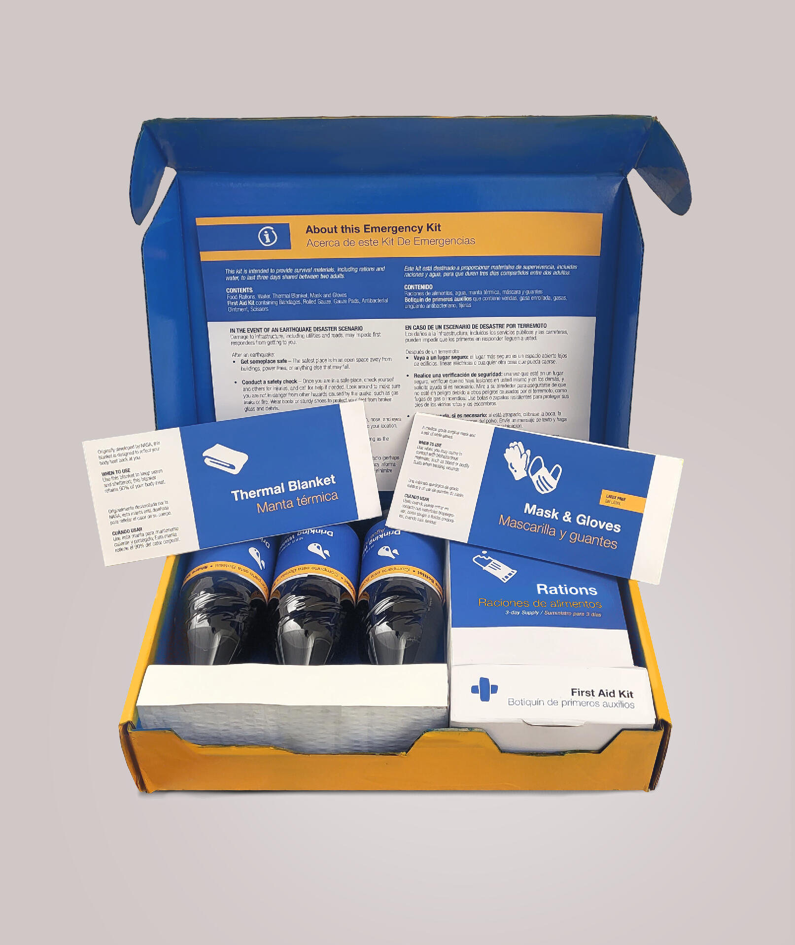
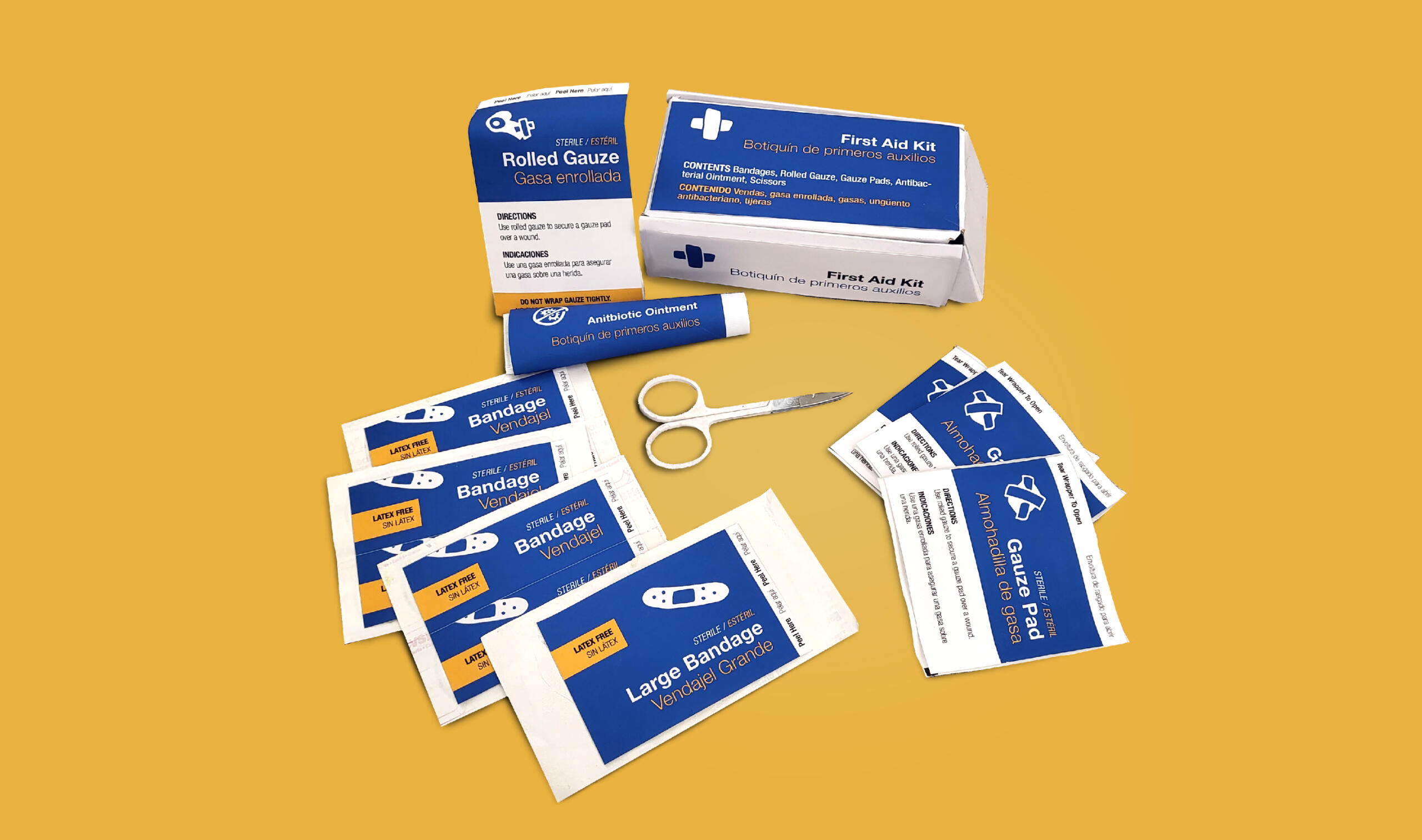
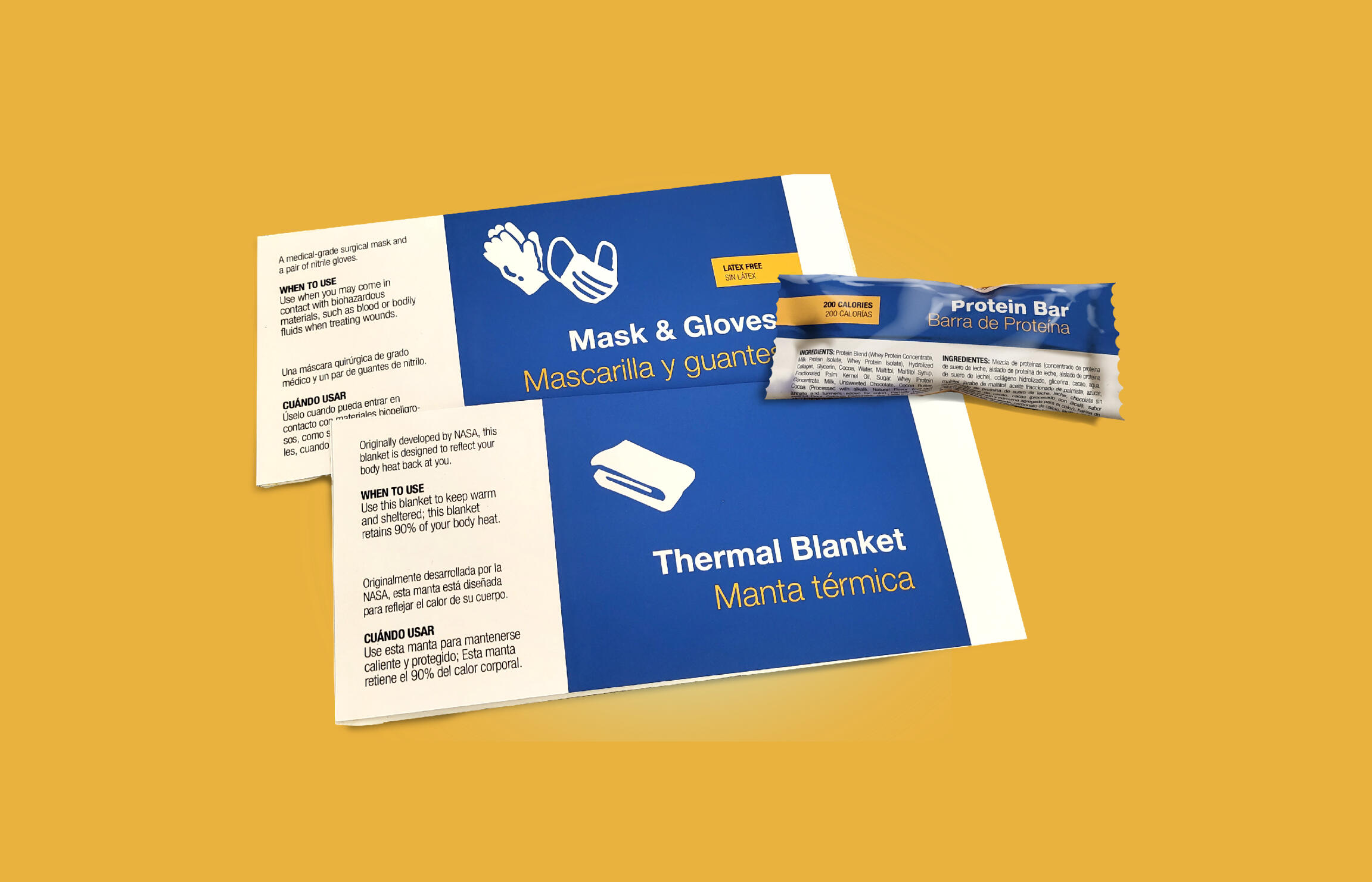
An earthquake kit to be delivered to stranded SoCal residents in the event of an earthquake that destroys infrastructure. The design process researched and utilized information on cognitive impairment caused by disaster situation to create an informative yet calming experience for people in an emergency situation.The packaging itself uses familiar shapes and formats to increase user confidence and ease of use. The exterior of the package is bright and eye catching to be seen from afar, while the interior aims to use the calming and authoritative connotations of blue to evoke trust in the user, as this is a product that would be distributed by a government agency.Programs: Adobe Indesign, Adobe Illustrator, Adobe Photoshop
+ Illustration
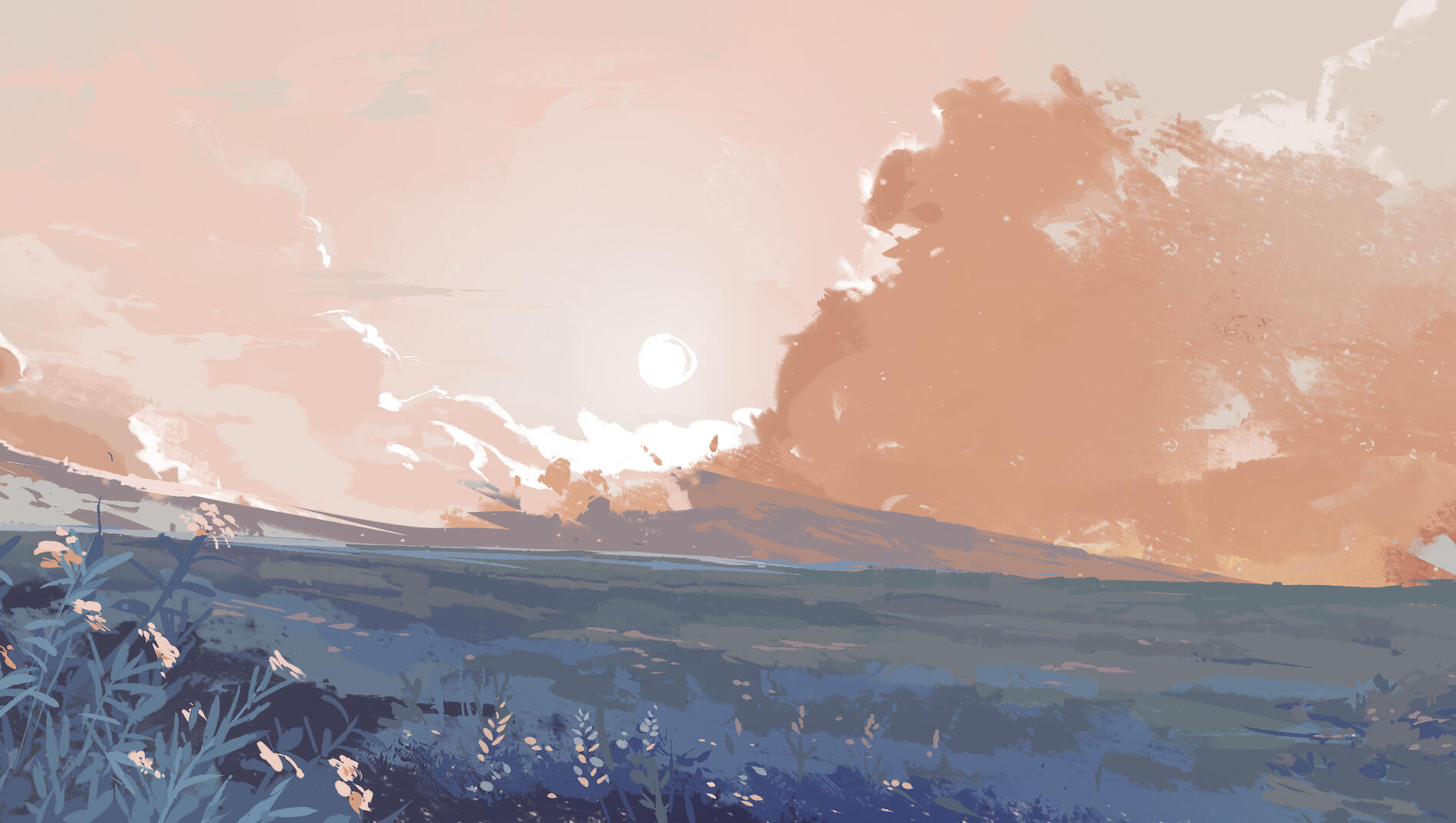
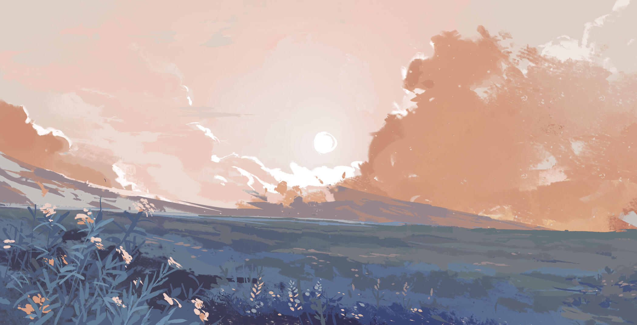
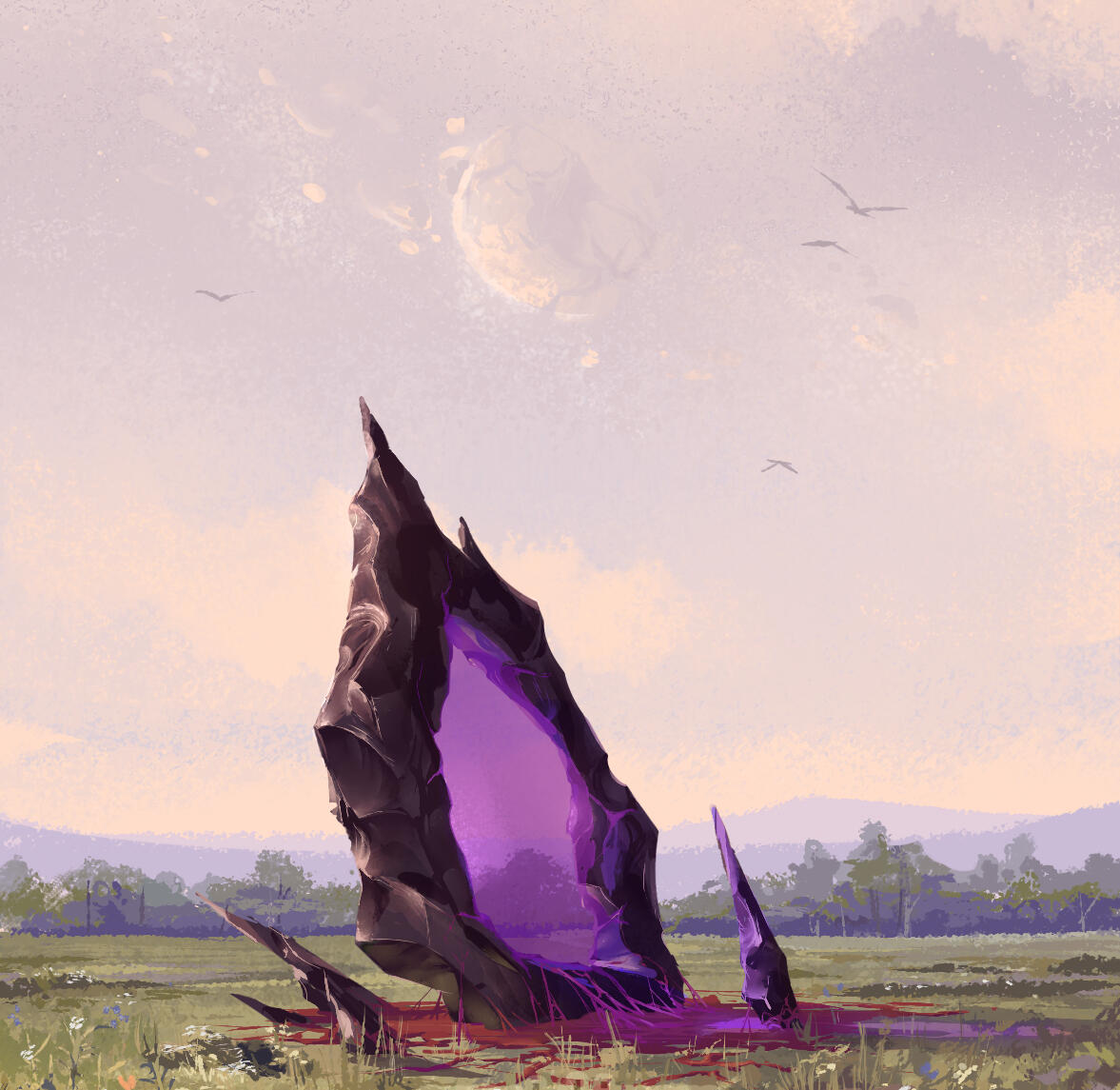
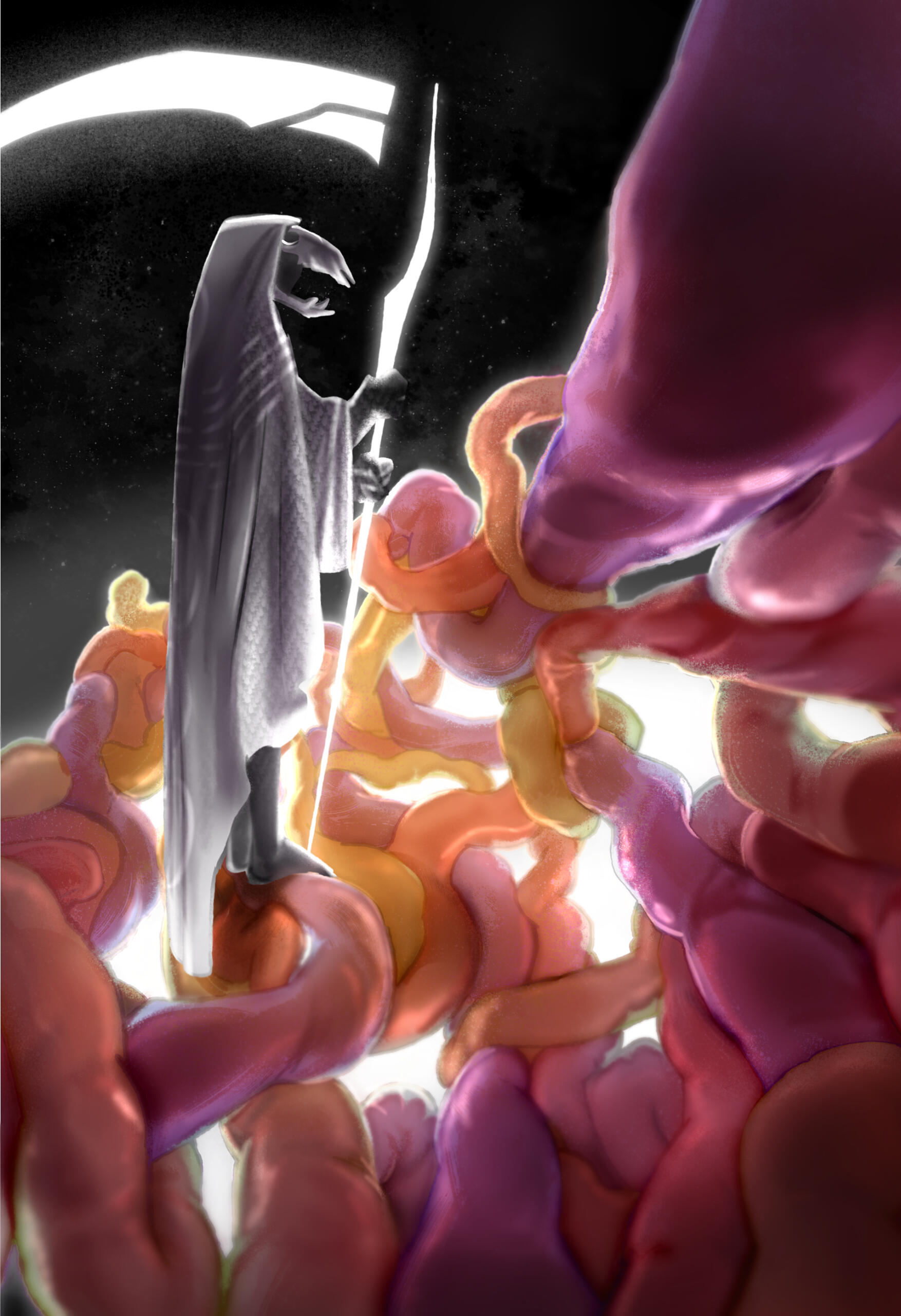
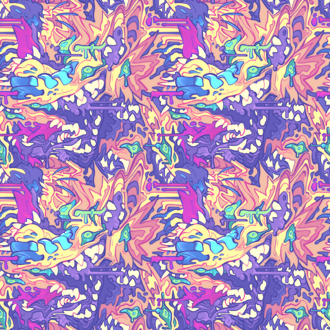
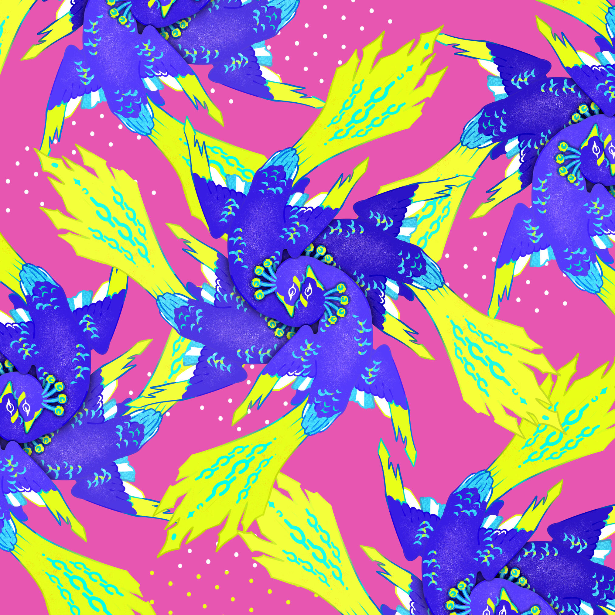
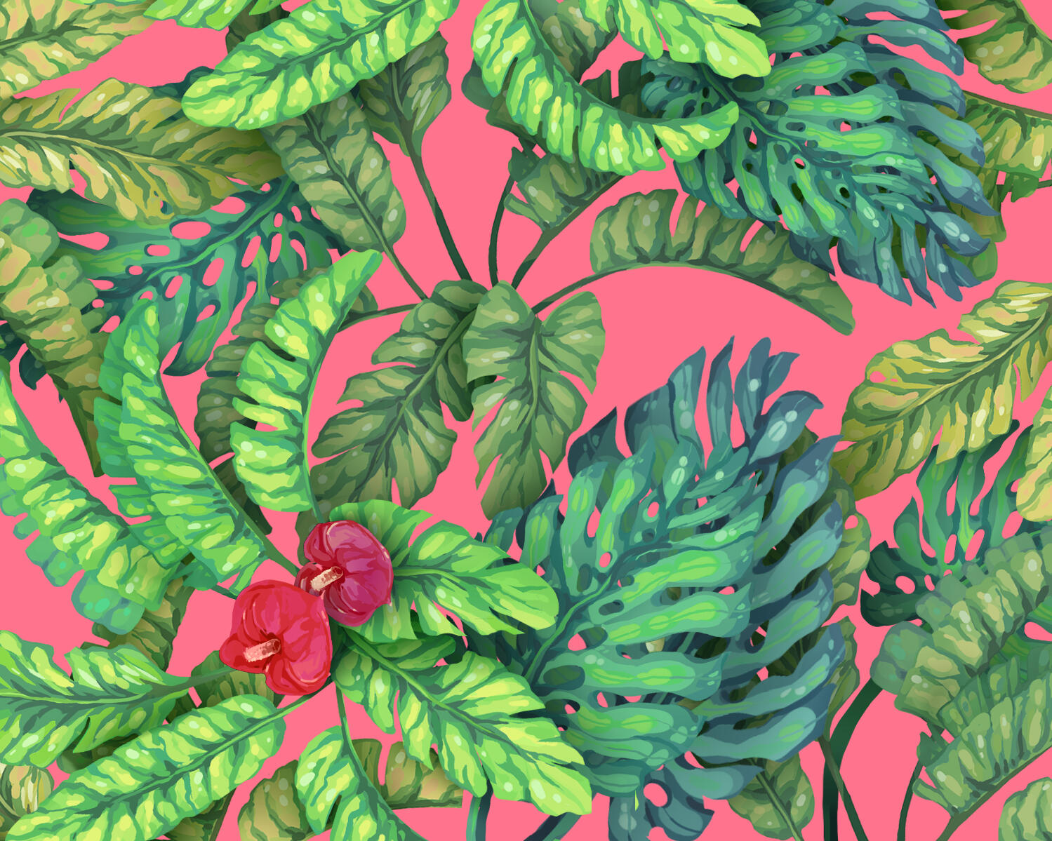
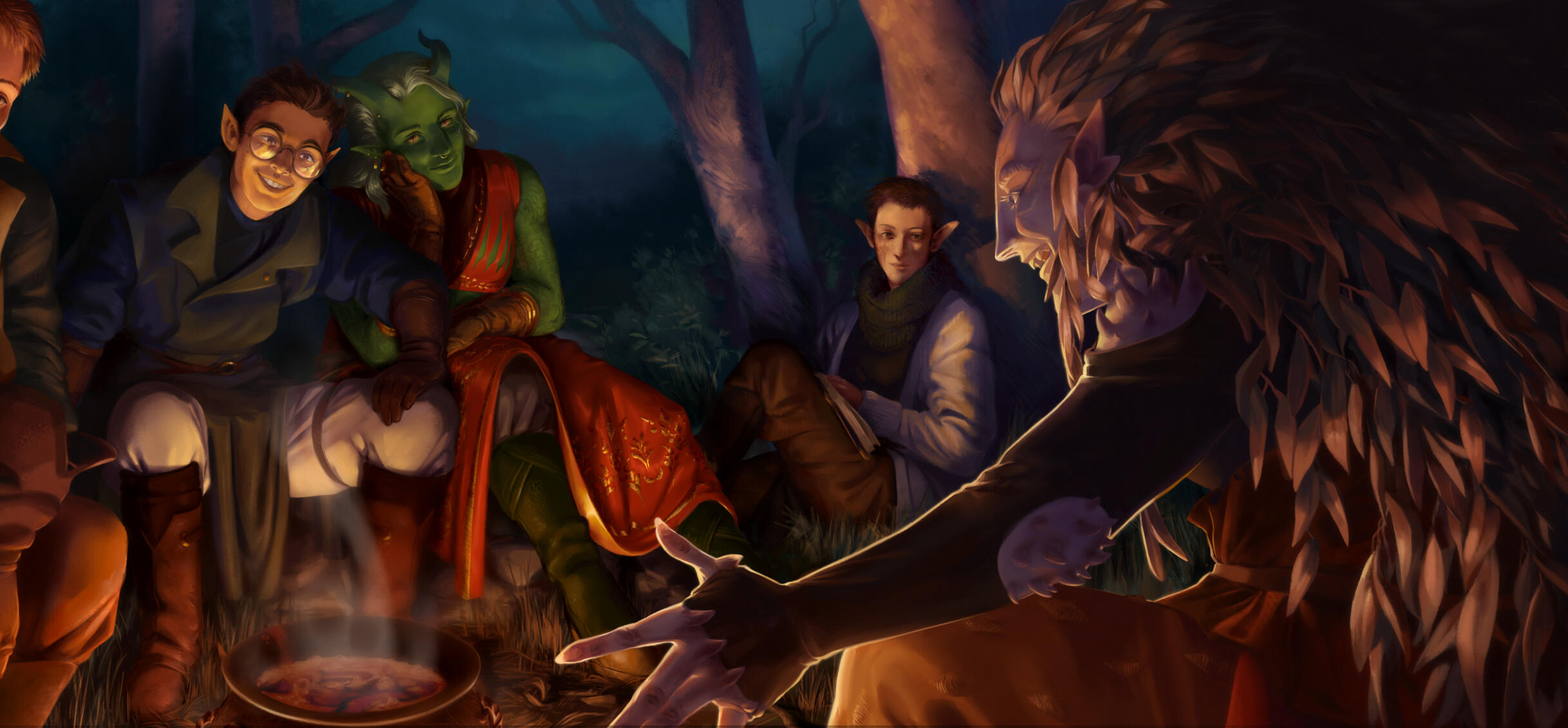
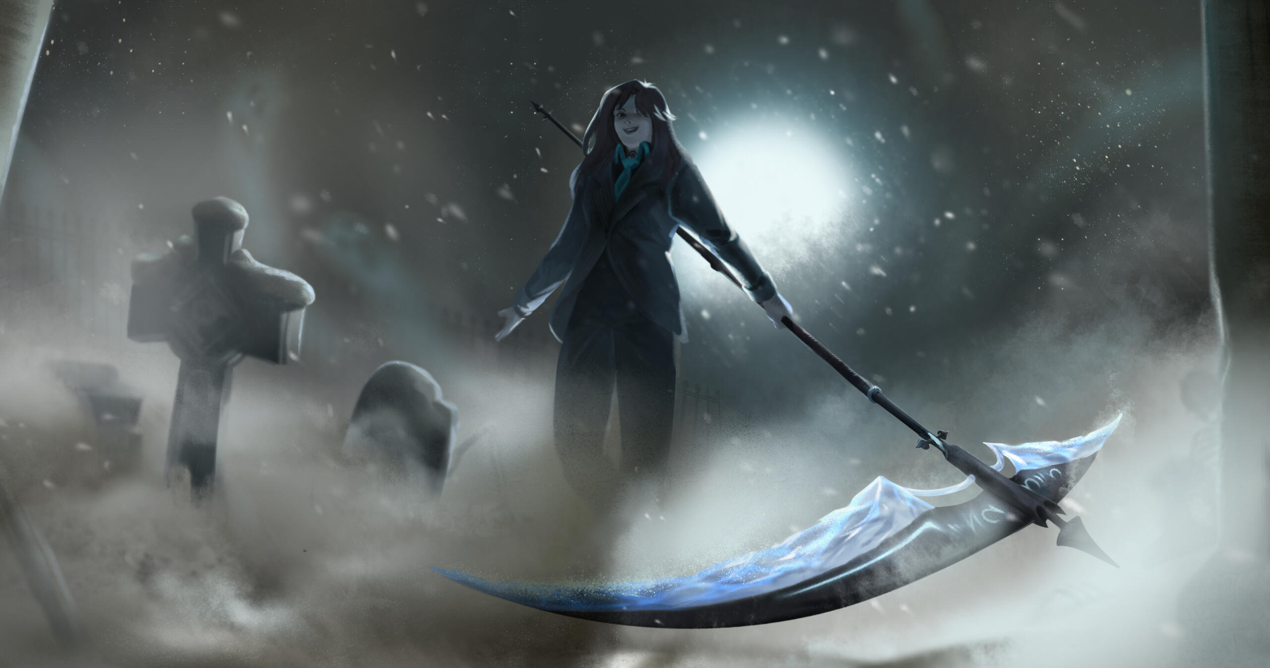
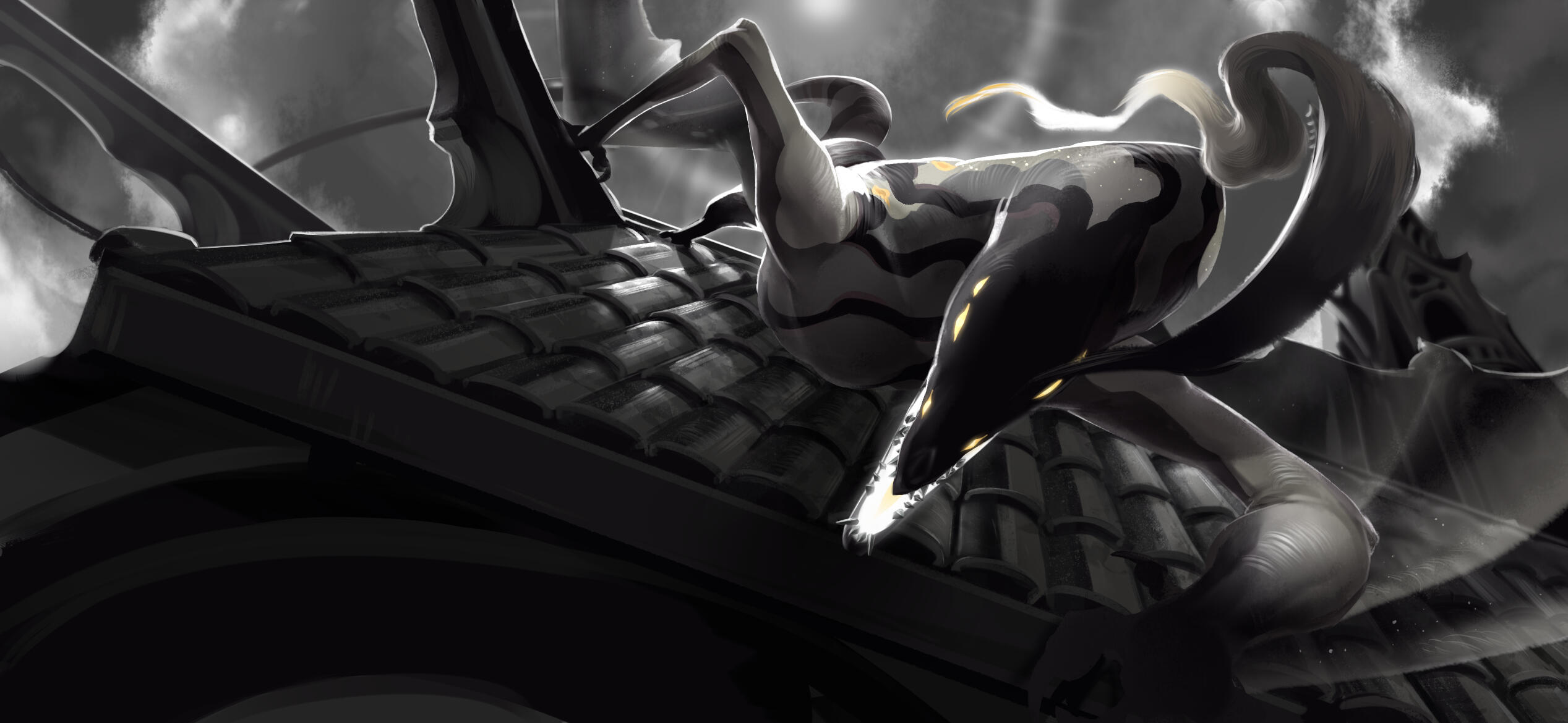
I draw a lot! I do just about everything illustrative for my side illustration business. Here's a sample of some custom paintings, backgrounds, patterns, character art, and more that I've done for clients and myself.Programs: Paint Tool Sai, Clip Studio Paint
Who is
This guy
Anyway?
🠖
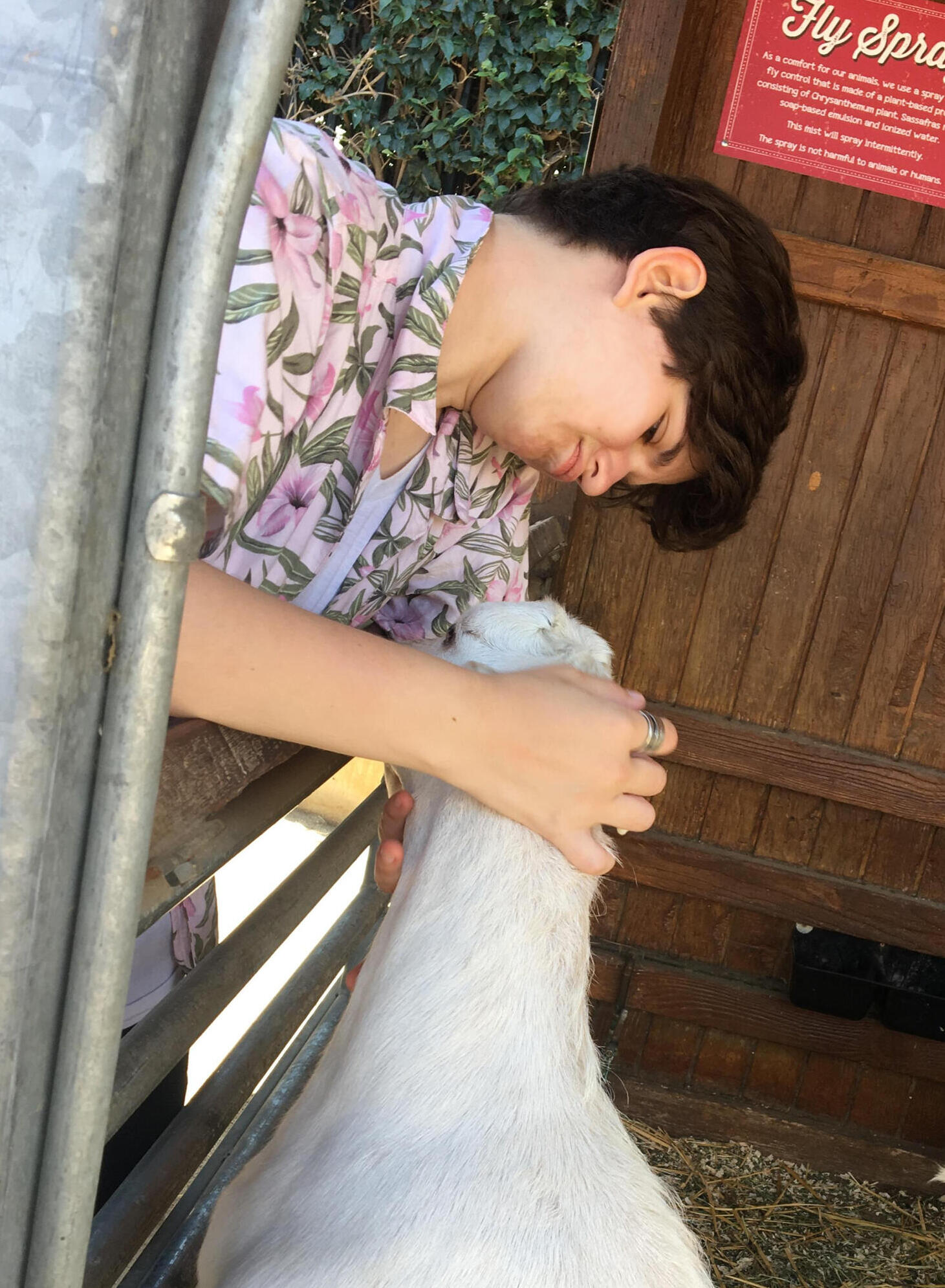
Hi, I’m Val!
I'm a Graphic Designer, Illustrator, and a SoCal native. I’m a total sucker for graphic illustration, and the power of custom (and non-custom) type. I like dynamic, maximalist designs that express personality through visual texture, and I’ve never met a diagonal line I didn’t love.I also love a good film, but I think I love bad ones more. Even outside of designing, I usually have my leg in the bear trap of the art world with my personal illustration endeavors.
Text me a picture of your cat, yea?(714) 269-3949
valerietaber26@gmail.com
linkedin.com/in/valtaber

